Descriptive statistics are the vocabulary with which we first speak to a dataset. Before any model is trained, before any loss function is minimized, a practitioner confronts raw numbers and asks a simple question: what does this data look like? The answer arrives through a small but powerful collection of summaries that compress thousands or millions of observations into a handful of interpretable quantities. These summaries are not merely a prelude to machine learning. They shape feature engineering, expose data quality problems, motivate preprocessing choices, and provide the sanity checks that catch errors before they propagate into production systems. This chapter develops descriptive statistics from first principles, with an eye toward the decisions a machine learning engineer actually faces.
36.1 1. Measures of Central Tendency
A measure of central tendency answers the question of where the bulk of the data sits. It is a single number meant to represent a typical value. The three classical measures, the mean, the median, and the mode, each formalize “typical” in a different way, and the differences between them carry real information.
36.1.1 1.1 The Arithmetic Mean
Given observations \(x_1, x_2, \ldots, x_n\), the arithmetic mean is
\[
\bar{x} = \frac{1}{n} \sum_{i=1}^{n} x_i.
\]
The mean is the unique value \(c\) that minimizes the sum of squared deviations \(\sum_i (x_i - c)^2\), a fact that ties it directly to least squares regression and to the Gaussian likelihood. Writing \(J(c) = \sum_i (x_i - c)^2\), differentiating gives \(J'(c) = -2 \sum_i (x_i - c)\), and setting this to zero yields \(\sum_i x_i = n c\), so \(c = \bar{x}\). The second derivative \(J''(c) = 2n > 0\) confirms a minimum. This optimization view explains why the mean appears everywhere a quadratic loss is used.
For random variables, the population analogue is the expectation \(\mu = \mathbb{E}[X]\), and the sample mean is an unbiased estimator of it, meaning \(\mathbb{E}[\bar{x}] = \mu\). By the law of large numbers, \(\bar{x}\) converges to \(\mu\) as \(n\) grows, which is the formal justification for trusting averages computed over large datasets.
The mean’s chief weakness is its sensitivity to outliers. A single extreme value can shift it arbitrarily far, because every observation contributes with equal weight \(1/n\) regardless of how anomalous it is. In a feature column polluted by sensor errors or data entry mistakes, the mean can be a misleading summary.
36.1.2 1.2 The Weighted and Geometric Means
When observations carry different importance, the weighted mean generalizes the arithmetic mean:
Weighted means appear constantly in machine learning, from importance-weighted loss functions that correct for class imbalance to the exponentially weighted moving averages used by optimizers such as Adam.
For quantities that combine multiplicatively, such as growth rates or likelihood ratios, the geometric mean is appropriate:
The geometric mean equals the exponential of the arithmetic mean of the logarithms, which is why log transforms often make skewed, multiplicatively scaled features behave more symmetrically.
36.1.3 1.3 The Median and the Mode
The median is the middle value of the sorted data. For odd \(n\) it is the observation at rank \((n+1)/2\), and for even \(n\) it is the average of the two central observations. The median minimizes the sum of absolute deviations \(\sum_i |x_i - c|\), which connects it to the \(L_1\) loss and to robust regression. Because reordering or extremizing the tails of the data does not move the middle, the median is insensitive to outliers. Up to nearly half the data can be corrupted before the median is forced outside the range of the original clean values.
The mode is the most frequently occurring value. For continuous data it is usually defined as the location of the peak of an estimated density. The mode is the natural summary for categorical variables, where mean and median have no meaning, and it is the only one of the three measures that need not be unique.
The relationship among the three reveals distributional shape. For a symmetric unimodal distribution, mean, median, and mode coincide. When the distribution is right skewed, the mean is pulled toward the long right tail and typically exceeds the median, which in turn exceeds the mode. This ordering gives a quick diagnostic: a large gap between mean and median signals skew or outliers worth investigating before modeling.
36.2 2. Measures of Dispersion
Central tendency alone is dangerously incomplete. Two features can share an identical mean while one is tightly concentrated and the other is wildly spread out. Measures of dispersion quantify this spread, and in machine learning they govern everything from feature scaling to uncertainty estimation.
36.2.1 2.1 Variance and Standard Deviation
The population variance is the expected squared deviation from the mean, \(\sigma^2 = \mathbb{E}[(X - \mu)^2]\). Its sample estimator comes in two forms:
The first uses the divisor \(n-1\) and is the unbiased estimator of \(\sigma^2\). The correction, known as Bessel’s correction, accounts for the fact that the deviations are taken from the sample mean rather than the true mean, which costs one degree of freedom. The second form, dividing by \(n\), is the maximum likelihood estimator under a Gaussian model and is biased downward. For large \(n\) the distinction is numerically tiny, but it explains the difference between the default behavior of NumPy, which uses \(n\), and most statistics textbooks, which use \(n-1\).
The bias can be derived directly. Start from the sum of squared deviations and add and subtract the true mean \(\mu\):
where the cross term collapses because \(\sum_i (x_i - \mu) = n(\bar{x} - \mu)\). Taking expectations and using \(\mathbb{E}[(x_i - \mu)^2] = \sigma^2\) together with \(\mathbb{E}[(\bar{x} - \mu)^2] = \operatorname{Var}(\bar{x}) = \sigma^2 / n\) gives
\[
\mathbb{E}\!\left[ \sum_{i=1}^{n} (x_i - \bar{x})^2 \right] = n \sigma^2 - n \cdot \frac{\sigma^2}{n} = (n-1)\,\sigma^2.
\]
Dividing by \(n\) therefore underestimates \(\sigma^2\) by the factor \((n-1)/n\), while dividing by \(n-1\) restores unbiasedness, so \(\mathbb{E}[s^2] = \sigma^2\). The intuition is that the sample mean is itself fit to the data, so the residuals \(x_i - \bar{x}\) are on average smaller than the deviations \(x_i - \mu\) from the unknown truth, and the lost degree of freedom is exactly the price of estimating \(\mu\).
As a worked example, take the five values \(2, 4, 4, 4, 6\). The mean is \(\bar{x} = 20 / 5 = 4\), the squared deviations are \(4, 0, 0, 0, 4\) summing to \(8\), so the maximum likelihood estimate is \(8 / 5 = 1.6\) and the unbiased estimate is \(8 / 4 = 2.0\). The standard deviation reported by most software is therefore \(\sqrt{2.0} \approx 1.414\).
The standard deviation \(s = \sqrt{s^2}\) returns the spread to the original units of the data, making it directly interpretable. Standardization, the transformation \(z_i = (x_i - \bar{x}) / s\), rescales a feature to zero mean and unit standard deviation and is one of the most common preprocessing steps in machine learning. It puts heterogeneous features on a comparable scale so that distance-based methods and gradient-based optimizers behave well.
36.2.2 2.2 Range, Interquartile Range, and the MAD
Simpler measures of spread are sometimes more useful. The range, \(x_{(n)} - x_{(1)}\), is the difference between the largest and smallest observations. It is trivially computed but maximally fragile, since it depends entirely on the two most extreme points.
The interquartile range (IQR) is the distance between the first and third quartiles, \(\text{IQR} = Q_3 - Q_1\), and captures the spread of the central half of the data. Because it discards the tails, it is robust to outliers and forms the basis of the standard boxplot whisker rule, which flags points beyond \(Q_1 - 1.5\,\text{IQR}\) or \(Q_3 + 1.5\,\text{IQR}\) as potential outliers.
The median absolute deviation (MAD) is a robust analogue of the standard deviation:
To make the MAD comparable to the standard deviation under normality, it is scaled by a constant, \(\hat{\sigma} = 1.4826 \cdot \text{MAD}\), where the constant is the reciprocal of the 0.75 quantile of the standard normal. The MAD tolerates up to half the data being corrupted, making it a workhorse for robust outlier detection.
36.2.3 2.3 The Coefficient of Variation
When comparing dispersion across features measured on different scales, absolute spread can mislead. The coefficient of variation normalizes the standard deviation by the mean,
\[
\text{CV} = \frac{s}{\bar{x}},
\]
yielding a dimensionless quantity. It is meaningful only for ratio-scale data with a positive mean, but where applicable it answers whether a feature is relatively noisy or relatively stable, independent of its units.
36.3 3. Moments: Skewness and Kurtosis
Mean and variance are the first two moments of a distribution. Higher moments describe the shape of the distribution beyond its location and spread, capturing asymmetry and tail behavior that strongly affect model performance.
36.3.1 3.1 Central Moments
The \(k\)-th central moment is \(\mu_k = \mathbb{E}[(X - \mu)^k]\). The first central moment is zero by construction, and the second is the variance. The third and fourth standardized central moments give skewness and kurtosis. Standardizing by powers of the standard deviation makes these quantities scale invariant, so they describe shape independent of units.
A symmetric distribution has zero skewness. Positive skewness indicates a long right tail, the situation typical of income, file sizes, response times, and many counts, where most values are modest but a few are very large. Negative skewness indicates a long left tail. Heavily skewed features often benefit from a log or Box-Cox transform, which compresses the long tail and tends to stabilize variance, helping models that implicitly assume roughly symmetric or homoscedastic inputs.
The sample skewness is computed by replacing expectations with averages,
The normal distribution has kurtosis exactly \(3\). It is common to report excess kurtosis, \(\gamma_2 - 3\), so that the Gaussian baseline sits at zero. Positive excess kurtosis (leptokurtic) signals heavy tails and a sharper peak, meaning extreme values occur more often than a Gaussian would predict. Negative excess kurtosis (platykurtic) signals light tails. High kurtosis is a warning sign for any method that assumes Gaussian noise or relies on the mean and variance as sufficient summaries, because rare extreme events will dominate squared-error losses and destabilize training. Recognizing leptokurtic features early motivates robust losses, gradient clipping, or careful outlier handling.
36.4 4. Quantiles and Robust Statistics
The summaries above mostly reduce a distribution to one or two numbers. Quantiles instead trace its full shape, and they underpin the robust statistics that resist contamination.
36.4.1 4.1 Quantiles, Percentiles, and the Five-Number Summary
The \(q\)-th quantile is the value \(x_q\) below which a fraction \(q\) of the data falls, defined through the cumulative distribution function as \(x_q = \inf \{ x : F(x) \geq q \}\). Percentiles are quantiles expressed on a 0 to 100 scale. The median is the 0.5 quantile, and the quartiles \(Q_1, Q_2, Q_3\) are the 0.25, 0.5, and 0.75 quantiles.
Because the empirical distribution is discrete, computing a sample quantile requires interpolating between order statistics, and there are several conventions for doing so. This is why different libraries can return slightly different percentile values for the same data; the discrepancy is a choice of interpolation rule, not a bug.
The five-number summary, consisting of the minimum, \(Q_1\), median, \(Q_3\), and maximum, compactly conveys both location and spread and is the data behind the boxplot. Tukey introduced this summary precisely to give analysts a fast, resistant picture of a distribution’s shape.
36.4.2 4.2 What Makes a Statistic Robust
A statistic is robust if it is insensitive to a modest fraction of arbitrary contamination. The breakdown point formalizes this: it is the largest fraction of observations that can be replaced by arbitrary values before the statistic can be driven to an arbitrary result. The mean has a breakdown point of \(0\), since a single point sent to infinity drags it along. The median has a breakdown point of \(0.5\), the highest possible, since the middle value stays put until half the data is corrupted.
Robust estimators matter in machine learning because real data is contaminated. Mislabeled rows, broken sensors, scraping artifacts, and adversarial inputs all inject the kind of outliers that wreck non-robust summaries. Trimmed means, which discard a fraction \(\alpha\) of observations from each tail before averaging, and Winsorized means, which clip extreme values to a percentile rather than removing them, offer tunable compromises between the efficiency of the mean and the resistance of the median.
36.4.3 4.3 Quantiles in Modern Practice
Quantiles are not just diagnostics. Quantile regression models conditional quantiles of a target rather than its conditional mean, providing prediction intervals and capturing heteroscedasticity that mean regression hides. Gradient boosting libraries support a pinball loss for exactly this purpose. Quantile-based binning discretizes continuous features into equal-frequency buckets, a transformation that is robust to outliers and monotone, which suits tree models and many calibration procedures. Even normalization has a robust variant, scaling features by the IQR and centering on the median rather than using mean and standard deviation, so that a few extreme values do not dominate the scaling.
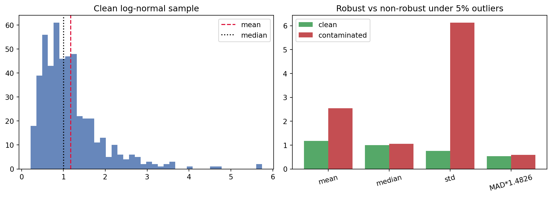
36.4.4 4.4 Worked Example: Robust and Non-Robust Estimators Under Contamination
The following example draws a right-skewed log-normal sample, injects a small fraction of gross outliers, and compares how classical and robust summaries respond. It also confirms Bessel’s correction empirically by averaging the two variance estimators over many small samples, and contrasts Pearson with Spearman correlation under a nonlinear but monotone relationship. The same computation is shown in three languages, with the Python version fully executable.
Under contamination the mean and standard deviation move sharply while the median and the scaled MAD barely budge, a direct visualization of the breakdown point. The empirical averages confirm that the \(1/n\) divisor underestimates the variance and the \(1/(n-1)\) divisor recovers it. Spearman exceeds Pearson because the underlying link is monotone but curved.
usingStatistics, StatsBase, RandomRandom.seed!(42)clean =exp.(0.6.*randn(500)) # log-normal samplecontaminated =copy(clean)idx =randperm(length(clean))[1:25] # 5% gross outlierscontaminated[idx] .=20.+20.*rand(25)functionsummarize(x) med =median(x) mad =median(abs.(x .- med)) (mean =mean(x), median = med, std =std(x), mad_scaled =1.4826* mad, skew =skewness(x), exkurt =kurtosis(x))endsc, sct =summarize(clean), summarize(contaminated)for k in (:mean, :median, :std, :mad_scaled, :skew, :exkurt)println(rpad(k, 12), round(getfield(sc, k), digits=4), " ",round(getfield(sct, k), digits=4))end# Pearson vs Spearman under a monotone nonlinear linkx =3.*rand(300)y =exp.(x) .+randn(300)println("Pearson r = ", round(cor(x, y), digits=4))println("Spearman r = ", round(corspearman(x, y), digits=4))
Most of the preceding statistics summarize one variable at a time. Correlation summarizes the relationship between two, and in machine learning it informs feature selection, multicollinearity diagnostics, and our understanding of leakage and redundancy.
36.5.1 5.1 Covariance and Pearson Correlation
The covariance between two variables measures how they vary together:
Its sign indicates the direction of the linear relationship, but its magnitude depends on the units of \(X\) and \(Y\), making raw covariances hard to compare. The Pearson correlation coefficient removes the scale by normalizing:
The result lies in \([-1, 1]\), with \(\pm 1\) indicating a perfect linear relationship and \(0\) indicating no linear association. To see the mechanics, take the paired values \((1,2), (2,4), (3,5), (4,4), (5,5)\). The means are \(\bar{x} = 3\) and \(\bar{y} = 4\). The centered products sum to \((-2)(-2) + (-1)(0) + (0)(1) + (1)(0) + (2)(1) = 6\), while \(\sum_i (x_i - \bar{x})^2 = 10\) and \(\sum_i (y_i - \bar{y})^2 = 6\). The correlation is then \(r = 6 / \sqrt{10 \cdot 6} = 6 / \sqrt{60} \approx 0.775\), a strong but imperfect positive association. Pearson correlation captures only linear structure, so a strong nonlinear dependence, such as \(Y = X^2\) over a symmetric range of \(X\), can produce a correlation near zero despite perfect determinism. The familiar caution that correlation does not imply causation applies with full force, and a third caution is equally important: a near-zero correlation does not imply independence.
36.5.2 5.2 Rank Correlation
When the relationship is monotone but not linear, or when the data contains outliers, rank correlations are more informative. Spearman’s \(\rho\) is simply the Pearson correlation computed on the ranks of the data rather than the raw values, which makes it invariant to any monotone transformation and resistant to outliers. Kendall’s \(\tau\) measures the difference between the number of concordant and discordant pairs,
and is often preferred for small samples or heavily tied data because of its direct interpretation as a probability of agreement in ordering.
36.5.3 5.3 Correlation Matrices in Feature Analysis
For a feature matrix, the pairwise correlations form a symmetric correlation matrix, and visualizing it as a heatmap is a standard early step in exploratory analysis. Blocks of highly correlated features reveal redundancy and multicollinearity, which inflate the variance of linear model coefficients and make them unstable and hard to interpret. Spotting a feature almost perfectly correlated with the target is a classic way to catch data leakage, where information from the future or from the label has contaminated the inputs. Correlation analysis thus serves both as a feature-pruning tool and as a guardrail against a common and costly modeling mistake.
36.6 6. Summary Statistics and Visualization in Exploratory Data Analysis
Descriptive statistics reach their full value inside exploratory data analysis (EDA), the open-ended investigation that John Tukey championed as a counterweight to confirmatory testing. EDA uses summaries and graphics together to form hypotheses about the data before any model is fit.
36.6.1 6.1 The Necessity of Visualization
Summary statistics compress, and compression discards. Anscombe’s quartet is the canonical demonstration: four datasets with nearly identical means, variances, correlations, and regression lines, yet utterly different shapes when plotted, including a clean linear trend, a curve, and configurations dominated by a single outlier. The Datasaurus Dozen extends the lesson with a dozen datasets sharing summary statistics to two decimal places, one of which forms a dinosaur. The conclusion is unambiguous: numerical summaries must be paired with visualization, because distinct distributions can hide behind identical numbers.
36.6.2 6.2 A Toolkit of Plots
Different plots expose different structure. Histograms and kernel density estimates reveal modality, skew, and gaps in a single variable. Boxplots compactly show the five-number summary and flag outliers, and they are well suited to comparing a distribution across groups. Violin plots combine a boxplot’s summary with a density estimate, showing multimodality that a boxplot would conceal. Scatter plots expose joint structure, clusters, and nonlinearity between two variables, while a scatter plot matrix extends this to all pairs at once. Empirical cumulative distribution function plots avoid the binning choices of histograms and make quantile comparisons straightforward. For high-dimensional data, projections such as principal component scatter plots provide a low-dimensional window onto global structure.
36.6.3 6.3 EDA as a Machine Learning Workflow
In a machine learning pipeline, descriptive statistics and visualization do concrete work. They diagnose missingness, by tabulating null counts and their patterns. They expose class imbalance, through frequency tables of the target. They reveal skew and heavy tails that motivate transforms, and they surface outliers that demand a decision about removal, clipping, or robust modeling. They detect distribution shift, by comparing summaries between training and serving data or across time. And they catch leakage, through suspiciously strong correlations or impossibly clean separations. A grouped summary, computing the mean of the target within each category of a feature, is often the single most informative early look at predictive signal.
The discipline these tools instill is a healthy skepticism. A model trained on data that was never described is a model whose failures will be discovered in production rather than in analysis. By computing central tendency, dispersion, moments, quantiles, and correlations, and by plotting what those numbers cannot show, the practitioner builds the understanding that every subsequent modeling decision depends upon. Descriptive statistics are not the part of the work to rush through on the way to the algorithm. They are where the algorithm’s eventual success or failure is quietly determined.
36.7 References
Wasserman, L. (2004). All of Statistics: A Concise Course in Statistical Inference. Springer. https://doi.org/10.1007/978-0-387-21736-9
Huber, P. J., and Ronchetti, E. M. (2009). Robust Statistics, 2nd ed. Wiley. https://doi.org/10.1002/9780470434697
Anscombe, F. J. (1973). Graphs in Statistical Analysis. The American Statistician, 27(1), 17 to 21. https://doi.org/10.1080/00031305.1973.10478966
Matejka, J., and Fitzmaurice, G. (2017). Same Stats, Different Graphs: Generating Datasets with Varied Appearance and Identical Statistics through Simulated Annealing. CHI Conference on Human Factors in Computing Systems, 1290 to 1294. https://doi.org/10.1145/3025453.3025912
Rousseeuw, P. J., and Croux, C. (1993). Alternatives to the Median Absolute Deviation. Journal of the American Statistical Association, 88(424), 1273 to 1283. https://doi.org/10.1080/01621459.1993.10476408
Koenker, R., and Hallock, K. F. (2001). Quantile Regression. Journal of Economic Perspectives, 15(4), 143 to 156. https://doi.org/10.1257/jep.15.4.143
Hyndman, R. J., and Fan, Y. (1996). Sample Quantiles in Statistical Packages. The American Statistician, 50(4), 361 to 365. https://doi.org/10.1080/00031305.1996.10473566
Joanes, D. N., and Gill, C. A. (1998). Comparing Measures of Sample Skewness and Kurtosis. Journal of the Royal Statistical Society: Series D, 47(1), 183 to 189. https://doi.org/10.1111/1467-9884.00122
Source Code
# Descriptive StatisticsDescriptive statistics are the vocabulary with which we first speak to a dataset. Before any model is trained, before any loss function is minimized, a practitioner confronts raw numbers and asks a simple question: what does this data look like? The answer arrives through a small but powerful collection of summaries that compress thousands or millions of observations into a handful of interpretable quantities. These summaries are not merely a prelude to machine learning. They shape feature engineering, expose data quality problems, motivate preprocessing choices, and provide the sanity checks that catch errors before they propagate into production systems. This chapter develops descriptive statistics from first principles, with an eye toward the decisions a machine learning engineer actually faces.## 1. Measures of Central TendencyA measure of central tendency answers the question of where the bulk of the data sits. It is a single number meant to represent a typical value. The three classical measures, the mean, the median, and the mode, each formalize "typical" in a different way, and the differences between them carry real information.### 1.1 The Arithmetic MeanGiven observations $x_1, x_2, \ldots, x_n$, the arithmetic mean is$$\bar{x} = \frac{1}{n} \sum_{i=1}^{n} x_i.$$The mean is the unique value $c$ that minimizes the sum of squared deviations $\sum_i (x_i - c)^2$, a fact that ties it directly to least squares regression and to the Gaussian likelihood. Writing $J(c) = \sum_i (x_i - c)^2$, differentiating gives $J'(c) = -2 \sum_i (x_i - c)$, and setting this to zero yields $\sum_i x_i = n c$, so $c = \bar{x}$. The second derivative $J''(c) = 2n > 0$ confirms a minimum. This optimization view explains why the mean appears everywhere a quadratic loss is used.For random variables, the population analogue is the expectation $\mu = \mathbb{E}[X]$, and the sample mean is an unbiased estimator of it, meaning $\mathbb{E}[\bar{x}] = \mu$. By the law of large numbers, $\bar{x}$ converges to $\mu$ as $n$ grows, which is the formal justification for trusting averages computed over large datasets.The mean's chief weakness is its sensitivity to outliers. A single extreme value can shift it arbitrarily far, because every observation contributes with equal weight $1/n$ regardless of how anomalous it is. In a feature column polluted by sensor errors or data entry mistakes, the mean can be a misleading summary.### 1.2 The Weighted and Geometric MeansWhen observations carry different importance, the weighted mean generalizes the arithmetic mean:$$\bar{x}_w = \frac{\sum_{i=1}^{n} w_i x_i}{\sum_{i=1}^{n} w_i}.$$Weighted means appear constantly in machine learning, from importance-weighted loss functions that correct for class imbalance to the exponentially weighted moving averages used by optimizers such as Adam.For quantities that combine multiplicatively, such as growth rates or likelihood ratios, the geometric mean is appropriate:$$\bar{x}_g = \left( \prod_{i=1}^{n} x_i \right)^{1/n} = \exp\!\left( \frac{1}{n} \sum_{i=1}^{n} \ln x_i \right).$$The geometric mean equals the exponential of the arithmetic mean of the logarithms, which is why log transforms often make skewed, multiplicatively scaled features behave more symmetrically.### 1.3 The Median and the ModeThe median is the middle value of the sorted data. For odd $n$ it is the observation at rank $(n+1)/2$, and for even $n$ it is the average of the two central observations. The median minimizes the sum of absolute deviations $\sum_i |x_i - c|$, which connects it to the $L_1$ loss and to robust regression. Because reordering or extremizing the tails of the data does not move the middle, the median is insensitive to outliers. Up to nearly half the data can be corrupted before the median is forced outside the range of the original clean values.The mode is the most frequently occurring value. For continuous data it is usually defined as the location of the peak of an estimated density. The mode is the natural summary for categorical variables, where mean and median have no meaning, and it is the only one of the three measures that need not be unique.The relationship among the three reveals distributional shape. For a symmetric unimodal distribution, mean, median, and mode coincide. When the distribution is right skewed, the mean is pulled toward the long right tail and typically exceeds the median, which in turn exceeds the mode. This ordering gives a quick diagnostic: a large gap between mean and median signals skew or outliers worth investigating before modeling.## 2. Measures of DispersionCentral tendency alone is dangerously incomplete. Two features can share an identical mean while one is tightly concentrated and the other is wildly spread out. Measures of dispersion quantify this spread, and in machine learning they govern everything from feature scaling to uncertainty estimation.### 2.1 Variance and Standard DeviationThe population variance is the expected squared deviation from the mean, $\sigma^2 = \mathbb{E}[(X - \mu)^2]$. Its sample estimator comes in two forms:$$s^2 = \frac{1}{n-1} \sum_{i=1}^{n} (x_i - \bar{x})^2, \qquad \hat{\sigma}^2 = \frac{1}{n} \sum_{i=1}^{n} (x_i - \bar{x})^2.$$The first uses the divisor $n-1$ and is the unbiased estimator of $\sigma^2$. The correction, known as Bessel's correction, accounts for the fact that the deviations are taken from the sample mean rather than the true mean, which costs one degree of freedom. The second form, dividing by $n$, is the maximum likelihood estimator under a Gaussian model and is biased downward. For large $n$ the distinction is numerically tiny, but it explains the difference between the default behavior of NumPy, which uses $n$, and most statistics textbooks, which use $n-1$.The bias can be derived directly. Start from the sum of squared deviations and add and subtract the true mean $\mu$:$$\sum_{i=1}^{n} (x_i - \bar{x})^2 = \sum_{i=1}^{n} \big[(x_i - \mu) - (\bar{x} - \mu)\big]^2 = \sum_{i=1}^{n} (x_i - \mu)^2 - n(\bar{x} - \mu)^2,$$where the cross term collapses because $\sum_i (x_i - \mu) = n(\bar{x} - \mu)$. Taking expectations and using $\mathbb{E}[(x_i - \mu)^2] = \sigma^2$ together with $\mathbb{E}[(\bar{x} - \mu)^2] = \operatorname{Var}(\bar{x}) = \sigma^2 / n$ gives$$\mathbb{E}\!\left[ \sum_{i=1}^{n} (x_i - \bar{x})^2 \right] = n \sigma^2 - n \cdot \frac{\sigma^2}{n} = (n-1)\,\sigma^2.$$Dividing by $n$ therefore underestimates $\sigma^2$ by the factor $(n-1)/n$, while dividing by $n-1$ restores unbiasedness, so $\mathbb{E}[s^2] = \sigma^2$. The intuition is that the sample mean is itself fit to the data, so the residuals $x_i - \bar{x}$ are on average smaller than the deviations $x_i - \mu$ from the unknown truth, and the lost degree of freedom is exactly the price of estimating $\mu$.As a worked example, take the five values $2, 4, 4, 4, 6$. The mean is $\bar{x} = 20 / 5 = 4$, the squared deviations are $4, 0, 0, 0, 4$ summing to $8$, so the maximum likelihood estimate is $8 / 5 = 1.6$ and the unbiased estimate is $8 / 4 = 2.0$. The standard deviation reported by most software is therefore $\sqrt{2.0} \approx 1.414$.The standard deviation $s = \sqrt{s^2}$ returns the spread to the original units of the data, making it directly interpretable. Standardization, the transformation $z_i = (x_i - \bar{x}) / s$, rescales a feature to zero mean and unit standard deviation and is one of the most common preprocessing steps in machine learning. It puts heterogeneous features on a comparable scale so that distance-based methods and gradient-based optimizers behave well.### 2.2 Range, Interquartile Range, and the MADSimpler measures of spread are sometimes more useful. The range, $x_{(n)} - x_{(1)}$, is the difference between the largest and smallest observations. It is trivially computed but maximally fragile, since it depends entirely on the two most extreme points.The interquartile range (IQR) is the distance between the first and third quartiles, $\text{IQR} = Q_3 - Q_1$, and captures the spread of the central half of the data. Because it discards the tails, it is robust to outliers and forms the basis of the standard boxplot whisker rule, which flags points beyond $Q_1 - 1.5\,\text{IQR}$ or $Q_3 + 1.5\,\text{IQR}$ as potential outliers.The median absolute deviation (MAD) is a robust analogue of the standard deviation:$$\text{MAD} = \operatorname{median}_i \left( |x_i - \operatorname{median}_j(x_j)| \right).$$To make the MAD comparable to the standard deviation under normality, it is scaled by a constant, $\hat{\sigma} = 1.4826 \cdot \text{MAD}$, where the constant is the reciprocal of the 0.75 quantile of the standard normal. The MAD tolerates up to half the data being corrupted, making it a workhorse for robust outlier detection.### 2.3 The Coefficient of VariationWhen comparing dispersion across features measured on different scales, absolute spread can mislead. The coefficient of variation normalizes the standard deviation by the mean,$$\text{CV} = \frac{s}{\bar{x}},$$yielding a dimensionless quantity. It is meaningful only for ratio-scale data with a positive mean, but where applicable it answers whether a feature is relatively noisy or relatively stable, independent of its units.## 3. Moments: Skewness and KurtosisMean and variance are the first two moments of a distribution. Higher moments describe the shape of the distribution beyond its location and spread, capturing asymmetry and tail behavior that strongly affect model performance.### 3.1 Central MomentsThe $k$-th central moment is $\mu_k = \mathbb{E}[(X - \mu)^k]$. The first central moment is zero by construction, and the second is the variance. The third and fourth standardized central moments give skewness and kurtosis. Standardizing by powers of the standard deviation makes these quantities scale invariant, so they describe shape independent of units.### 3.2 SkewnessSkewness measures asymmetry:$$\gamma_1 = \mathbb{E}\!\left[ \left( \frac{X - \mu}{\sigma} \right)^{3} \right] = \frac{\mu_3}{\sigma^3}.$$A symmetric distribution has zero skewness. Positive skewness indicates a long right tail, the situation typical of income, file sizes, response times, and many counts, where most values are modest but a few are very large. Negative skewness indicates a long left tail. Heavily skewed features often benefit from a log or Box-Cox transform, which compresses the long tail and tends to stabilize variance, helping models that implicitly assume roughly symmetric or homoscedastic inputs.The sample skewness is computed by replacing expectations with averages,$$g_1 = \frac{\frac{1}{n} \sum_{i=1}^{n} (x_i - \bar{x})^3}{\left( \frac{1}{n} \sum_{i=1}^{n} (x_i - \bar{x})^2 \right)^{3/2}},$$and software typically applies a small-sample correction factor to reduce its bias.### 3.3 KurtosisKurtosis measures the heaviness of the tails relative to a normal distribution:$$\gamma_2 = \mathbb{E}\!\left[ \left( \frac{X - \mu}{\sigma} \right)^{4} \right] = \frac{\mu_4}{\sigma^4}.$$The normal distribution has kurtosis exactly $3$. It is common to report excess kurtosis, $\gamma_2 - 3$, so that the Gaussian baseline sits at zero. Positive excess kurtosis (leptokurtic) signals heavy tails and a sharper peak, meaning extreme values occur more often than a Gaussian would predict. Negative excess kurtosis (platykurtic) signals light tails. High kurtosis is a warning sign for any method that assumes Gaussian noise or relies on the mean and variance as sufficient summaries, because rare extreme events will dominate squared-error losses and destabilize training. Recognizing leptokurtic features early motivates robust losses, gradient clipping, or careful outlier handling.## 4. Quantiles and Robust StatisticsThe summaries above mostly reduce a distribution to one or two numbers. Quantiles instead trace its full shape, and they underpin the robust statistics that resist contamination.### 4.1 Quantiles, Percentiles, and the Five-Number SummaryThe $q$-th quantile is the value $x_q$ below which a fraction $q$ of the data falls, defined through the cumulative distribution function as $x_q = \inf \{ x : F(x) \geq q \}$. Percentiles are quantiles expressed on a 0 to 100 scale. The median is the 0.5 quantile, and the quartiles $Q_1, Q_2, Q_3$ are the 0.25, 0.5, and 0.75 quantiles.Because the empirical distribution is discrete, computing a sample quantile requires interpolating between order statistics, and there are several conventions for doing so. This is why different libraries can return slightly different percentile values for the same data; the discrepancy is a choice of interpolation rule, not a bug.The five-number summary, consisting of the minimum, $Q_1$, median, $Q_3$, and maximum, compactly conveys both location and spread and is the data behind the boxplot. Tukey introduced this summary precisely to give analysts a fast, resistant picture of a distribution's shape.### 4.2 What Makes a Statistic RobustA statistic is robust if it is insensitive to a modest fraction of arbitrary contamination. The breakdown point formalizes this: it is the largest fraction of observations that can be replaced by arbitrary values before the statistic can be driven to an arbitrary result. The mean has a breakdown point of $0$, since a single point sent to infinity drags it along. The median has a breakdown point of $0.5$, the highest possible, since the middle value stays put until half the data is corrupted.Robust estimators matter in machine learning because real data is contaminated. Mislabeled rows, broken sensors, scraping artifacts, and adversarial inputs all inject the kind of outliers that wreck non-robust summaries. Trimmed means, which discard a fraction $\alpha$ of observations from each tail before averaging, and Winsorized means, which clip extreme values to a percentile rather than removing them, offer tunable compromises between the efficiency of the mean and the resistance of the median.### 4.3 Quantiles in Modern PracticeQuantiles are not just diagnostics. Quantile regression models conditional quantiles of a target rather than its conditional mean, providing prediction intervals and capturing heteroscedasticity that mean regression hides. Gradient boosting libraries support a pinball loss for exactly this purpose. Quantile-based binning discretizes continuous features into equal-frequency buckets, a transformation that is robust to outliers and monotone, which suits tree models and many calibration procedures. Even normalization has a robust variant, scaling features by the IQR and centering on the median rather than using mean and standard deviation, so that a few extreme values do not dominate the scaling.### 4.4 Worked Example: Robust and Non-Robust Estimators Under ContaminationThe following example draws a right-skewed log-normal sample, injects a small fraction of gross outliers, and compares how classical and robust summaries respond. It also confirms Bessel's correction empirically by averaging the two variance estimators over many small samples, and contrasts Pearson with Spearman correlation under a nonlinear but monotone relationship. The same computation is shown in three languages, with the Python version fully executable.::: {.panel-tabset}## Python```{python}import numpy as npfrom scipy import statsimport matplotlib.pyplot as pltrng = np.random.default_rng(42)# Clean right-skewed sample, then inject 5% gross outliersclean = rng.lognormal(mean=0.0, sigma=0.6, size=500)contaminated = clean.copy()n_out =int(0.05* clean.size)idx = rng.choice(clean.size, size=n_out, replace=False)contaminated[idx] = rng.uniform(20, 40, size=n_out)def summarize(x): med = np.median(x) mad = np.median(np.abs(x - med))return {"mean": np.mean(x),"median": med,"std": np.std(x, ddof=1),"mad_scaled": 1.4826* mad,"skew": stats.skew(x, bias=False),"exkurt": stats.kurtosis(x, fisher=True, bias=False), }s_clean, s_cont = summarize(clean), summarize(contaminated)print("estimator clean contaminated")for k in ["mean", "median", "std", "mad_scaled", "skew", "exkurt"]:print(f"{k:12s}{s_clean[k]:10.4f}{s_cont[k]:12.4f}")# Bessel's correction: average each variance estimator over many small samplesbiased, unbiased = [], []for _ inrange(3000): s = rng.lognormal(0.0, 0.6, size=8) d = s - s.mean() biased.append(np.sum(d **2) /8) unbiased.append(np.sum(d **2) /7)true_var = (np.exp(0.6**2) -1) * np.exp(0.6**2)print(f"\ntrue variance {true_var:.4f}")print(f"E[1/n divisor] {np.mean(biased):.4f} (biased low)")print(f"E[1/(n-1) divisor] {np.mean(unbiased):.4f} (unbiased)")# Pearson vs Spearman under a nonlinear monotone linkx = rng.uniform(0, 3, 300)y = np.exp(x) + rng.normal(0, 1, 300)print(f"\nPearson r = {stats.pearsonr(x, y)[0]:.4f}")print(f"Spearman r = {stats.spearmanr(x, y)[0]:.4f}")fig, ax = plt.subplots(1, 2, figsize=(11, 4))ax[0].hist(clean, bins=40, color="#4c72b0", alpha=0.85)ax[0].axvline(s_clean["mean"], color="crimson", ls="--", label="mean")ax[0].axvline(s_clean["median"], color="black", ls=":", label="median")ax[0].set_title("Clean log-normal sample")ax[0].legend()labels = ["mean", "median", "std", "MAD*1.4826"]cln = [s_clean[k] for k in ["mean", "median", "std", "mad_scaled"]]con = [s_cont[k] for k in ["mean", "median", "std", "mad_scaled"]]xp = np.arange(len(labels))ax[1].bar(xp -0.2, cln, 0.4, label="clean", color="#55a868")ax[1].bar(xp +0.2, con, 0.4, label="contaminated", color="#c44e52")ax[1].set_xticks(xp)ax[1].set_xticklabels(labels, rotation=15)ax[1].set_title("Robust vs non-robust under 5% outliers")ax[1].legend()fig.tight_layout()plt.show()```Under contamination the mean and standard deviation move sharply while the median and the scaled MAD barely budge, a direct visualization of the breakdown point. The empirical averages confirm that the $1/n$ divisor underestimates the variance and the $1/(n-1)$ divisor recovers it. Spearman exceeds Pearson because the underlying link is monotone but curved.## Julia```juliausingStatistics, StatsBase, RandomRandom.seed!(42)clean =exp.(0.6.*randn(500)) # log-normal samplecontaminated =copy(clean)idx =randperm(length(clean))[1:25] # 5% gross outlierscontaminated[idx] .=20.+20.*rand(25)functionsummarize(x) med =median(x) mad =median(abs.(x .- med)) (mean =mean(x), median = med, std =std(x), mad_scaled =1.4826* mad, skew =skewness(x), exkurt =kurtosis(x))endsc, sct =summarize(clean), summarize(contaminated)for k in (:mean, :median, :std, :mad_scaled, :skew, :exkurt)println(rpad(k, 12), round(getfield(sc, k), digits=4), " ",round(getfield(sct, k), digits=4))end# Pearson vs Spearman under a monotone nonlinear linkx =3.*rand(300)y =exp.(x) .+randn(300)println("Pearson r = ", round(cor(x, y), digits=4))println("Spearman r = ", round(corspearman(x, y), digits=4))```## Rust```rust// Cargo.toml: rand ="0.8"use rand::prelude::*;use rand_distr::{LogNormal, Uniform};fn median(v:&mut [f64]) -> f64 {v.sort_by(|a, b|a.partial_cmp(b).unwrap()); let n =v.len();if n % 2==1 { v[n /2] } else { (v[n /2-1] + v[n /2]) /2.0 }}fn main() { let mut rng = StdRng::seed_from_u64(42); let ln = LogNormal::new(0.0, 0.6).unwrap(); let clean: Vec<f64>= (0..500).map(|_|ln.sample(&mut rng)).collect(); let mut contaminated =clean.clone(); let unif = Uniform::new(20.0, 40.0);for i in0..25 { contaminated[i] =unif.sample(&mut rng); } let mean =|x:&[f64]|x.iter().sum::<f64>() /x.len() as f64; let std =|x:&[f64], m: f64| { (x.iter().map(|v| (v - m).powi(2)).sum::<f64>() / (x.len() as f64 -1.0)).sqrt() }; let mut c =clean.clone(); let med =median(&mut c); let mut dev: Vec<f64>=clean.iter().map(|v| (v - med).abs()).collect(); let mad =1.4826*median(&mut dev); println!("mean {:.4}", mean(&clean)); println!("median {:.4}", med); println!("std {:.4}", std(&clean, mean(&clean))); println!("mad {:.4}", mad);}```:::## 5. CorrelationMost of the preceding statistics summarize one variable at a time. Correlation summarizes the relationship between two, and in machine learning it informs feature selection, multicollinearity diagnostics, and our understanding of leakage and redundancy.### 5.1 Covariance and Pearson CorrelationThe covariance between two variables measures how they vary together:$$\operatorname{cov}(X, Y) = \mathbb{E}\big[ (X - \mu_X)(Y - \mu_Y) \big].$$Its sign indicates the direction of the linear relationship, but its magnitude depends on the units of $X$ and $Y$, making raw covariances hard to compare. The Pearson correlation coefficient removes the scale by normalizing:$$\rho_{X,Y} = \frac{\operatorname{cov}(X, Y)}{\sigma_X \, \sigma_Y}, \qquad r = \frac{\sum_{i}(x_i - \bar{x})(y_i - \bar{y})}{\sqrt{\sum_{i}(x_i - \bar{x})^2}\sqrt{\sum_{i}(y_i - \bar{y})^2}}.$$The result lies in $[-1, 1]$, with $\pm 1$ indicating a perfect linear relationship and $0$ indicating no linear association. To see the mechanics, take the paired values $(1,2), (2,4), (3,5), (4,4), (5,5)$. The means are $\bar{x} = 3$ and $\bar{y} = 4$. The centered products sum to $(-2)(-2) + (-1)(0) + (0)(1) + (1)(0) + (2)(1) = 6$, while $\sum_i (x_i - \bar{x})^2 = 10$ and $\sum_i (y_i - \bar{y})^2 = 6$. The correlation is then $r = 6 / \sqrt{10 \cdot 6} = 6 / \sqrt{60} \approx 0.775$, a strong but imperfect positive association. Pearson correlation captures only linear structure, so a strong nonlinear dependence, such as $Y = X^2$ over a symmetric range of $X$, can produce a correlation near zero despite perfect determinism. The familiar caution that correlation does not imply causation applies with full force, and a third caution is equally important: a near-zero correlation does not imply independence.### 5.2 Rank CorrelationWhen the relationship is monotone but not linear, or when the data contains outliers, rank correlations are more informative. Spearman's $\rho$ is simply the Pearson correlation computed on the ranks of the data rather than the raw values, which makes it invariant to any monotone transformation and resistant to outliers. Kendall's $\tau$ measures the difference between the number of concordant and discordant pairs,$$\tau = \frac{(\text{concordant pairs}) - (\text{discordant pairs})}{\binom{n}{2}},$$and is often preferred for small samples or heavily tied data because of its direct interpretation as a probability of agreement in ordering.### 5.3 Correlation Matrices in Feature AnalysisFor a feature matrix, the pairwise correlations form a symmetric correlation matrix, and visualizing it as a heatmap is a standard early step in exploratory analysis. Blocks of highly correlated features reveal redundancy and multicollinearity, which inflate the variance of linear model coefficients and make them unstable and hard to interpret. Spotting a feature almost perfectly correlated with the target is a classic way to catch data leakage, where information from the future or from the label has contaminated the inputs. Correlation analysis thus serves both as a feature-pruning tool and as a guardrail against a common and costly modeling mistake.## 6. Summary Statistics and Visualization in Exploratory Data AnalysisDescriptive statistics reach their full value inside exploratory data analysis (EDA), the open-ended investigation that John Tukey championed as a counterweight to confirmatory testing. EDA uses summaries and graphics together to form hypotheses about the data before any model is fit.### 6.1 The Necessity of VisualizationSummary statistics compress, and compression discards. Anscombe's quartet is the canonical demonstration: four datasets with nearly identical means, variances, correlations, and regression lines, yet utterly different shapes when plotted, including a clean linear trend, a curve, and configurations dominated by a single outlier. The Datasaurus Dozen extends the lesson with a dozen datasets sharing summary statistics to two decimal places, one of which forms a dinosaur. The conclusion is unambiguous: numerical summaries must be paired with visualization, because distinct distributions can hide behind identical numbers.### 6.2 A Toolkit of PlotsDifferent plots expose different structure. Histograms and kernel density estimates reveal modality, skew, and gaps in a single variable. Boxplots compactly show the five-number summary and flag outliers, and they are well suited to comparing a distribution across groups. Violin plots combine a boxplot's summary with a density estimate, showing multimodality that a boxplot would conceal. Scatter plots expose joint structure, clusters, and nonlinearity between two variables, while a scatter plot matrix extends this to all pairs at once. Empirical cumulative distribution function plots avoid the binning choices of histograms and make quantile comparisons straightforward. For high-dimensional data, projections such as principal component scatter plots provide a low-dimensional window onto global structure.### 6.3 EDA as a Machine Learning WorkflowIn a machine learning pipeline, descriptive statistics and visualization do concrete work. They diagnose missingness, by tabulating null counts and their patterns. They expose class imbalance, through frequency tables of the target. They reveal skew and heavy tails that motivate transforms, and they surface outliers that demand a decision about removal, clipping, or robust modeling. They detect distribution shift, by comparing summaries between training and serving data or across time. And they catch leakage, through suspiciously strong correlations or impossibly clean separations. A grouped summary, computing the mean of the target within each category of a feature, is often the single most informative early look at predictive signal.The discipline these tools instill is a healthy skepticism. A model trained on data that was never described is a model whose failures will be discovered in production rather than in analysis. By computing central tendency, dispersion, moments, quantiles, and correlations, and by plotting what those numbers cannot show, the practitioner builds the understanding that every subsequent modeling decision depends upon. Descriptive statistics are not the part of the work to rush through on the way to the algorithm. They are where the algorithm's eventual success or failure is quietly determined.## References1. Wasserman, L. (2004). *All of Statistics: A Concise Course in Statistical Inference*. Springer. https://doi.org/10.1007/978-0-387-21736-92. Huber, P. J., and Ronchetti, E. M. (2009). *Robust Statistics*, 2nd ed. Wiley. https://doi.org/10.1002/97804704346973. Anscombe, F. J. (1973). Graphs in Statistical Analysis. *The American Statistician*, 27(1), 17 to 21. https://doi.org/10.1080/00031305.1973.104789664. Matejka, J., and Fitzmaurice, G. (2017). Same Stats, Different Graphs: Generating Datasets with Varied Appearance and Identical Statistics through Simulated Annealing. *CHI Conference on Human Factors in Computing Systems*, 1290 to 1294. https://doi.org/10.1145/3025453.30259125. Rousseeuw, P. J., and Croux, C. (1993). Alternatives to the Median Absolute Deviation. *Journal of the American Statistical Association*, 88(424), 1273 to 1283. https://doi.org/10.1080/01621459.1993.104764086. Koenker, R., and Hallock, K. F. (2001). Quantile Regression. *Journal of Economic Perspectives*, 15(4), 143 to 156. https://doi.org/10.1257/jep.15.4.1437. Hyndman, R. J., and Fan, Y. (1996). Sample Quantiles in Statistical Packages. *The American Statistician*, 50(4), 361 to 365. https://doi.org/10.1080/00031305.1996.104735668. Joanes, D. N., and Gill, C. A. (1998). Comparing Measures of Sample Skewness and Kurtosis. *Journal of the Royal Statistical Society: Series D*, 47(1), 183 to 189. https://doi.org/10.1111/1467-9884.00122