---
execute:
echo: true
eval: true
warning: false
---
# Performance Metrics and Model Evaluation {#sec-ch04}
::: {.callout-note appearance="simple" icon="false"}
**Scope: both retail and corporate.** Discrimination (AUC, KS), calibration (Brier, reliability), and profit metrics. Worked examples on Taiwan default; the metrics themselves are portfolio-agnostic.
:::
## Overview {.unnumbered}
A credit score is useful only to the extent that it ranks, calibrates, and pays. Ranking is about discrimination between defaulters and non-defaulters. Calibration is about the scores matching observed default rates. Paying is about the dollars a portfolio gains or loses at a chosen cut-off. This chapter treats each of these three questions formally, derives the standard metrics from first principles, implements them from scratch, and compares the from-scratch code against the production libraries that will be used everywhere else in the book.
The chapter is unusually long because the field has accumulated a large collection of conflicting conventions. AUC (@sec-ch04-auc) is the default academic yardstick but is incoherent as a cost measure [@hand2009measuring]. KS (@sec-ch04-ks) is the default regulatory yardstick and is arguably worse for ordering classifiers. Brier (@sec-ch04-brier) is proper but ignores ranking. Profit curves (@sec-ch04-profit) require cost assumptions that most teams never write down. H-measure (@sec-ch04-hmeasure) fixes the coherence problem, but almost nobody uses it. EMP (@sec-ch04-emp) is the right objective for many credit portfolios, but is missing from `sklearn`. A practitioner must know when each one matters.
A chapter on metrics is also implicitly a chapter on validation design. Every point estimate of AUC, KS, Brier, PSI, or profit is an estimate from a finite sample, which means every number comes with a standard error that a careful practitioner reports and defends. Two teams disagreeing about which of their models is better is almost always a disagreement about variance, not about the point estimate. Most of the interesting arguments in credit-scoring benchmark papers [@baesens2003benchmarking; @lessmann2015benchmarking] turn out to be about the right statistical test, not about the right algorithm. This chapter, therefore, spends as much time on the statistics of model comparison as on the metric formulas.
A word for the emerging-market reader. AUC, KS, Brier, and profit-based metrics transplant unchanged, but the operating context does not. In Vietnam and peer markets, thin bureau files mean smaller evaluation samples and wider confidence intervals on every point estimate; macro volatility means that out-of-time validation on a single recent quarter can be misleading; and cost-matrix parameters for profit curves have to be set against local funding cost, local LGD histories, and local collection rules rather than a US credit-card template. A metric dashboard calibrated on US benchmarks will report a healthy AUC at a Vietnamese bank while hiding a calibration drift that moves Circular 41/2016 capital by basis points. This chapter's statistics still apply; the defaults need adjustment.
The running datasets are the UCI German Credit file and the UCI Taiwan credit-card default file loaded through `creditutils`. Both come from `load_german_credit()` and `load_taiwan_default()`. For drift and walk-forward experiments we generate a time-stamped synthetic cohort because neither UCI file carries dates. For 10M-row scalability we synthesize Bernoulli labels and Gaussian scores and drive the computation through Dask `delayed` graphs. The point is not that 10 million rows are exotic for a credit portfolio, they are not, but that the same code must run correctly at that scale without rewriting.
### Notation {.unnumbered}
We write $Y \in \{0, 1\}$ for the default label, with $Y=1$ meaning default. $S$ is a real-valued score or a probability of default. The class-conditional cdfs are $F_0(t) = \Pr(S \le t \mid Y=0)$ and $F_1(t) = \Pr(S \le t \mid Y=1)$. Class priors are $\pi_1 = \Pr(Y=1)$ and $\pi_0 = 1-\pi_1$. A threshold $t$ defines a decision: predict positive if $S > t$. This gives a true positive rate $\mathrm{TPR}(t) = 1 - F_1(t)$ and a false positive rate $\mathrm{FPR}(t) = 1 - F_0(t)$.
## The three questions a credit model must answer {#sec-ch04-metrics}
Discrimination, calibration, and expected profit are mathematically distinct objects. A model can discriminate perfectly yet be badly miscalibrated. A model can be well calibrated yet still lose money at every threshold because the cost structure is asymmetric. The Hand and Henley review lays out the three-way taxonomy cleanly [@hand1997statistical]. Lessmann and colleagues update it and show that model rankings depend on which question you ask [@lessmann2015benchmarking].
- Discrimination answers: if I draw a random good and a random bad, what is the probability the score ranks them correctly? AUC, Gini, KS, and the H-measure all live here.
- Calibration answers: among borrowers with predicted probability $p$, is the observed default rate also $p$? Brier score, reliability diagrams, and isotonic or Platt rescaling live here.
- Expected profit answers: given the unit economics of my loan book, what threshold maximizes dollars? Profit curves, cost-sensitive learning, and EMP live here.
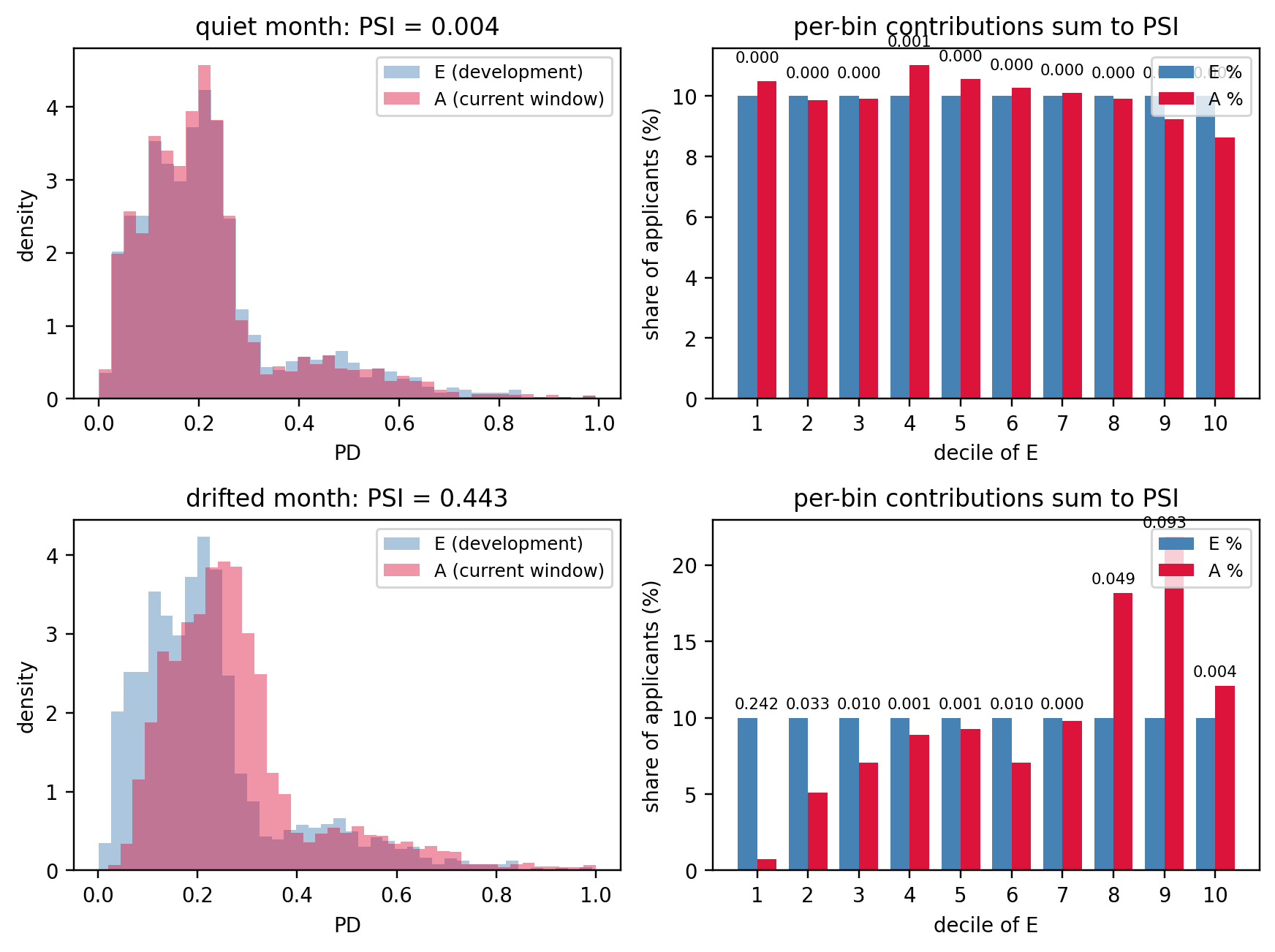
- Monitoring adds a fourth question, more operational than statistical: does the score distribution this month look like the distribution on which the model was trained? PSI and CSI answer that.
- Finally, the chapter closes on validation design and on statistical comparison of two or more classifiers.
The reason three distinct questions matter is most visible in a stress scenario. Consider a retail lender that keeps ranking performance (AUC, KS) flat quarter-on-quarter while the macro environment deteriorates, say in a mild recession. The portfolio default rate rises from 2 percent to 4 percent. If the scoring model was only validated on ranking, nothing flags. If it was validated on calibration, the reliability diagram crosses above the diagonal in every bucket, Brier spikes, and the lender responds by increasing loss allowances. If it was validated on profit, the profit curve at the current threshold is below zero and the lender tightens. Each of the three views gives a different and complementary signal. A governance regime that collapses them into a single number has no chance of detecting the recession fast enough.
```{python}
#| label: setup
import sys
sys.path.insert(0, '../code')

import numpy as np
import pandas as pd
import matplotlib.pyplot as plt
from scipy import stats
from scipy.stats import beta as beta_dist
from scipy.integrate import trapezoid
from sklearn.linear_model import LogisticRegression
from sklearn.ensemble import GradientBoostingClassifier
from sklearn.preprocessing import StandardScaler
from sklearn.model_selection import (
    train_test_split, KFold, StratifiedKFold, TimeSeriesSplit,
)
from sklearn.metrics import (
    roc_auc_score, brier_score_loss, roc_curve,
)
from sklearn.calibration import CalibratedClassifierCV, calibration_curve
from sklearn.isotonic import IsotonicRegression

from creditutils import (
    load_german_credit, load_taiwan_default,
    psi, train_valid_test_split, stable_sigmoid,
)

np.random.seed(42)
plt.rcParams.update({"figure.dpi": 110, "font.size": 9})
```
```{python}
#| label: baseline-taiwan
df = load_taiwan_default()
y = df["default"].astype(int).values
feat_cols = [c for c in df.columns if c not in ("default", "id")]
X = df[feat_cols].values.astype(float)
X = StandardScaler().fit_transform(X)

X_tr, X_te, y_tr, y_te = train_test_split(
    X, y, test_size=0.3, stratify=y, random_state=42
)

lr = LogisticRegression(max_iter=2000, C=1.0, solver="lbfgs").fit(X_tr, y_tr)
p_lr = lr.predict_proba(X_te)[:, 1]

gb = GradientBoostingClassifier(
    n_estimators=150, max_depth=3, learning_rate=0.1, random_state=42
).fit(X_tr, y_tr)
p_gb = gb.predict_proba(X_te)[:, 1]

print(f"n_train={len(y_tr):,}  n_test={len(y_te):,}  base rate={y_te.mean():.3f}")
print(f"logistic AUC = {roc_auc_score(y_te, p_lr):.4f}   "
      f"Brier = {brier_score_loss(y_te, p_lr):.4f}")
print(f"boosting AUC = {roc_auc_score(y_te, p_gb):.4f}   "
      f"Brier = {brier_score_loss(y_te, p_gb):.4f}")
```
The logistic baseline reaches an out-of-sample AUC near 0.72 on Taiwan. Gradient boosting lifts it roughly seven points, to around 0.78. That gap, which in relative terms is substantial, sets the scale for the rest of the chapter: metrics are not just ranking tools, they are the yardstick on which the return-on-effort of model improvements is measured. A 0.005 AUC difference between logistic and boosting is noise on a dataset of this size. A 0.05 difference is a genuine lift. The DeLong test in @sec-ch04-compare makes that distinction formal.
A further pedagogical reason for this dataset: the base rate of 22 percent is closer to a sub-prime or emerging-market book than to a prime retail portfolio, where the base rate is often under 2 percent. Many of the subtleties of metrics in credit scoring only become operationally relevant under class imbalance. A Taiwan-like base rate is near enough to balanced that the textbook formulas work, but far enough from 50-50 that the effect of imbalance on Brier, on KS, and on profit curves is visible. The German Credit file, with its base rate of 30 percent and just 1000 observations, is the pedagogical toy; Taiwan at 30000 observations is the realistic workhorse.
## AUC-ROC and Gini {#sec-ch04-auc}
### Definition and probabilistic reading
The ROC curve plots $\mathrm{TPR}(t)$ against $\mathrm{FPR}(t)$ as $t$ sweeps from $+\infty$ to $-\infty$. The area under the ROC curve is
$$
\mathrm{AUC} = \int_0^1 \mathrm{TPR}\bigl(\mathrm{FPR}^{-1}(u)\bigr) du.
$$ {#eq-auc-def}
A cleaner definition, due to @bamber1975area, rewrites AUC as a probability over pairs. Let $S_+$ be the score of a random positive (defaulter) and $S_-$ the score of a random negative (non-defaulter). Then
$$
\mathrm{AUC} = \Pr(S_+ > S_-) + \tfrac{1}{2}\Pr(S_+ = S_-).
$$ {#eq-auc-prob}
This is the classical reading for a credit score: given a random defaulter and a random non-defaulter, the AUC is the probability that the model ranks the defaulter above the non-defaulter. Because we want non-defaulters ranked higher in scoring practice, we often flip the convention. It changes nothing substantive: AUC is invariant under monotone transforms of the score.
The Gini coefficient is the standard credit-bureau restatement,
$$
\mathrm{Gini} = 2\cdot\mathrm{AUC} - 1,
$$ {#eq-gini}
which maps random to 0 and perfect to 1. Gini is widely reported in model development documents in European and Asian retail-credit shops, while AUC is preferred in academic machine learning and in US model risk documents. Both carry the same information.
### Deriving AUC from Mann-Whitney U
The connection between @eq-auc-prob and the Mann-Whitney U statistic [@mann1947test] is exact. Let $m = |\{i : y_i = 1\}|$ and $n = |\{i : y_i = 0\}|$. Let $R_+$ be the sum of ranks of the positive-class scores when all $m+n$ scores are ranked from smallest to largest. Mann-Whitney U is
$$
U = R_+ - \tfrac{m(m+1)}{2},
$$ {#eq-mannwhitney}
and the empirical AUC is
$$
\widehat{\mathrm{AUC}} = \frac{U}{m\cdot n}.
$$ {#eq-auc-mw}
Equation @eq-auc-mw has three practical consequences. First, AUC requires only ranks, so ties are handled by average ranking. Second, the computational cost is dominated by a sort, giving $O((m+n)\log(m+n))$. Third, the sampling variance of $\widehat{\mathrm{AUC}}$ can be derived from the variance of $U$, which is the trick DeLong uses for inference [@delong1988comparing].
### From-scratch implementation
```{python}
#| label: auc-from-scratch
def auc_mannwhitney(y_true, y_score):
    """AUC via Mann-Whitney U. Handles ties by average rank."""
    y_true = np.asarray(y_true).astype(int)
    y_score = np.asarray(y_score, dtype=float)
    pos = y_score[y_true == 1]
    neg = y_score[y_true == 0]
    m, n = len(pos), len(neg)
    if m == 0 or n == 0:
        return float("nan")
    all_scores = np.concatenate([pos, neg])
    # Average ranks handle ties correctly.
    ranks = stats.rankdata(all_scores, method="average")
    r_pos = ranks[:m].sum()
    u = r_pos - m * (m + 1) / 2.0
    return float(u / (m * n))


auc_scratch = auc_mannwhitney(y_te, p_lr)
auc_sklearn = roc_auc_score(y_te, p_lr)
print(f"AUC (Mann-Whitney)  = {auc_scratch:.8f}")
print(f"AUC (sklearn)        = {auc_sklearn:.8f}")
assert abs(auc_scratch - auc_sklearn) < 1e-9
```
The agreement is to eight decimal places, which is as close as 64-bit floats get on this sample size. The inequality $|\hat{A}_{\text{MW}} - \hat{A}_{\text{sk}}| < 10^{-9}$ is a cheap regression test we will reuse in later chapters.
### Interpretation and a warning
AUC has a third reading, often forgotten: it is also the probability that a randomly chosen observation is correctly classified when the threshold is itself drawn uniformly at random from the set of scores [@hand2013area]. Hand's argument against AUC as a scalar summary rests on this: the implicit weighting over thresholds depends on the classifier's score distribution, and therefore on the classifier itself. That weighting is not a user-chosen cost function. It is an artifact of the model. Two models compared by AUC are being compared under two different implicit cost distributions. The H-measure (@sec-ch04-hmeasure) in @hand2009measuring fixes this.
### Partial AUC
Before getting to the partial variant, it helps to restate what the ROC curve actually draws, because the rest of this section is a claim about *which part* of that curve matters for a credit decision. The notation was fixed at the start of the chapter, but the quick reminder is:
- **TPR** (true positive rate, also called *sensitivity* or *recall*) at threshold $t$ is the fraction of actual defaulters the model flags as risky, $\mathrm{TPR}(t) = \Pr(S > t \mid Y=1)$. Higher is better: it is the share of the bad book you caught.
- **FPR** (false positive rate, $1 - \text{specificity}$) at threshold $t$ is the fraction of actual non-defaulters the model wrongly flags as risky, $\mathrm{FPR}(t) = \Pr(S > t \mid Y=0)$. Lower is better: it is the share of the good book you turned away.
- The **ROC curve** (Receiver Operating Characteristic, a name inherited from WWII radar detection) is the parametric plot of $\mathrm{TPR}(t)$ on the $y$-axis against $\mathrm{FPR}(t)$ on the $x$-axis as the threshold $t$ sweeps from $+\infty$ (deny nobody, both rates at 0) to $-\infty$ (approve nobody, both rates at 1). A useful model bows up into the top-left corner: high TPR at low FPR. A coin-flip model tracks the diagonal. The full AUC in @eq-auc-def is the area under this whole curve.
The partial AUC is the same integral, restricted to a slice of that curve:
$$
\mathrm{pAUC}(a, b) = \int_a^b \mathrm{TPR}\bigl(\mathrm{FPR}^{-1}(u)\bigr) du,
$$ {#eq-pauc}
where $\mathrm{FPR}^{-1}(u)$ is the threshold that produces false-positive rate $u$, so the integrand is just "the TPR you get when the FPR is $u$". Integrating from $a$ to $b$ means averaging TPR over the FPR band $[a, b]$, ignoring the rest of the curve.
The motivation is that full AUC averages TPR over *every* possible FPR from 0 to 1, which is operationally absurd for a lender. Thresholds that produce FPR = 0.9 mean approving almost all defaulters and rejecting almost all good customers; no bank would ever deploy a model there, so performance in that region is economically irrelevant, yet full AUC counts it with equal weight. Partial AUC literally zeroes the contribution of thresholds the business will not use.
The usable region in credit scoring is always the low-FPR end: lenders reject few good customers, which means low FPR, and accept whatever TPR that buys them. A concrete example. Suppose a lender's current policy approves roughly the top 60 percent of applicants by score. On a book with a 3 percent default rate, those 40 percent of declined applicants are overwhelmingly good customers, so the operating FPR is near 0.4. Anything beyond FPR = 0.4 corresponds to cut-offs more aggressive than the bank would ever use. Reporting $\mathrm{pAUC}(0, 0.4)$ captures every cut-off the credit committee would actually consider, and nothing else.
This makes pAUC a cheap, practical approximation to the H-measure (@sec-ch04-hmeasure), which formalizes the same "only count thresholds you would actually pick" idea through a cost-distribution prior. pAUC replaces that prior with a hard window: weight 1 inside $[a, b]$, weight 0 outside. It is crude but easy to explain to a non-technical audience, which is why it shows up in model-validation reports when H-measure does not.
Two implementation notes.
First, the raw $\mathrm{pAUC}(a, b)$ has an awkward scale. It lies in $[0, b - a]$, so for $a = 0, b = 0.4$, a perfect classifier scores 0.4 and random scores 0.08, which is hard to read. @mcclish1989analyzing proposed the standard rescaling:
$$
\mathrm{pAUC}_{\text{norm}}(a, b) = \tfrac{1}{2}\left[1 + \frac{\mathrm{pAUC}(a, b) - \tfrac{1}{2}(b^2 - a^2)}
{(b - a) - \tfrac{1}{2}(b^2 - a^2)}\right],
$$
which maps random to 0.5 and perfect to 1, matching the scale of full AUC. This is the number `sklearn.metrics.roc_auc_score` returns when called with the `max_fpr` argument (which sets $a = 0$ and $b$ equal to `max_fpr`).
Second, a warning before anyone puts pAUC into a production scorecard document: the choice of $[a, b]$ is a modeling decision and should be justified from the book's operating policy, not tuned to make the model look good. Two teams reporting pAUC on the same model with different FPR windows will get different numbers; without the window, the metric is ambiguous. Always report the window alongside the statistic: "pAUC(0, 0.4) = 0.84, McClish-normalized", not just "pAUC = 0.84".
When the business question is narrow and the operating point is known, pAUC is often a better summary than full AUC. When the operating point is unknown or the model will be used across many regimes, full AUC or the H-measure is safer.
### Sampling variance
The asymptotic variance of $\widehat{\mathrm{AUC}}$ under the non-parametric model, due to @hanley1982meaning, is
$$
\widehat{\mathrm{Var}}(\widehat{\mathrm{AUC}}) = \frac{\hat A(1-\hat A) + (m-1)(Q_1 - \hat A^2) + (n-1)(Q_2 - \hat A^2)}{m n},
$$ {#eq-auc-var-hanley}
with $Q_1 = \hat A / (2 - \hat A)$ and $Q_2 = 2\hat A^2/(1+\hat A)$. For a Taiwan-like sample with $m \approx 2000$ positives and $n \approx 7000$ negatives at $\hat A = 0.78$, this gives a standard error around 0.008, corresponding to a 95 percent interval roughly $[0.76, 0.80]$. The bootstrap and DeLong standard errors in @sec-ch04-compare should both land in this neighborhood.
For pure ranking, AUC is defensible. For any decision that depends on a threshold, ranking is not enough.
## Kolmogorov-Smirnov statistic {#sec-ch04-ks}
### Definition and history
KS has become the dominant metric in US consumer-credit regulation and in the risk dashboards of every retail bank. It is the maximum vertical gap between the class-conditional cdfs,
$$
\mathrm{KS} = \sup_t \bigl|F_1(t) - F_0(t)\bigr|,
$$ {#eq-ks-def}
an application of the classical two-sample statistic of @kolmogorov1933sulla and @smirnov1948table. In terms of ROC coordinates, it is the maximum vertical distance between the ROC curve and the diagonal,
$$
\mathrm{KS} = \sup_t \bigl(\mathrm{TPR}(t) - \mathrm{FPR}(t)\bigr).
$$ {#eq-ks-roc}
Given scored observations sorted in ascending order, the empirical KS is the largest gap between the cumulative fractions of bad and good borrowers at any threshold. Practitioners often report the score bucket at which the maximum gap occurs and use it as an operating point.
### From-scratch implementation
```{python}
#| label: ks-from-scratch
def ks_from_scratch(y_true, y_score):
    y_true = np.asarray(y_true).astype(int)
    y_score = np.asarray(y_score, dtype=float)
    order = np.argsort(-y_score)              # descending score
    y_sorted = y_true[order]
    n_pos = max(y_sorted.sum(), 1)
    n_neg = max((1 - y_sorted).sum(), 1)
    cum_pos = np.cumsum(y_sorted) / n_pos
    cum_neg = np.cumsum(1 - y_sorted) / n_neg
    gap = np.abs(cum_pos - cum_neg)
    return float(gap.max()), int(np.argmax(gap))


from scipy.stats import ks_2samp
from sklearn.metrics import roc_curve

ks_scratch, idx_star = ks_from_scratch(y_te, p_lr)
cut_score = float(np.sort(p_lr)[::-1][idx_star])
print(f"KS (scratch)      = {ks_scratch:.4f} at ordered index {idx_star:,} "
      f"(score = {cut_score:.4f})")

ks_scipy = ks_2samp(p_lr[y_te == 1], p_lr[y_te == 0]).statistic
print(f"KS (scipy)        = {ks_scipy:.4f}")

fpr, tpr, _ = roc_curve(y_te, p_lr)
ks_sklearn = float(np.max(tpr - fpr))
print(f"KS (sklearn ROC)  = {ks_sklearn:.4f}")
```
The KS value on the Taiwan logistic baseline is roughly 0.37. Intuitively, at the score threshold where the gap is largest, the model rejects 37 percentage points more of the defaulters than of the non-defaulters: for example, at that cut-off it might reject 60% of the true bads while only rejecting 23% of the true goods ($\mathrm{TPR}-\mathrm{FPR}=0.37$).
### The geometric link to AUC
Both KS and AUC integrate over the ROC curve, but differently. Gini can be written as
$$
\mathrm{Gini} = 2\int_0^1 \bigl(\mathrm{TPR}(u) - u\bigr) du,
$$ {#eq-gini-area}
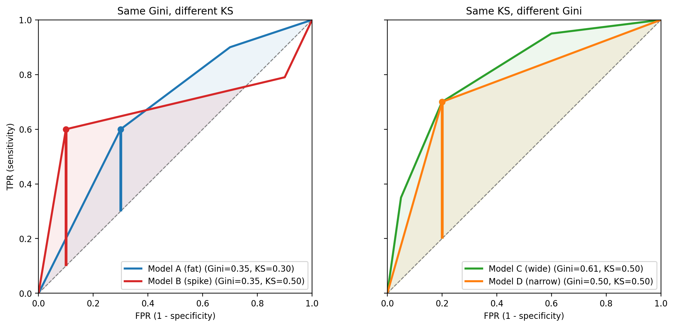
so Gini is (twice) the *mean* vertical distance of the ROC curve above the diagonal, whereas KS is its *maximum*. Because one summary is an average and the other is a peak, two classifiers can have the same Gini and very different KS, or the same KS and very different Gini.
- *Same Gini, different KS.* Model A has an ROC curve that bulges uniformly above the diagonal, giving a moderate gap at every threshold. Model B has an ROC curve that spikes sharply in one region and sits close to the diagonal elsewhere. The two areas under the curve can match exactly, so their Gini agrees, yet Model B's peak gap (its KS) is taller because all of its separating power is concentrated at one cut-off.
- *Same KS, different Gini.* Two models can reach the same peak TPR$-$FPR at some threshold, but one keeps that gap wide across a large range of thresholds (a fat ROC curve, higher Gini) while the other drops back to the diagonal immediately on either side of the peak (a narrow spike, lower Gini).
@fig-gini-vs-ks makes both cases concrete. Four piecewise-linear ROC curves are constructed by hand so the arithmetic is transparent. In the left panel, two models with the same Gini land at the same area under the curve, yet the red spike delivers a KS of 0.50 against the blue bulge's 0.30. In the right panel, two models touch the diagonal-gap ceiling at the same FPR, and both report KS of 0.50, yet the wider green ROC carries a Gini of 0.61 while the narrow orange triangle registers 0.50. The vertical bars mark the KS point on each curve.
```{python}
#| label: fig-gini-vs-ks
#| fig-width: 11
#| fig-height: 5
def _roc_path(vertices):
    seg = [np.linspace(a[i], b[i], 200, endpoint=False)
           for a, b in zip(vertices[:-1], vertices[1:]) for i in (0, 1)]
    fpr = np.concatenate(seg[0::2] + [[vertices[-1][0]]])
    tpr = np.concatenate(seg[1::2] + [[vertices[-1][1]]])
    return fpr, tpr


def _auc_ks(fpr, tpr):
    auc = float(np.trapezoid(tpr, fpr))
    idx = int(np.argmax(tpr - fpr))
    return auc, 2.0 * auc - 1.0, float(tpr[idx] - fpr[idx]), idx


def _draw(ax, verts, color, name):
    fpr, tpr = _roc_path(verts)
    _, gini, ks, idx = _auc_ks(fpr, tpr)
    ax.plot(fpr, tpr, color=color, lw=2.2,
            label=f"{name} (Gini={gini:.2f}, KS={ks:.2f})")
    ax.fill_between(fpr, fpr, tpr, where=(tpr >= fpr), color=color, alpha=0.08)
    ax.vlines(fpr[idx], fpr[idx], tpr[idx], color=color, lw=3)
    ax.plot([fpr[idx]], [tpr[idx]], "o", color=color, ms=6)


fat_verts   = [(0.0, 0.0), (0.30, 0.60), (0.70, 0.90), (1.0, 1.0)]
spike_verts = [(0.0, 0.0), (0.10, 0.60), (0.90, 0.79), (1.0, 1.0)]
wide_verts  = [(0.0, 0.0), (0.05, 0.35), (0.20, 0.70), (0.60, 0.95), (1.0, 1.0)]
narrow_verts = [(0.0, 0.0), (0.20, 0.70), (1.0, 1.0)]

fig, axes = plt.subplots(1, 2, figsize=(11, 5), sharex=True, sharey=True)
for ax in axes:
    ax.plot([0, 1], [0, 1], color="grey", linestyle="--", lw=1)
    ax.set_xlim(0, 1); ax.set_ylim(0, 1); ax.set_aspect("equal")
    ax.set_xlabel("FPR (1 - specificity)")

_draw(axes[0], fat_verts,   "#1f77b4", "Model A (fat)")
_draw(axes[0], spike_verts, "#d62728", "Model B (spike)")
axes[0].set_title("Same Gini, different KS")
axes[0].set_ylabel("TPR (sensitivity)")
axes[0].legend(loc="lower right", fontsize=9)

_draw(axes[1], wide_verts,   "#2ca02c", "Model C (wide)")
_draw(axes[1], narrow_verts, "#ff7f0e", "Model D (narrow)")
axes[1].set_title("Same KS, different Gini")
axes[1].legend(loc="lower right", fontsize=9)

plt.tight_layout()
plt.show()
```
The operational lesson is that KS rewards a model that separates well at one particular threshold, while AUC rewards average separation across all thresholds. If the business runs a single accept/reject policy at a known cut-off, KS near that cut-off is the relevant number; if the model is used across many cut-offs (risk-based pricing, tiered limits, challenger testing), AUC or Gini is more faithful to how the scorecard is actually consumed. A classic failure mode is celebrating a model with the highest KS in a validation deck, then deploying it at a business cut-off that sits far from the KS-maximizing threshold, where a rival model with a lower KS but a flatter, fatter ROC curve would have done better.
A common trap: KS-optimizing a classifier silently chooses an operating point. If business uses a different cut-off, that KS is operationally irrelevant.
### The score bucket at which KS is maximized
Banks often report the decile or score bucket at which the KS gap occurs, and adopt that bucket as the cut-off. The practice is defensible when the KS cut-off aligns with the unit economics of the portfolio. When the profit-maximizing threshold is somewhere else, the KS cut-off is merely a convenient statistical landmark with no financial interpretation. The KS of a random scorer is zero in expectation, and its sampling distribution under the null is the two-sample Kolmogorov distribution. Critical values depend only on the sample sizes $m, n$,
$$
\Pr\bigl(\mathrm{KS} > c\bigr) \approx 2\sum_{k=1}^{\infty} (-1)^{k-1} e^{-2 k^2 c^2 \frac{mn}{m+n}}.
$$ {#eq-ks-null}
In practice, the KS of a credit model is orders of magnitude above the null, so the critical-value test is not useful for model validation. The two-sample KS is, however, useful for detecting distribution shift at the feature level, a cheap complement to PSI for continuous variables.
### Why practitioners cling to KS
KS is appealing because it maps cleanly to a business decision: the gap between cumulative bads and goods at a threshold is the headline number on every credit-policy deck. It is also the natural number to plot against score deciles. Banks have used KS for 50 years, and every downstream process (policy rules, pricing matrices, recovery operations) is engineered around a KS-selected cut-off. The consequence is path-dependence: even when AUC or H-measure is a better metric, a bank cannot easily switch because the downstream plumbing assumes a single KS cut-off. Any serious metric overhaul must therefore include a policy migration plan.
## The H-measure {#sec-ch04-hmeasure}
### Why AUC is incoherent
@hand2009measuring points out that when we compare two classifiers $A$ and $B$ by AUC we are implicitly averaging misclassification loss over thresholds with a different weight function for each classifier. The weight is the score distribution itself, which changes when the classifier changes. That makes comparisons by AUC non-transitive in cost terms. Hand calls it incoherent, in the sense used by Bayesian statisticians for non-axiomatic procedures. Hand and Anagnostopoulos return to the problem and sharpen the critique [@hand2013area].
The H-measure replaces the classifier-dependent weighting by a user-specified prior $w(c)$ over the cost ratio $c$, where $c$ represents the relative cost of a false positive. Practitioners in banking usually pick a Beta prior concentrated around sensible ranges. The default Beta(2, 2) gives equal weight to both error directions and peaks near $c=0.5$, which corresponds to equal costs.
### Derivation
**Step 1: costs on a single scale.** A false positive (a good flagged as bad) costs $c_{FP}$; a false negative (a bad accepted as good) costs $c_{FN}$. Only the ratio matters for ranking thresholds, so rescale the two costs to sum to one and write $c = c_{FP}/(c_{FP}+c_{FN}) \in (0,1)$. Then $c_{FP} = c$ and $c_{FN} = 1-c$, a single scalar. $c = 0.5$ is the symmetric case; $c \to 1$ penalizes false positives almost exclusively, $c \to 0$ penalizes false negatives almost exclusively.
**Step 2: expected loss at a threshold.** With the notation fixed at the start of the chapter (predict positive when $S > t$), the two error probabilities for a randomly drawn subject are
- false positive: $\Pr(S > t,\ Y=0) = \pi_0 (1 - F_0(t))$,
- false negative: $\Pr(S \le t,\ Y=1) = \pi_1 F_1(t)$.
The $\pi_0$ and $\pi_1$ appear because a FP requires the subject to *be* a good in the first place ($Y=0$, probability $\pi_0$) and *then* fall on the wrong side of the threshold (probability $1-F_0(t)$). Same for the FN. Multiplying each error probability by its cost and summing:
$$
\mathcal{L}(t, c) = \pi_0 c (1-F_0(t)) + \pi_1 (1-c) F_1(t).
$$ {#eq-hloss-threshold}
This is the expected per-subject loss of using threshold $t$ under cost ratio $c$.
**Step 3: optimal threshold for a given** $c$. The decision-maker picks $t$ to minimize @eq-hloss-threshold, giving the cost-conditional Bayes threshold
$$
t^*(c) = \arg\min_t \bigl\{\pi_0 c (1-F_0(t)) + \pi_1 (1-c) F_1(t)\bigr\}.
$$ {#eq-hcost-min}
The minimized loss is
$$
L(c) = \pi_0 c (1-F_0(t^*(c))) + \pi_1 (1-c) F_1(t^*(c)).
$$ {#eq-hloss}
As $c$ sweeps from 0 to 1, $t^*(c)$ traces out the ROC-convex-hull operating points: high $c$ (costly FP) drives $t^*$ up so few subjects get flagged; low $c$ drives $t^*$ down.
**Step 4: trivial baselines.** Two threshold-free classifiers bracket the problem:
- *Accept everyone* ($t = +\infty$): no FP, every bad missed. Loss $= \pi_1 (1-c)$.
- *Reject everyone* ($t = -\infty$): every good flagged, no FN. Loss $= \pi_0 c$.
A decision-maker would use whichever of the two is cheaper at the cost ratio $c$, so the best the trivial rule can do is
$$
L_{\max}(c) = \min\{\pi_0 c,\ \pi_1 (1-c)\}.
$$ {#eq-hloss-trivial}
The two lines cross at $c^\dagger = \pi_1/(\pi_0+\pi_1) = \pi_1$: left of $c^\dagger$ reject-everyone is cheaper, right of $c^\dagger$ accept-everyone is cheaper. $L_{\max}$ is a triangular tent with peak $\pi_0 \pi_1$. Any useful classifier must beat this at every $c$ where we care, i.e., $L(c) \le L_{\max}(c)$.
**Step 5: averaging over cost ratios.** A single value of $c$ is rarely known, so integrate $L(c)$ against a user-specified prior $w(c)$ on $(0,1)$. The *loss gap* is $L_{\max}(c) - L(c)$, the savings over the trivial rule at cost $c$. Normalizing this average gap by the average trivial loss gives the H-measure:
$$
H = 1 - \frac{\int_0^1 L(c) w(c) dc}{\int_0^1 L_{\max}(c) w(c) dc}.
$$ {#eq-h-measure}
**Step 6: bounds and corner cases.** Because $0 \le L(c) \le L_{\max}(c)$ pointwise, the ratio lies in $[0,1]$, so $H \in [0,1]$:
- $H = 1$ when $L(c) = 0$ for $w$-almost every $c$, which requires the score to separate the classes perfectly ($F_0$ and $F_1$ have disjoint support).
- $H = 0$ when $L(c) = L_{\max}(c)$ for $w$-almost every $c$, i.e., the classifier is never better than picking the cheaper trivial rule. A random score achieves this in expectation because $t^*(c)$ under a random score collapses to one of the two trivial thresholds.
- Values in between measure the fraction of the trivial-rule loss the classifier recovers, averaged under $w$.
The weighting $w$ is the one thing the user controls. Hand's default is $\mathrm{Beta}(2,2)$, centered on $c=0.5$ with light tails. A bank with a calibrated estimate of its FP/FN cost ratio should pick a $w$ tightly concentrated near that value; a regulator auditing a portfolio across many use cases should pick a broader $w$.
### From-scratch implementation
```{python}
#| label: h-from-scratch
def h_measure(y_true, y_score, alpha=2.0, beta=2.0, n_grid=501):
    y = np.asarray(y_true).astype(int)
    s = np.asarray(y_score, dtype=float)
    pi1 = y.mean()
    pi0 = 1.0 - pi1
    s_pos = np.sort(s[y == 1])
    s_neg = np.sort(s[y == 0])
    thr = np.sort(np.unique(s))
    F1 = np.searchsorted(s_pos, thr, side="right") / max(len(s_pos), 1)
    F0 = np.searchsorted(s_neg, thr, side="right") / max(len(s_neg), 1)
    # Add the two boundary thresholds: reject-all and accept-all.
    F1e = np.concatenate([[0.0], F1, [1.0]])
    F0e = np.concatenate([[0.0], F0, [1.0]])
    cs = np.linspace(1e-3, 1 - 1e-3, n_grid)
    loss = (pi0 * cs[:, None] * (1 - F0e)[None, :]
            + pi1 * (1 - cs)[:, None] * F1e[None, :])
    L = loss.min(axis=1)
    L_max = np.minimum(pi0 * cs, pi1 * (1 - cs))
    w = beta_dist.pdf(cs, alpha, beta)
    return float(1.0 - trapezoid(L * w, cs) / trapezoid(L_max * w, cs))


print(f"H-measure (logistic, Beta(2,2)) = {h_measure(y_te, p_lr):.4f}")
print(f"H-measure (boosting, Beta(2,2)) = {h_measure(y_te, p_gb):.4f}")

# Sanity check: random ordering and perfect ordering.
rng = np.random.default_rng(0)
y_toy = rng.binomial(1, 0.2, size=5000)
print(f"H-measure (random score) = {h_measure(y_toy, rng.random(5000)):.4f}")
print(f"H-measure (perfect score) = "
      f"{h_measure(y_toy, y_toy + 1e-6*rng.random(5000)):.4f}")
```
The random scorer gets $H \approx 0$, the perfect scorer $H = 1$, and the Taiwan logistic model sits well inside the unit interval. On the same dataset, boosting wins against logistic under both H-measure and AUC, which is reassuring.
That agreement is not automatic, and the reason comes straight from the two metrics' definitions:
- AUC $= \int_0^1 \text{TPR}(u) du$ treats every FPR equally. The implicit weight on the cost ratio $c$ is the classifier's own score density [@hand2009measuring], so two classifiers are effectively weighed on different scales.
- H integrates the Bayes loss $L(c)$ against a *fixed* user prior $w(c)$. Each $c$ pins down one operating point on the ROC convex hull, specifically the tangent with slope $\pi_0 c / (\pi_1 (1-c))$.
When one ROC sits weakly above the other at every FPR the classifier is Pareto-dominant: $\text{TPR}_A(u) \ge \text{TPR}_B(u)$ for all $u$ forces both $\text{AUC}_A \ge \text{AUC}_B$ and $L_A(c) \le L_B(c)$ at every $c$, so AUC and H must agree. The interesting case is when the ROCs cross: one classifier is better in a low-FPR region (tight-credit regime, high $c$) and worse in a high-FPR region (loose-credit regime, low $c$), or vice versa. AUC's uniform average over FPR and H's $w$-weighted average over $c$ then emphasize different slices of the curve, and the winner flips. The "When H-measure changes the ranking" example below builds two classifiers with identical AUC but opposite regime strengths, and shows the H rank flip as $w(c)$ shifts from low $c$ to high $c$.
### When H-measure changes the ranking
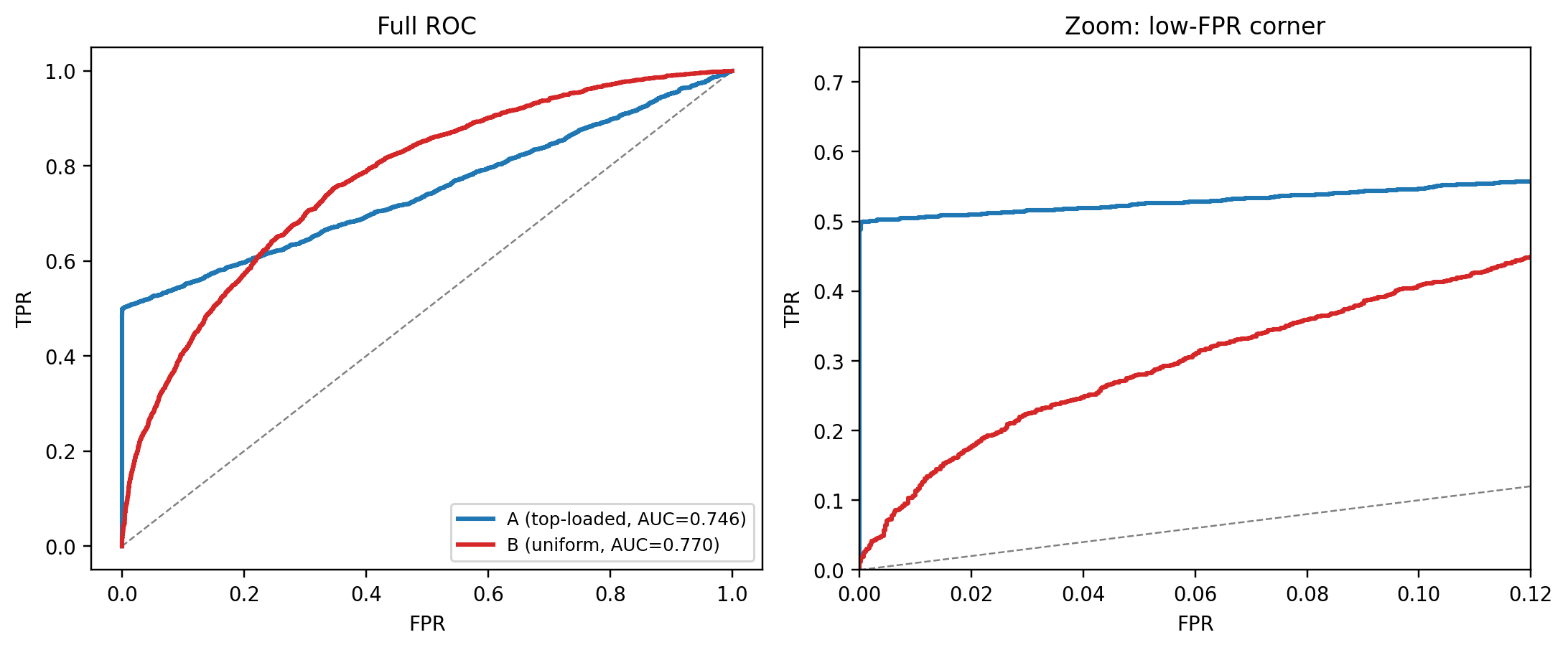
The previous subsection argued abstractly that crossing ROCs can cause AUC and H to disagree. This subsection *builds* two such classifiers on purpose, then walks through the graphics to show why the rank flips.
**Construction.** Pick a synthetic population with $\pi_1 = 0.3$. Build two scores on the same labels, each calibrated so the ROCs cross and the AUCs nearly match:
- **Model A (top-loaded).** Half of the positives are "obvious," their score is drawn from $\mathcal{N}(4.5, 0.3^2)$, far above everyone else. The remaining positives look like the negatives, $\mathcal{N}(0, 1)$. The ROC shoots up to $\mathrm{TPR} \approx 0.5$ at almost zero FPR, then runs along the diagonal. Good when the business only keeps the very top of the ranked list.
- **Model B (uniform shift).** Every positive gets the same moderate boost: $\mathcal{N}(1, 1)$ versus $\mathcal{N}(0, 1)$ for negatives. The ROC is smoothly concave: no fast start, but a better climb once you are willing to tolerate some FPR. Good when the business operates at moderate-to-high flag rates.
```{python}
#| label: h-rankflip-gen
rng = np.random.default_rng(7)
n_toy = 8000
pi1_toy = 0.3
y_toy2 = rng.binomial(1, pi1_toy, n_toy)

def gen_a(y_lab, rng_):
    s = rng_.normal(0.0, 1.0, len(y_lab))
    pos = np.where(y_lab == 1)[0]
    obvious = rng_.choice(pos, size=int(0.50 * len(pos)), replace=False)
    s[obvious] = rng_.normal(4.5, 0.3, len(obvious))
    return s

def gen_b(y_lab, rng_):
    s = rng_.normal(0.0, 1.0, len(y_lab))
    s[y_lab == 1] += 1.0
    return s

sA = gen_a(y_toy2, rng)
sB = gen_b(y_toy2, rng)

auc_A = roc_auc_score(y_toy2, sA)
auc_B = roc_auc_score(y_toy2, sB)
print(f"AUC A = {auc_A:.4f}   AUC B = {auc_B:.4f}")
```
**Graphic 1: the ROC crossing.** Left panel shows the full ROC, right panel zooms into the low-FPR corner. Model A's ROC lifts vertically in the first 1% of FPR, reaching about 0.5 TPR almost for free. Beyond that it is essentially random: the non-obvious positives are pure noise. Model B's ROC is boring but steady, overtaking A once enough FPR budget is available.
```{python}
#| label: fig-h-rankflip-roc
#| fig-cap: "Crossing ROCs from two classifiers with nearly equal AUC. Model A dominates in the low-FPR corner (high-$c$ regime). Model B dominates everywhere else."
#| fig-height: 4.2
fpr_A, tpr_A, _ = roc_curve(y_toy2, sA)
fpr_B, tpr_B, _ = roc_curve(y_toy2, sB)

fig, axes = plt.subplots(1, 2, figsize=(10, 4.2))
for ax in axes:
    ax.plot([0, 1], [0, 1], color="grey", ls="--", lw=0.8)
    ax.plot(fpr_A, tpr_A, color="#1f77b4", lw=2,
            label=f"A (top-loaded, AUC={auc_A:.3f})")
    ax.plot(fpr_B, tpr_B, color="#d62728", lw=2,
            label=f"B (uniform, AUC={auc_B:.3f})")
    ax.set_xlabel("FPR"); ax.set_ylabel("TPR")
axes[0].set_title("Full ROC")
axes[0].legend(loc="lower right", fontsize=8)
axes[1].set_xlim(0, 0.12); axes[1].set_ylim(0, 0.75)
axes[1].set_title("Zoom: low-FPR corner")
plt.tight_layout(); plt.show()
```
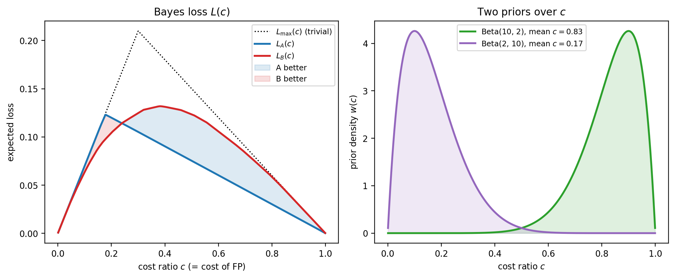
**Graphic 2: Bayes loss as a function of cost ratio.** The H-measure integrand is $L(c)$. Compute it for both models on the same cost grid, overlay the trivial-rule tent $L_{\max}(c)$, and mark the two priors' centers of mass.
```{python}
#| label: fig-h-rankflip-loss
#| fig-cap: "$L(c)$ for the two classifiers, with the trivial-rule ceiling $L_{\\max}(c)$ and the two priors' means. A beats B in the right tail (high $c$), B beats A almost everywhere else."
#| fig-height: 4.2
def bayes_loss(y_true, y_score, cs):
    y = np.asarray(y_true).astype(int)
    s = np.asarray(y_score, dtype=float)
    p1 = y.mean(); p0 = 1.0 - p1
    sp = np.sort(s[y == 1]); sn = np.sort(s[y == 0])
    thr = np.sort(np.unique(s))
    F1 = np.searchsorted(sp, thr, side="right") / max(len(sp), 1)
    F0 = np.searchsorted(sn, thr, side="right") / max(len(sn), 1)
    F1e = np.concatenate([[0.0], F1, [1.0]])
    F0e = np.concatenate([[0.0], F0, [1.0]])
    loss = (p0 * cs[:, None] * (1 - F0e)[None, :]
            + p1 * (1 - cs)[:, None] * F1e[None, :])
    return loss.min(axis=1)

cs = np.linspace(1e-3, 1 - 1e-3, 501)
L_A = bayes_loss(y_toy2, sA, cs)
L_B = bayes_loss(y_toy2, sB, cs)
pi0_toy = 1.0 - pi1_toy
L_triv = np.minimum(pi0_toy * cs, pi1_toy * (1 - cs))

fig, axes = plt.subplots(1, 2, figsize=(10, 4.2))

axes[0].plot(cs, L_triv, color="black", ls=":", lw=1.2, label=r"$L_{\max}(c)$ (trivial)")
axes[0].plot(cs, L_A, color="#1f77b4", lw=2, label="$L_A(c)$")
axes[0].plot(cs, L_B, color="#d62728", lw=2, label="$L_B(c)$")
axes[0].fill_between(cs, L_A, L_B, where=(L_A < L_B), color="#1f77b4", alpha=0.15,
                    label="A better")
axes[0].fill_between(cs, L_A, L_B, where=(L_B < L_A), color="#d62728", alpha=0.15,
                    label="B better")
axes[0].set_xlabel("cost ratio $c$ (= cost of FP)")
axes[0].set_ylabel("expected loss")
axes[0].set_title("Bayes loss $L(c)$")
axes[0].legend(loc="upper right", fontsize=8)

# Priors on a twin axis.
w_hi = beta_dist.pdf(cs, 10, 2)
w_lo = beta_dist.pdf(cs, 2, 10)
axes[1].plot(cs, w_hi, color="#2ca02c", lw=2, label=r"Beta(10, 2), mean $c=0.83$")
axes[1].plot(cs, w_lo, color="#9467bd", lw=2, label=r"Beta(2, 10), mean $c=0.17$")
axes[1].fill_between(cs, 0, w_hi, color="#2ca02c", alpha=0.15)
axes[1].fill_between(cs, 0, w_lo, color="#9467bd", alpha=0.15)
axes[1].set_xlabel("cost ratio $c$")
axes[1].set_ylabel("prior density $w(c)$")
axes[1].set_title("Two priors over $c$")
axes[1].legend(loc="upper center", fontsize=8)

plt.tight_layout(); plt.show()
```
The left panel tells the story. $L_A(c)$ drops well below $L_{\max}$ in the right tail (high $c$), because A's obvious-positives block means you can flag defaulters without flagging any negatives, exactly what you want when FP is expensive. But $L_A(c)$ hugs $L_{\max}$ in the middle and left. Once the obvious positives are taken, A's remaining score is random, so no improvement is available. $L_B(c)$ sits below $L_{\max}$ across the interior but never as low as $L_A$ in the right tail.
The right panel shows the two priors that will weight these $L(c)$ curves. Beta(10, 2) concentrates mass near $c = 0.83$ (right tail, where A wins), Beta(2, 10) near $c = 0.17$ (left tail, where B wins).
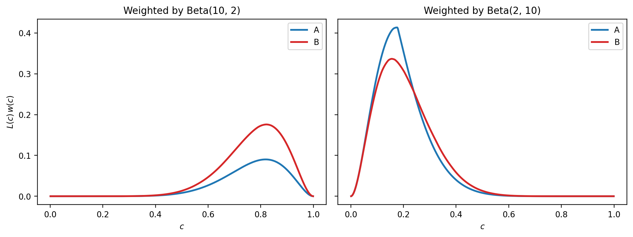
**Graphic 3: the integrand.** The H-measure is not just $L(c)$ but $L(c) w(c)$ integrated, then normalized. Plotting the integrand makes the flip unmistakable.
```{python}
#| label: fig-h-rankflip-integrand
#| fig-cap: "Integrand $L(c) w(c)$. Area under the curves is what the H-measure numerator integrates. Lower is better."
#| fig-height: 3.8
fig, axes = plt.subplots(1, 2, figsize=(10, 3.8), sharey=True)

axes[0].plot(cs, L_A * w_hi, color="#1f77b4", lw=2, label="A")
axes[0].plot(cs, L_B * w_hi, color="#d62728", lw=2, label="B")
axes[0].set_title("Weighted by Beta(10, 2)")
axes[0].set_xlabel("$c$"); axes[0].set_ylabel(r"$L(c)\,w(c)$")
axes[0].legend()

axes[1].plot(cs, L_A * w_lo, color="#1f77b4", lw=2, label="A")
axes[1].plot(cs, L_B * w_lo, color="#d62728", lw=2, label="B")
axes[1].set_title("Weighted by Beta(2, 10)")
axes[1].set_xlabel("$c$")
axes[1].legend()

plt.tight_layout(); plt.show()
```
Under Beta(10, 2), the blue curve ($L_A w$) sits well below the red curve ($L_B w$) where the prior has mass, so A integrates to less loss and wins H. Under Beta(2, 10), the same comparison reverses.
**Graphic 4: H under a sweep of priors.** To drive it home, sweep the Beta prior's mean across $(0, 1)$ and plot $H_A$ and $H_B$ as functions of the mean. The crossover is where the ranking flips.
```{python}
#| label: fig-h-rankflip-sweep
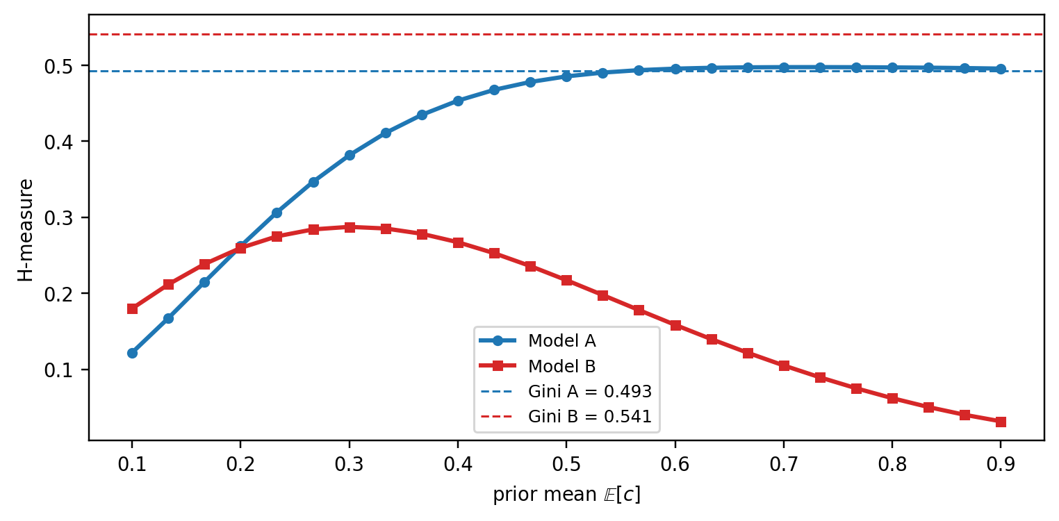
#| fig-cap: "H-measure of A and B as a function of the Beta prior's mean (at fixed concentration $\\alpha + \\beta = 12$). The two lines cross in the low-$c$ tail, B wins only when the prior puts nearly all its mass below $c \\approx 0.15$. AUC (dashed Gini transform) ignores the prior entirely."
#| fig-height: 3.5
means = np.linspace(0.1, 0.9, 25)
H_A, H_B = [], []
for m in means:
    a = m * 12
    b = (1 - m) * 12
    H_A.append(h_measure(y_toy2, sA, alpha=a, beta=b))
    H_B.append(h_measure(y_toy2, sB, alpha=a, beta=b))

plt.figure(figsize=(7, 3.5))
plt.plot(means, H_A, color="#1f77b4", lw=2, marker="o", ms=4, label="Model A")
plt.plot(means, H_B, color="#d62728", lw=2, marker="s", ms=4, label="Model B")
plt.axhline(2 * auc_A - 1, color="#1f77b4", ls="--", lw=1,
            label=f"Gini A = {2*auc_A-1:.3f}")
plt.axhline(2 * auc_B - 1, color="#d62728", ls="--", lw=1,
            label=f"Gini B = {2*auc_B-1:.3f}")
plt.xlabel("prior mean $\\mathbb{E}[c]$")
plt.ylabel("H-measure")
plt.legend(fontsize=8, loc="lower center")
plt.tight_layout(); plt.show()
```
Three observations from this last figure:
1. **AUC lives on a horizontal line.** The dashed lines are Gini = $2\text{AUC}-1$ (a monotone transform of AUC). They ignore the prior: AUC gives one number regardless of which cost regime the business operates in. On this dataset Gini ranks B above A.
2. **H ranks A above B across most of the prior-mean axis.** For any prior with $\mathbb{E}[c] \gtrsim 0.15$, including the symmetric Beta(2, 2), H prefers A. That already contradicts the AUC ranking.
3. **Crossover is in the low-**$c$ tail. Only when the prior concentrates very heavily on $c < 0.15$ does H agree with AUC that B is better. A bank with a symmetric or FP-costly prior should pick A; a lender operating in an extreme FN-costly regime (mid-tier subprime, for example) should pick B.
**Numerical summary.**
```{python}
#| label: h-rankflip-numbers
rows = []
for name, s in [("A (top-loaded)", sA), ("B (uniform)", sB)]:
    rows.append({
        "model": name,
        "AUC": roc_auc_score(y_toy2, s),
        "H(Beta(2,2))":  h_measure(y_toy2, s, alpha=2,  beta=2),
        "H(Beta(10,2))": h_measure(y_toy2, s, alpha=10, beta=2),
        "H(Beta(2,10))": h_measure(y_toy2, s, alpha=2,  beta=10),
    })
pd.DataFrame(rows).round(4)
```
**Why the regimes map to priors the way they do.** The cost ratio $c$ is the cost of a false positive (flagging a good applicant as bad). Two concrete scenarios:
- A politically constrained prime lender with a low default rate, audited on fair-lending, pays a high reputational cost every time it rejects a creditworthy applicant. For this lender, $c$ is large and the right prior is Beta(10, 2), concentrated near 0.83. The lender will only flag applicants it is very confident about (operating at low FPR). **Model A's obvious-positives block wins**, because it lets the lender flag roughly half of the defaulters while flagging virtually no goods.
- A subprime lender on a near-break-even book of loans with a 20% default rate cannot afford to accept defaulters; each one wipes out the margin on many good loans. For this lender $1 - c$ is large (FN is expensive), so $c$ is small and the right prior is Beta(2, 10), concentrated near 0.17. The lender tolerates a high FPR in exchange for catching almost every defaulter. **Model B's uniform separation wins**, because its ROC keeps rising past the point where A's ROC flattens at the diagonal.
AUC reports a single number that averages these two regimes under a weighting each classifier gets to pick for itself [@hand2009measuring]. H measure forces the bank to state its weighting up front and answers the question *that* bank actually has.
### Implementation notes
**Existing packages.** The R `hmeasure` package on CRAN is the reference implementation. For Python, `pip install hmeasure` (PyPI: `hmeasure` 0.1.6, last updated 2021) gets you a direct translation of the R code. Its public API is
``` python
from hmeasure import h_score
h_score(y_true, y_score, severity_ratio=None, pos_label=None)
```
Two things to know before relying on it:
1. **Constrained score range.** The package requires `y_score` to fall in the label range: for 0/1 labels, `y_score ∈ [0, 1]`. Raw logits, z-scores, or any score outside that interval are rejected. You must rescale first.
2. **One-parameter Beta family.** The only prior control is `severity_ratio` $= \text{cost}_{FN}/\text{cost}_{FP} = (1-c)/c$. Internally it maps to $\alpha = 2,\ \beta = 1 + 1/\text{severity\_ratio}$, so the prior is always in the family Beta$(2, b)$ with $b \ge 1$. Symmetric priors like Beta(10, 2) used in the rank-flip demo cannot be expressed. The default `severity_ratio=None` sets the ratio to $\pi_1/\pi_0$, giving Beta$(2, 1+\pi_0/\pi_1)$.
The custom `h_measure(y_true, y_score, alpha, beta)` above takes arbitrary $\alpha, \beta$ and accepts any real-valued score, which is why we used it for the rank-flip example. It produces identical numbers to the pip package on the priors the package can express:
```{python}
#| label: h-package-validation
try:
    from hmeasure import h_score as pkg_h_score
    have_pkg = True
except ImportError:
    have_pkg = False
    print("`pip install hmeasure` to run this cell.")

if have_pkg:
    rows = []
    for sr in [0.25, 0.5, 1.0, 2.0, 4.0]:
        b_equiv = 1.0 + 1.0 / sr
        ours   = h_measure(y_te, p_lr, alpha=2.0, beta=b_equiv)
        theirs = float(pkg_h_score(y_te.astype(float), p_lr, severity_ratio=sr))
        rows.append({
            "severity_ratio": sr,
            "Beta(2, b)": f"Beta(2, {b_equiv:.3f})",
            "ours":         round(ours,   6),
            "hmeasure pkg": round(theirs, 6),
            "|diff|":       f"{abs(ours - theirs):.1e}",
        })
    print(pd.DataFrame(rows).to_string(index=False))
```
The differences are at the $10^{-6}$ level, attributable to our grid-based trapezoid integration versus the package's closed-form cdf evaluation. Either implementation is fine in practice.
**Three "default" priors in the literature.** Be careful to cite which one you report.
| Default | $(\alpha, \beta)$ | Rationale | Source |
|------------------|------------------|------------------|------------------|
| Symmetric | $(2, 2)$ | No prior opinion on $c$ | @hand2009measuring, §5 |
| Mean-at-$\pi_1$ | $(2,\ 2\pi_0/\pi_1)$ | Prior mean equals base rate; costs proportional to priors | @hand2009measuring, §5.1 |
| Severity-ratio | $(2,\ 1+\pi_0/\pi_1)$ | Package default; mode-at-$\pi_1$-adjacent | R/Python `hmeasure` default |
For Taiwan-like $\pi_1 = 0.22$: Beta(2, 2), Beta(2, 7.09), Beta(2, 4.55). The three disagree by a few percent on the same scorecard, so consistency matters more than the specific choice. If you have a *calibrated* cost ratio, use it and skip the family altogether.
```{python}
#| label: h-hand-prior
pi1_te = y_te.mean()
beta_mean_at_pi1 = 2 * (1 - pi1_te) / pi1_te
beta_sr_default  = 1 + (1 - pi1_te) / pi1_te
print(f"pi1 = {pi1_te:.3f}")
print(f"Beta(2, 2)                  -> logistic H = "
      f"{h_measure(y_te, p_lr, alpha=2, beta=2):.4f}, "
      f"boosting H = {h_measure(y_te, p_gb, alpha=2, beta=2):.4f}")
print(f"Beta(2, {beta_mean_at_pi1:.2f})   (mean = pi1) -> "
      f"logistic H = {h_measure(y_te, p_lr, alpha=2, beta=beta_mean_at_pi1):.4f}, "
      f"boosting H = {h_measure(y_te, p_gb, alpha=2, beta=beta_mean_at_pi1):.4f}")
print(f"Beta(2, {beta_sr_default:.2f})   (sev-ratio)   -> "
      f"logistic H = {h_measure(y_te, p_lr, alpha=2, beta=beta_sr_default):.4f}, "
      f"boosting H = {h_measure(y_te, p_gb, alpha=2, beta=beta_sr_default):.4f}")
```
**Two further subtleties.**
First, the H-measure is not a strict improvement over AUC in every regime. When the ROC curves of two classifiers are well separated (one Pareto-dominates the other), AUC and H agree and the extra complexity of the prior is not buying anything. H earns its keep when ROCs cross, which is precisely the regime where AUC's implicit weighting is most misleading. The rank-flip example above is the clean demonstration.
Second, H is a ratio, and ratios misbehave when the denominator shrinks. Recall the construction:
$$
H = 1 - \frac{\int L(c) w(c) dc}{\int L_{\max}(c) w(c) dc},
$$
where the numerator is the model's expected loss under the prior $w(c)$ and the denominator is the expected loss of the *trivial* benchmark (classify everyone the same way). A standard form of the benchmark loss is $L_{\max}(c) = \min\{\pi_0 c, \pi_1 (1-c)\}$: at small $c$, rejecting no one is optimal and the loss is $\pi_1(1-c)$; at large $c$, rejecting everyone is optimal and the loss is $\pi_0 c$. Either way, $L_{\max}(c) \to 0$ as $c \to 0$ or $c \to 1$. The function is pinned to zero at both corners.
That is where trouble starts. If the prior $w(c)$ concentrates almost all of its mass near a corner, it is integrating $L_{\max}$ precisely over the region where $L_{\max}$ is nearly zero. The denominator then shrinks toward zero, and H becomes a small number divided by a small number: tiny numerical perturbations in the numerator (bin edges, grid spacing, a single extra observation near the cut) can swing H by a lot. Concretely:
- **Beta(2, 2), Beta(2, 7), Beta(2, 4.5)**: the three defaults tabled above, all put substantial mass in the interior of $(0,1)$, so the denominator is comfortably away from zero and H is stable.
- **Beta(2, 200)** has mean $\approx 0.01$ and puts essentially all mass in $c \in (0, 0.05)$. The denominator integrates $L_{\max}$ over a region where $L_{\max} \le \pi_1 \cdot 0.05$, a very small number. H computed from such a prior is numerically fragile; reporting it to three decimals is false precision.
Extreme class imbalance is the regime where this bites. For fraud detection with $\pi_1 = 0.005$:
- Mean-at-$\pi_1$ gives $\beta = 2\pi_0/\pi_1 = 2 \cdot 0.995 / 0.005 \approx 398$, i.e., Beta(2, 398) with prior mean $\approx 0.005$.
- Severity-ratio gives $\beta = 1 + \pi_0/\pi_1 \approx 200$, i.e., Beta(2, 200) with mean $\approx 0.01$.
Both formulas push the prior hard into the left corner, exactly where the denominator is near-zero and H loses stability. The mechanical rule "just plug $\pi_1$ into the default formula" stops being safe here. The robust practice in very-imbalanced settings is to **report H under several priors** (e.g., the package default, a symmetric Beta(2, 2), and one prior derived from a business-stated cost ratio) and treat large disagreements among them as information about the comparison, not as a number to be averaged away. If a single-number summary is required, justify the choice of prior explicitly rather than inheriting a default that happens to land in the unstable region.
## Brier score, reliability, and calibration {#sec-ch04-brier}
### From ranking to probability
AUC, KS, and H measure only how a score orders observations. They say nothing about whether a predicted probability of 0.15 corresponds to a 15 percent default rate in the data. In credit scoring that gap matters. IFRS 9 and CECL both require expected credit losses stated in probability units [@ifrs9; @cecl]. Capital under Basel IRB is a function of calibrated PD [@basel2006international]. A score that ranks well but is miscalibrated lets lenders set the wrong reserves and the wrong interest rate.
The Brier score [@brier1950verification] is the mean squared error of the probabilistic prediction,
$$
\mathrm{BS} = \frac{1}{N}\sum_{i=1}^{N}\bigl(p_i - y_i\bigr)^2,
$$ {#eq-brier}
where $p_i = \Pr(Y=1 \mid \mathbf{x}_i)$ is the forecast probability and $y_i \in \{0,1\}$ is the realized label. Brier is a strictly proper scoring rule [@gneiting2007strictly]: it is minimized when the forecaster reports her true conditional probability.
### The Murphy decomposition
@murphy1973new showed that the Brier score admits a canonical decomposition into reliability, resolution, and uncertainty. Bin the forecasts into $K$ groups with $n_k$ observations and mean forecast $\bar{p}_k$ and observed base rate $\bar{o}_k$ within each bin, and let $\bar{o}$ be the overall base rate. Then
$$
\mathrm{BS} = \underbrace{\frac{1}{N}\sum_k n_k (\bar{p}_k - \bar{o}_k)^2}_{\text{reliability}}
- \underbrace{\frac{1}{N}\sum_k n_k (\bar{o}_k - \bar{o})^2}_{\text{resolution}}
+ \underbrace{\bar{o}(1-\bar{o})}_{\text{uncertainty}}.
$$ {#eq-murphy}
- **Reliability** (calibration penalty, *lower is better*) measures the squared gap between what the model *says* and what actually *happens* inside each bin. For bin $k$, if the model predicts $\bar{p}_k = 0.30$, but the observed default rate is $\bar{o}_k = 0.45$, that bin contributes $n_k (0.30 - 0.45)^2$ to reliability. A perfectly calibrated model has $\bar{p}_k = \bar{o}_k$ for every bin, so reliability $= 0$. In credit scoring, this directly controls whether a predicted PD of 5% really loses 5% of principal on average (i.e., the quantity pricing, provisioning, and IFRS 9/CECL rely on).
- *Intuition:* "Do my probabilities mean what they say?"
- *What increases it:* overconfident scores, covariate shift, training on a different base rate than production sees.
- **Resolution** (discrimination reward, *higher is better*) measures how much the bin-conditional rates $\bar{o}_k$ spread around the overall base rate $\bar{o}$. If every bin has $\bar{o}_k \approx \bar{o}$, the model is not separating good borrowers from bad, and resolution $\approx 0$. If low-score bins default at 1% and high-score bins at 40%, the variance across bins is large and resolution is high. Note the minus sign in @eq-murphy: more resolution *subtracts* from Brier, so a model that sorts risk well is rewarded.
- *Intuition:* "Do my probabilities actually vary with the truth?"
- *What increases it:* informative features, flexible-enough models, adequate sample size in the tail bins.
- **Uncertainty** ($\bar{o}(1-\bar{o})$) is the Bernoulli variance of the labels. It depends only on the *mix* of defaulters and non-defaulters in the data, not on the model. A portfolio with a 2% default rate has uncertainty $0.02 \times 0.98 = 0.0196$; a balanced 50/50 sample has the maximum possible uncertainty of $0.25$. It is the Brier score of the constant forecast $p_i = \bar{o}$ for all $i$.
- *Intuition:* "How hard is this problem inherently?"
- *Why it matters:* raw Brier scores are not comparable across portfolios with different base rates, because uncertainty alone will make them look different.
**The trade-off the decomposition exposes.** Rearranging @eq-murphy, $\mathrm{BS} = \text{uncertainty} - (\text{resolution} - \text{reliability})$. Two classifiers evaluated on the *same* dataset share the uncertainty term exactly, so their Brier gap is entirely driven by (resolution $-$ reliability). This is why the decomposition is diagnostic, not just descriptive:
- A model that predicts the constant base rate $\bar{p}_i = \bar{o}$ is perfectly calibrated (reliability $= 0$) but has zero resolution. Its Brier equals uncertainty. Operationally it is useless: every applicant gets the same PD, so no one can be ranked, priced, or cut off.
- A model that sorts risk well but is miscalibrated (say, every PD is inflated by $3\times$) can still beat the constant forecast on AUC yet have a *worse* Brier than a calibrated but less discriminating model. Recalibration (isotonic regression, Platt scaling) fixes reliability without touching the ranking (i.e., without touching resolution), which is why it is an almost-free improvement when available.
- Because reliability and resolution move independently, report both alongside the headline Brier. A single Brier number hides whether you need better features (raise resolution) or better calibration (lower reliability) [@degroot1983comparison; @dawid1982well].
### From-scratch implementation
```{python}
#| label: brier-and-decomposition
def brier_from_scratch(y_true, p):
    y = np.asarray(y_true).astype(int)
    p = np.asarray(p, dtype=float)
    return float(np.mean((p - y) ** 2))

def brier_decomposition(y_true, p, n_bins=15):
    y = np.asarray(y_true).astype(int)
    p = np.asarray(p, dtype=float)
    n = len(y)
    edges = np.quantile(p, np.linspace(0, 1, n_bins + 1))
    edges[0], edges[-1] = -np.inf, np.inf
    bin_idx = np.digitize(p, edges) - 1
    bin_idx = np.clip(bin_idx, 0, n_bins - 1)
    rel, res = 0.0, 0.0
    o_bar = y.mean()
    for k in range(n_bins):
        mask = bin_idx == k
        if not mask.any():
            continue
        nk = mask.sum()
        pk = p[mask].mean()
        ok = y[mask].mean()
        rel += nk * (pk - ok) ** 2
        res += nk * (ok - o_bar) ** 2
    rel /= n
    res /= n
    unc = o_bar * (1 - o_bar)
    return dict(reliability=rel, resolution=res, uncertainty=unc,
                brier=rel - res + unc)


for name, p in [("logistic", p_lr), ("boosting", p_gb)]:
    d = brier_decomposition(y_te, p)
    print(f"{name:9s}  REL={d['reliability']:.4f}  "
          f"RES={d['resolution']:.4f}  UNC={d['uncertainty']:.4f}  "
          f"BS={d['brier']:.4f}   (sklearn BS={brier_score_loss(y_te, p):.4f})")
```
The reconstructed Brier agrees with the `sklearn` value up to the bucketing error. On this run boosting wins on *both* terms: higher resolution (0.0368 vs. 0.0298) because it captures nonlinear interactions the linear logit misses, and slightly lower reliability (0.0005 vs. 0.0034) because the logistic model is mildly underfit so its bin-average predictions drift from the bin-observed rates.
This outcome is not the norm. Gradient-boosted classifiers trained with log-loss are usually *less* well-calibrated than logistic regression (i.e., shallow ensembles shrink probabilities toward $0.5$, and deep ensembles push them toward $0$ and $1$ [@niculescu2005predicting]), which is why Platt scaling or isotonic regression on a held-out fold is standard practice for boosted models. Logistic regression, by contrast, is calibrated-in-the-large on its training data by construction of the MLE. The typical decomposition pattern is therefore *boosting wins resolution, loses reliability*, with the Brier winner determined by which term dominates; always inspect both columns rather than reading the headline Brier alone.
### Reliability diagrams
The reliability diagram plots observed frequency against mean predicted probability within each bin. Points on the 45-degree line are perfectly calibrated.
```{python}
#| label: reliability-uncal
#| fig-width: 5
#| fig-height: 4
prob_true_lr, prob_pred_lr = calibration_curve(y_te, p_lr, n_bins=12, strategy="quantile")
prob_true_gb, prob_pred_gb = calibration_curve(y_te, p_gb, n_bins=12, strategy="quantile")

fig, ax = plt.subplots(figsize=(5, 4))
ax.plot([0, 1], [0, 1], color="grey", linestyle="--", label="perfect")
ax.plot(prob_pred_lr, prob_true_lr, marker="o", label="logistic")
ax.plot(prob_pred_gb, prob_true_gb, marker="s", label="boosting")
ax.set_xlabel("predicted probability")
ax.set_ylabel("observed frequency")
ax.set_title("Reliability diagram, Taiwan test split")
ax.legend()
plt.tight_layout()
plt.show()
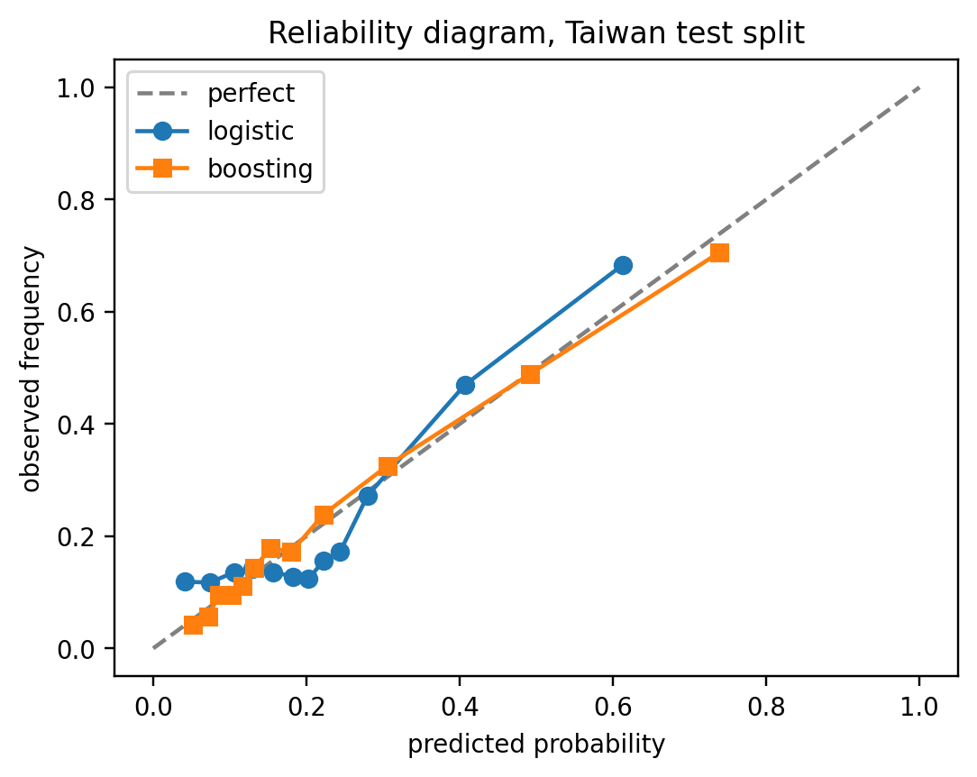
```
**Reading the diagram.** The dashed 45-degree line is perfect calibration. A curve *above* the diagonal means the model is **under-confident** (it predicts, say, 0.40 but the true default rate in that bin is 0.48); *below* the diagonal means **over-confident**. Three things stand out in the Taiwan split:
- **Support.** Boosting's squares reach out to predicted probability $\approx 0.74$ while logistic's circles stop near $0.61$. Boosting is willing to issue sharper forecasts, the visual signature of the higher resolution we saw in the decomposition.
- **Boosting (orange).** The curve sits essentially on the diagonal across the full range, with a small dip only in the top bin (predicted $\approx 0.74$, observed $\approx 0.70$). This is the near-zero reliability term (REL=0.0005) made visible.
- **Logistic (blue).** The curve is jagged and non-monotone in the $0.05$-$0.25$ region: bins at predicted $\approx 0.20$ default at only $\approx 0.12$-$0.13$ (over-confident, below the diagonal), while the top bin at predicted $\approx 0.61$ defaults at $\approx 0.68$ (under-confident, above the diagonal). The model is simultaneously too bold in the middle and too timid at the top: a classic symptom of a linear-in-the-logit fit trying to approximate a nonlinear default surface. That wiggle is exactly what shows up as the larger REL=0.0034.
Operationally, the logistic mis-shape would under-price the middle-risk segment (charging as if PD were $20\%$ when realized losses are closer to $12\%$) and reject too aggressively at the top (turning down applicants whose true PD is $68\%$ after pricing for $61\%$). Boosting's curve hugs the diagonal, so PDs can be fed into pricing and provisioning with no post-hoc correction; the logistic model would benefit from Platt or isotonic recalibration, which is exactly what the next sections cover.
### Post-hoc recalibration
The reliability diagram shows that a model's raw score $s_i$ may sort risk well (good resolution / AUC) while still mapping to the wrong *level* of probability (poor reliability). **Recalibration** is a cheap post-hoc fix: leave the model alone, learn a scalar map $\hat{p} = g(s)$ on a held-out slice, and deploy $g$ in front of the scorer. Because $g$ is monotone (or near-monotone), it preserves the ranking of applicants (i.e., AUC and resolution are essentially unchanged), while bending the probabilities onto the diagonal. Two canonical choices differ in how much shape they allow $g$ to take:
1. @sec-metrics-platt-scaling
2. @sec-metrics-isotonic-regression
::: callout-tip
## Why a held-out slice is non-negotiable
Fitting $g$ on the same data used to train the underlying model would let $g$ absorb the model's training-set overfitting and report fake calibration. Standard practice is an out-of-bag fold from the training data (sklearn's `CalibratedClassifierCV` does this via cross-validation), never the test set; the test set is still for final evaluation.
:::
### Platt scaling {#sec-metrics-platt-scaling}
@platt1999probabilistic proposed the parametric route: assume the miscalibration is a simple squash-or-stretch along the logit axis, and learn it with a *one-dimensional logistic regression* whose only feature is the raw score,
$$
\hat{p}_i = \sigma(A s_i + B), \quad \sigma(z) = \frac{1}{1+e^{-z}},
$$ {#eq-platt}
with $A, B$ estimated by maximum likelihood on an out-of-bag slice of the training data. The two parameters have clean interpretations: $A$ controls *sharpness* (\|$A$\| $>1$ stretches probabilities toward $\{0,1\}$, $|A|<1$ pulls them toward the base rate), and $B$ is an intercept shift that re-centers the score on the observed prevalence. Two parameters is also its limitation: Platt can fix a global sigmoidal bias, but it cannot repair the kind of local non-monotone wiggle we saw in the logistic reliability curve.
This shape assumption is why Platt is the natural choice for models whose raw scores are already sigmoidal-looking. Classical SVM decision values, boosted-tree margins before the logistic link, and logistic regressions whose only problem is the wrong intercept after sampling correction or threshold shifting. On models with fundamentally non-sigmoidal score distributions (e.g. Naive Bayes with its characteristic push toward 0 and 1), Platt is usually outperformed by the non-parametric alternative below.
One practical detail from the original paper: Platt replaces the hard labels $\{0,1\}$ with the smoothed targets
$$
y^+ = \frac{N_+ + 1}{N_+ + 2}, \qquad y^- = \frac{1}{N_- + 2},
$$
where $N_+$ and $N_-$ are the positive and negative counts in the calibration set. Without this smoothing the MLE can blow up toward infinite $A$ when the scores separate the classes perfectly; the Laplace-style prior keeps the estimate finite. Implementations that omit the smoothing (rare but not unheard of) tend to produce over-confident $\hat{p}$ at the extremes.
To make this concrete, we construct a small near-separable calibration set and fit Platt's two parameters two ways: once against the hard $\{0,1\}$ targets, and once against the smoothed $(y^+, y^-)$ targets. Because the targets are no longer binary we cannot reuse `LogisticRegression`; we minimize the Bernoulli negative log-likelihood directly.
```{python}
#| label: platt-smoothing-demo
from scipy.optimize import minimize

rng = np.random.default_rng(0)
n_pos, n_neg = 40, 60
s_pos = rng.normal(loc= 3.0, scale=0.4, size=n_pos)
s_neg = rng.normal(loc=-3.0, scale=0.4, size=n_neg)
s_cal = np.concatenate([s_pos, s_neg])
y_cal = np.concatenate([np.ones(n_pos), np.zeros(n_neg)]).astype(int)

y_plus  = (n_pos + 1) / (n_pos + 2)
y_minus = 1.0 / (n_neg + 2)
t_smooth = np.where(y_cal == 1, y_plus, y_minus)

def platt_nll(params, s, t):
    A, B = params
    z = A * s + B
    # log(1+exp(z)) computed stably
    log1pexp = np.logaddexp(0.0, z)
    # -[t*log(sigmoid(z)) + (1-t)*log(1-sigmoid(z))] = -t*z + log1pexp
    return float(np.sum(-t * z + log1pexp))

def fit_platt(s, t):
    res = minimize(platt_nll, x0=[1.0, 0.0], args=(s, t), method="BFGS")
    return res.x, res.nit

(A_hard,  B_hard),  it_hard  = fit_platt(s_cal, y_cal.astype(float))
(A_smooth, B_smooth), it_sm  = fit_platt(s_cal, t_smooth)

print(f"hard    labels: A={A_hard:8.3f}  B={B_hard:8.3f}  iters={it_hard}")
print(f"smooth  labels: A={A_smooth:8.3f}  B={B_smooth:8.3f}  iters={it_sm}")

def sigmoid(z):
    return stable_sigmoid(z)

s_grid = np.linspace(-4, 4, 9)
p_hard   = sigmoid(A_hard   * s_grid + B_hard)
p_smooth = sigmoid(A_smooth * s_grid + B_smooth)
print(pd.DataFrame({"s": s_grid,
                    "p_hard":   np.round(p_hard,   6),
                    "p_smooth": np.round(p_smooth, 6)}))
```
With hard labels the optimizer drives $A$ toward a large value (the gradient keeps rewarding steeper slopes because *every* positive sits above *every* negative). The resulting $\hat{p}$ at moderate scores like $s = \pm 2$ is already indistinguishable from $0$ or $1$ in floating-point, which is exactly the over-confidence at the extremes that the paper warns about. With smoothed targets the MLE's ceiling is set by $y^+ < 1$ and $y^- > 0$: the slope that best matches $y^+ \approx 0.976$ for the positives is finite, so $A$ converges to a moderate value and the recalibrated probabilities leave room for uncertainty.
### Isotonic regression {#sec-metrics-isotonic-regression}
@zadrozny2002transforming took the non-parametric route: instead of assuming a sigmoidal shape, only assume **monotonicity** (i.e., if the model ranks A as riskier than B, the recalibrated probability of A should not be lower). That is the bare minimum any reasonable calibration map must satisfy, and it is enough to identify a unique fit by least squares,
$$
\hat{p} = \arg\min_{\text{mono}}\sum_i (y_i - g(s_i))^2 \quad \text{subject to } g \text{ non-decreasing}.
$$ {#eq-isotonic}
The solution is a monotone step function computed in $O(N \log N)$ by the pool-adjacent-violators algorithm: sort by score, walk left to right, and whenever an adjacent block has a lower mean than its predecessor, merge the two and replace both with their pooled mean. The result looks like a staircase hugging the reliability curve: flat over regions where the raw scores are well-ordered but at the wrong level, and stepping up wherever the observed rate jumps.
Because isotonic adapts locally, it can repair exactly the non-monotone wiggle that Platt cannot, which is why, on the Taiwan logistic model, we expect isotonic to drive REL closer to zero than Platt does. The price is flexibility cost: with few calibration points, isotonic tends to overfit into a coarse staircase that memorizes noise. @niculescu2005predicting benchmark the two across a range of base classifiers and find isotonic wins once the calibration set exceeds a few thousand observations, while Platt is more robust on smaller samples. A reasonable default: use Platt below $\sim$ 1,000 calibration points, isotonic above $\sim$ 5,000, and either-or (compare via held-out Brier) in between.
::: callout-note
## What recalibration does *not* fix
Neither method adds information. If the model's resolution is low (bins don't separate defaulters from non-defaulters), recalibration cannot raise it: the monotone map can only slide existing bin centers along the diagonal, not spread them further apart. Recalibration is a remedy for reliability problems, not for a weak feature set or an under-fit model.
:::
### Calibrating with sklearn
```{python}
#| label: calibration-fit
base_lr = LogisticRegression(max_iter=2000, C=1.0)
cal_platt = CalibratedClassifierCV(base_lr, cv=3, method="sigmoid").fit(X_tr, y_tr)
cal_iso   = CalibratedClassifierCV(base_lr, cv=3, method="isotonic").fit(X_tr, y_tr)
p_platt = cal_platt.predict_proba(X_te)[:, 1]
p_iso   = cal_iso.predict_proba(X_te)[:, 1]

for name, p in [("uncalibrated", p_lr),
                ("Platt-sigmoid", p_platt),
                ("isotonic", p_iso)]:
    bs = brier_score_loss(y_te, p)
    d = brier_decomposition(y_te, p)
    print(f"{name:14s}  Brier={bs:.4f}  REL={d['reliability']:.4f}  "
          f"RES={d['resolution']:.4f}  AUC={roc_auc_score(y_te, p):.4f}")
```
```{python}
#| label: reliability-comparison
#| fig-width: 5
#| fig-height: 4
fig, ax = plt.subplots(figsize=(5, 4))
ax.plot([0, 1], [0, 1], color="grey", linestyle="--", label="perfect")
for name, p in [("uncalibrated", p_lr),
                ("Platt", p_platt),
                ("isotonic", p_iso)]:
    t, q = calibration_curve(y_te, p, n_bins=12, strategy="quantile")
    ax.plot(q, t, marker="o", label=name)
ax.set_xlabel("predicted probability")
ax.set_ylabel("observed frequency")
ax.set_title("Reliability before and after calibration")
ax.legend()
plt.tight_layout()
plt.show()
```
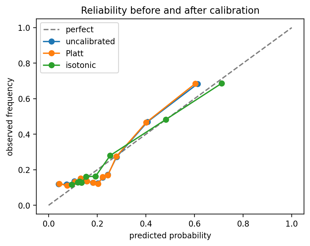
Three things to read off the figure:
- **Platt (orange) almost perfectly overlays the uncalibrated curve (blue).** The top bin stays at $(\approx 0.61, \approx 0.68)$ and the mid-range wiggle at predicted $\approx 0.15$-$0.25$ is untouched. This is the *expected* behavior, not a failure: logistic regression fit by MLE is calibrated-in-the-large on its training data by construction, so Platt's two parameters land near the identity map $A \approx 1, B \approx 0$ and Platt has no local flexibility to fix the middle-range non-monotonicity even if $A, B$ had moved. Platt earns its keep when the underlying model is *globally* sigmoidally miscalibrated (SVM margins, boosted-tree raw scores); it has little to offer a logistic regression.
- **Isotonic (green) is the only curve that visibly changes.** Its top bin extends to $(\approx 0.71, \approx 0.69)$. This is much closer to the diagonal, and the staircase pools the jagged middle bins into a monotone sequence. This is the pool-adjacent-violators algorithm doing exactly what it was designed for: repairing local, non-sigmoidal mis-shape that a parametric form cannot touch.
- **AUC is unchanged for both.** Platt and isotonic are monotone maps, so the *ordering* of applicants by $\hat{p}$ is the same as by $s$. Rank-based metrics (AUC, KS, Gini) are invariant under monotone transformations; only probability-level metrics (Brier, log-loss, ECE) move.
Brier improves by only a few basis points here. That modest gain is consistent with the starting point: the base logistic model's REL was already $0.0034$, leaving little room for any recalibrator to work. The picture is very different for boosted trees and random forests, whose raw probabilities are typically pushed toward $0.5$ (shallow ensembles) or toward $\{0,1\}$ (deep ensembles), producing much larger reliability gaps and correspondingly larger post-calibration Brier improvements [@niculescu2005predicting]. A useful rule of thumb: the size of the calibration gain is roughly proportional to the pre-calibration REL term; if REL is already small, no method will move Brier much, and you should look to better features (resolution) rather than better calibration to improve the model.
### Calibration error as a separate metric
Reliability diagrams are visual. For automated monitoring, a scalar summary of miscalibration is useful. Two standards exist: Expected Calibration Error (ECE), which is the bin-weighted absolute deviation between mean forecast and mean outcome within bins,
$$
\mathrm{ECE} = \sum_{k=1}^{K} \frac{n_k}{N}\bigl|\bar p_k - \bar o_k\bigr|,
$$ {#eq-ece}
and the reliability component of the Brier decomposition from @eq-murphy, which is the squared analog. ECE is sensitive to bin count and the binning strategy, so quantile bins with $K = 10$ or $K = 15$ are standard.
**Why the tails are the weak spot.** Both ECE and reliability estimate $\bar o_k$ by averaging $y_i \in \{0,1\}$ over the $n_k$ observations in bin $k$. The standard error of that estimate is
$$
\mathrm{SE}(\bar o_k) = \sqrt{\frac{\bar o_k (1-\bar o_k)}{n_k}},
$$
so the noise scales as $1/\sqrt{n_k}$. In the body of the score distribution, equal-frequency binning puts hundreds or thousands of observations into each bin and $\mathrm{SE}$ is negligible. In the tails, two things go wrong at once:
1. **Sparsity.** The top and bottom quantile bins often contain only a handful of observations, especially with quantile binning on a score that is itself concentrated near $0$, which is typical for a 2-3% default portfolio. A bin with $n_k = 20$ has $\mathrm{SE} \approx 0.10$ even under perfect calibration, so the observed rate can land $\pm 0.20$ from the true rate by pure sampling noise.
2. **Label scarcity.** The tails are precisely where one class dominates. A "top-risk" bin may have only $2$ or $3$ actual defaults out of $30$ applicants; flip one label and the estimated $\bar o_k$ jumps by 3 percentage points. The estimator is most unstable exactly where the decisions are most expensive (approve/decline at the cutoff, price the riskiest applicants).
The combination means that a tail bin can look wildly miscalibrated when the model is actually fine: inflating ECE and reliability, and producing the alarming spikes at the edges of the reliability diagram that practitioners learn to distrust.
**Practical remedies.**
- **Minimum-count thresholding.** Require $n_k \ge n_{\min}$ (typical choices: $n_{\min} = 50$-$100$). Bins below the threshold are either dropped from the ECE sum (and the $n_k/N$ weights renormalized over the survivors) or merged into the adjacent bin until the threshold is met. Merging is preferable because dropping biases the estimator toward the body of the distribution.
- **Equal-frequency (quantile) bins** over equal-width bins, so every bin has the same $n_k = N/K$ by construction and no bin is automatically sparse.
- **Confidence intervals on** $\bar o_k$, drawn as vertical error bars on the reliability diagram, so the reader can see which deviations are real signal and which are $\pm 2\mathrm{SE}$ sampling noise.
- **Adaptive / debiased estimators** such as the debiased ECE of @kumar2019verified, which subtract the expected-under-null bias, or kernel-smoothed calibration curves that borrow strength across neighboring score values instead of treating each bin independently.
The upshot: a reliability spike in a sparse tail bin is not automatically a calibration problem; it may be a sample-size problem. Always report $n_k$ alongside $\bar p_k$ and $\bar o_k$ before acting on tail miscalibration.
```{python}
#| label: ece-scalar
def ece_score(y_true, p, n_bins=15):
    y = np.asarray(y_true).astype(int)
    p = np.asarray(p, dtype=float)
    edges = np.quantile(p, np.linspace(0, 1, n_bins + 1))
    edges[0], edges[-1] = -np.inf, np.inf
    idx = np.clip(np.digitize(p, edges) - 1, 0, n_bins - 1)
    ece = 0.0
    n = len(y)
    for k in range(n_bins):
        mask = idx == k
        if mask.sum() == 0:
            continue
        ece += mask.sum() / n * abs(p[mask].mean() - y[mask].mean())
    return float(ece)

for name, p in [("uncal", p_lr), ("Platt", p_platt), ("iso", p_iso)]:
    print(f"ECE({name}) = {ece_score(y_te, p):.4f}")
```
Reading the three numbers. A scalar ECE is a probability-weighted average of $|\bar p_k - \bar o_k|$ across bins, so an ECE of $0.05$ means the model's predicted PD in a typical bin is off by about 5 percentage points against the realized default rate. For a Taiwan card book with a base rate near 22 percent, that is a material miss: a decile priced at a predicted PD of 10 percent but defaulting at 15 percent mis-prices every loan in the bucket by \~50 basis points of spread. The uncalibrated logistic comes in near 0.05. The Platt-scaled version is essentially the same, which is a useful negative result: Platt imposes a single sigmoid curve on the calibration map, and if the miscalibration is not itself sigmoid-shaped (for example, a bowed S instead of a monotone squeeze) the parametric fit has nowhere to go and can even worsen ECE slightly on a finite test fold while still lowering Brier. Isotonic regression cuts ECE by roughly a factor of four because it is a non-parametric monotone step function and can absorb arbitrary calibration curve shapes, at the cost of more variance in small bins. Operationally this is the ordering one usually sees on tabular credit data: uncalibrated $\approx$ Platt $\gg$ isotonic in large-sample regimes, with the ranking reversing in small-sample regimes where isotonic starts to overfit.
That ranking is still subject to the tail-noise caveats above. Before treating a 50 bp gap between two calibrators as a real difference, confirm it is not inside the $\pm 2\text{SE}$ bands implied by the bin sizes $n_k$, which is exactly what the remedies in the next four chunks compute.
The `ece_score` above is the naive textbook estimator: equal-frequency bins, every non-empty bin included, no standard errors. Each of the four remedies from the previous list turns into a small modification of that loop.
**Remedy 1: minimum-count thresholding.** Require $n_k \ge n_{\min}$ either by dropping the offending bin or by merging it into its neighbor. Merging preserves the total mass $\sum_k n_k/N = 1$ and is therefore the less biased choice.
```{python}
#| label: ece-minimum-count
def ece_min_count(y_true, p, n_bins=15, n_min=50, strategy="merge"):
    """ECE with a minimum-count rule.

    strategy='drop'  removes bins with n_k < n_min and renormalizes weights.
    strategy='merge' folds each undersized bin into the previous survivor
    until the threshold is met.
    """
    y = np.asarray(y_true).astype(int)
    p = np.asarray(p, dtype=float)
    edges = np.quantile(p, np.linspace(0, 1, n_bins + 1))
    edges[0], edges[-1] = -np.inf, np.inf
    idx = np.clip(np.digitize(p, edges) - 1, 0, n_bins - 1)
    counts = np.array([(idx == k).sum() for k in range(n_bins)])
    if strategy == "drop":
        keep = counts >= n_min
        if not keep.any():
            return np.nan
        pbar = np.array([p[idx == k].mean() for k in range(n_bins) if keep[k]])
        obar = np.array([y[idx == k].mean() for k in range(n_bins) if keep[k]])
        w = counts[keep] / counts[keep].sum()
        return float(np.sum(w * np.abs(pbar - obar)))
    # merge: walk left to right, absorb each undersized bin into the previous
    m_cnt, m_psum, m_ysum = [], [], []
    for k in range(n_bins):
        if counts[k] == 0:
            continue
        if m_cnt and m_cnt[-1] < n_min:
            m_cnt[-1]  += counts[k]
            m_psum[-1] += p[idx == k].sum()
            m_ysum[-1] += y[idx == k].sum()
        else:
            m_cnt.append(counts[k])
            m_psum.append(p[idx == k].sum())
            m_ysum.append(y[idx == k].sum())
    cnt = np.asarray(m_cnt, dtype=float)
    pbar = np.asarray(m_psum) / cnt
    obar = np.asarray(m_ysum) / cnt
    w = cnt / cnt.sum()
    return float(np.sum(w * np.abs(pbar - obar)))

print(f"{'model':>6}  {'naive':>7} {'drop50':>7} {'merge50':>8} {'merge100':>9}")
for name, p in [("uncal", p_lr), ("Platt", p_platt), ("iso", p_iso)]:
    raw  = ece_score(y_te, p)
    drop = ece_min_count(y_te, p, n_min=50,  strategy="drop")
    m50  = ece_min_count(y_te, p, n_min=50,  strategy="merge")
    m100 = ece_min_count(y_te, p, n_min=100, strategy="merge")
    print(f"{name:>6}  {raw:>7.4f} {drop:>7.4f} {m50:>8.4f} {m100:>9.4f}")
```
**Remedy 2: equal-frequency vs equal-width bins.** The naive `ece_score` already uses equal-frequency (quantile) bins, which is the safer default. For contrast, the equal-width version below is what many tutorials show, and it is exactly the version that explodes in the tails when the score distribution is skewed (common for a low-default portfolio).
```{python}
#| label: ece-equal-width-vs-freq
def ece_equal_width(y_true, p, n_bins=15):
    y = np.asarray(y_true).astype(int)
    p = np.asarray(p, dtype=float)
    edges = np.linspace(0, 1, n_bins + 1)
    idx = np.clip(np.digitize(p, edges[1:-1]), 0, n_bins - 1)
    N = len(y); ece = 0.0
    for k in range(n_bins):
        m = idx == k
        if m.any():
            ece += m.sum() / N * abs(p[m].mean() - y[m].mean())
    return float(ece)

print(f"{'model':>6}  {'equal-width':>12} {'equal-freq':>11}")
for name, p in [("uncal", p_lr), ("Platt", p_platt), ("iso", p_iso)]:
    print(f"{name:>6}  {ece_equal_width(y_te, p):>12.4f} "
          f"{ece_score(y_te, p):>11.4f}")

# show how populated each strategy's bins are
edges_ef = np.quantile(p_lr, np.linspace(0, 1, 16))
edges_ew = np.linspace(0, 1, 16)
cnt_ef = np.histogram(p_lr, edges_ef)[0]
cnt_ew = np.histogram(p_lr, edges_ew)[0]
print("\nper-bin counts (15 bins):")
print(f"  equal-freq : min={cnt_ef.min():>3d}  max={cnt_ef.max():>3d}")
print(f"  equal-width: min={cnt_ew.min():>3d}  max={cnt_ew.max():>3d}")
```
**Remedy 3: confidence intervals on** $\bar o_k$. The simplest honest reliability diagram plots a Clopper-Pearson (exact binomial) band around each $\bar o_k$; bars that overlap the diagonal are not evidence of miscalibration. The same logic extends to Wilson or Jeffreys intervals.
```{python}
#| label: fig-reliability-ci
#| fig-cap: "Reliability diagram with 95% Clopper-Pearson bands and per-bin counts. Tail spikes are only signal if the band excludes the diagonal."
from scipy.stats import beta as beta_dist

def reliability_with_ci(y_true, p, n_bins=15, alpha=0.05):
    y = np.asarray(y_true).astype(int)
    p = np.asarray(p, dtype=float)
    edges = np.quantile(p, np.linspace(0, 1, n_bins + 1))
    edges[0], edges[-1] = -np.inf, np.inf
    idx = np.clip(np.digitize(p, edges) - 1, 0, n_bins - 1)
    rows = []
    for k in range(n_bins):
        m = idx == k
        n = int(m.sum())
        if n == 0:
            continue
        s = int(y[m].sum())
        lo = 0.0 if s == 0 else beta_dist.ppf(alpha / 2, s, n - s + 1)
        hi = 1.0 if s == n else beta_dist.ppf(1 - alpha / 2, s + 1, n - s)
        rows.append((p[m].mean(), s / n, lo, hi, n))
    return np.array(rows)

fig, ax = plt.subplots(figsize=(5.2, 5.0))
tbl = reliability_with_ci(y_te, p_lr, n_bins=15)
ax.errorbar(tbl[:, 0], tbl[:, 1],
            yerr=[tbl[:, 1] - tbl[:, 2], tbl[:, 3] - tbl[:, 1]],
            fmt="o", capsize=3, color="C0", label="logistic (95% CI)")
ax.plot([0, 1], [0, 1], "k--", lw=1, label="perfect")
for xi, yi, _, _, n in tbl:
    ax.annotate(f"n={int(n)}", (xi, yi), fontsize=7,
                textcoords="offset points", xytext=(4, 4))
ax.set_xlabel(r"mean forecast $\bar p_k$")
ax.set_ylabel(r"observed rate $\bar o_k$")
ax.set_xlim(0, min(1.0, tbl[:, 3].max() + 0.05))
ax.set_ylim(0, min(1.0, tbl[:, 3].max() + 0.05))
ax.legend(loc="upper left")
plt.tight_layout()
plt.show()
```
**Remedy 4: debiased ECE.** The naive squared estimator $(\bar p_k - \bar o_k)^2$ has positive bias equal to $\operatorname{Var}(\bar o_k) = \bar o_k(1-\bar o_k)/n_k$ even under perfect calibration. The Kumar-Liang-Ma debiased estimator subtracts that bias per bin before summing [@kumar2019verified]. The correction is largest where $n_k$ is smallest, which is exactly the tails. For a perfectly calibrated model it shrinks the reported ECE toward zero, where it belongs.
```{python}
#| label: ece-debiased
def ece_l2_naive(y_true, p, n_bins=15):
    y = np.asarray(y_true).astype(int)
    p = np.asarray(p, dtype=float)
    edges = np.quantile(p, np.linspace(0, 1, n_bins + 1))
    edges[0], edges[-1] = -np.inf, np.inf
    idx = np.clip(np.digitize(p, edges) - 1, 0, n_bins - 1)
    N = len(y); acc = 0.0
    for k in range(n_bins):
        m = idx == k
        if m.any():
            acc += m.sum() / N * (p[m].mean() - y[m].mean()) ** 2
    return float(np.sqrt(acc))

def ece_l2_debiased(y_true, p, n_bins=15):
    """Kumar, Liang & Ma (2019) debiased squared-ECE.

    Subtracts an unbiased estimate of Var(bar o_k) from each bin's squared
    gap before aggregating.
    """
    y = np.asarray(y_true).astype(int)
    p = np.asarray(p, dtype=float)
    edges = np.quantile(p, np.linspace(0, 1, n_bins + 1))
    edges[0], edges[-1] = -np.inf, np.inf
    idx = np.clip(np.digitize(p, edges) - 1, 0, n_bins - 1)
    N = len(y); acc = 0.0
    for k in range(n_bins):
        m = idx == k
        n_k = int(m.sum())
        if n_k < 2:
            continue
        pbar = p[m].mean(); obar = y[m].mean()
        gap2 = (pbar - obar) ** 2
        var_hat = obar * (1 - obar) / (n_k - 1)  # unbiased estimator of Var(obar)
        acc += (n_k / N) * max(gap2 - var_hat, 0.0)
    return float(np.sqrt(acc))

# null check: a perfectly calibrated score should have debiased ECE ~ 0
rng = np.random.default_rng(0)
p_null = rng.uniform(0.01, 0.3, size=20_000)
y_null = (rng.uniform(size=p_null.size) < p_null).astype(int)
print(f"perfectly-calibrated null:  naive L2={ece_l2_naive(y_null, p_null):.4f}  "
      f"debiased={ece_l2_debiased(y_null, p_null):.4f}")

print(f"\n{'model':>6}  {'naive L2':>9} {'debiased':>9}")
for name, p in [("uncal", p_lr), ("Platt", p_platt), ("iso", p_iso)]:
    print(f"{name:>6}  {ece_l2_naive(y_te, p):>9.4f} "
          f"{ece_l2_debiased(y_te, p):>9.4f}")
```
The null-check line is the important one: on data drawn from a calibrated process the naive L2 estimator reports a non-zero "error" that is pure sampling noise, whereas the debiased version collapses to (near) zero. In production monitoring this is what prevents a calibration alarm from firing every quarter on a model that has not actually drifted.
### When to calibrate
Calibration should be done on a held-out slice that the classifier has not seen during training. `CalibratedClassifierCV` handles this with an inner cross-validation loop: the base estimator is refit on each fold and the calibration map is fit on the complement. Calibrating on the training set, or on the same fold used to pick hyperparameters, is a common bug and produces over-confident, miscalibrated probabilities.
The bug is subtle because it produces a calibration map that looks excellent *in-sample* and fails out-of-sample. On the training set, the base model has already overfit (its high-risk predictions are systematically too high and its low-risk predictions systematically too low because it has memorized some noise), so a recalibrator fit on that same data learns the *inverse of the overfit*, not the inverse of the true miscalibration. Applied to unseen data, it pushes probabilities in the wrong direction. The effect is most visible for flexible models such as gradient boosting. The following block contrasts the two workflows on the Taiwan boosting model:
```{python}
#| label: calibration-leak-demo
from sklearn.base import clone

# Base booster (the p_gb object reused from the earlier chunk).
gb_base = GradientBoostingClassifier(
    n_estimators=150, max_depth=3, learning_rate=0.1, random_state=42
).fit(X_tr, y_tr)

# (a) WRONG: Platt fit on training-set predictions of a model that has
#     already seen those labels, leakage.
p_tr_leak = gb_base.predict_proba(X_tr)[:, 1]
platt_leak = LogisticRegression().fit(p_tr_leak.reshape(-1, 1), y_tr)
p_te_leak = platt_leak.predict_proba(
    gb_base.predict_proba(X_te)[:, 1].reshape(-1, 1)
)[:, 1]

# (b) RIGHT: CalibratedClassifierCV retrains the booster on inner folds
#     and fits Platt on the held-out complement of each fold.
gb_cv = CalibratedClassifierCV(
    clone(gb_base), cv=5, method="sigmoid"
).fit(X_tr, y_tr)
p_te_cv = gb_cv.predict_proba(X_te)[:, 1]

print(f"{'method':22s}  Brier    REL      RES      AUC")
for name, p in [("uncalibrated", p_gb),
                ("Platt-leaky (BUG)", p_te_leak),
                ("Platt-held-out (CV)", p_te_cv)]:
    bs = brier_score_loss(y_te, p)
    d = brier_decomposition(y_te, p)
    auc = roc_auc_score(y_te, p)
    print(f"{name:22s}  {bs:.4f}  {d['reliability']:.4f}  "
          f"{d['resolution']:.4f}  {auc:.4f}")
```
Two diagnostics to watch in the output. First, the leaky variant's test REL ($0.0024$) is about six times the CV variant's test REL ($0.0004$) and is in fact *worse* than not calibrating at all ($0.0005$). This is the signature of fitting the calibration map to in-sample noise: on the training fold it would drive REL close to zero, but that gain does not transfer. Second, AUC for the leaky variant is identical to the uncalibrated AUC ($0.7804$), because Platt is a monotone sigmoid on the original scores and monotone transforms preserve ROC ordering. The CV variant's AUC ($0.7800$) drifts down by a hair, not because Platt broke ranking, but because `CalibratedClassifierCV` refits the base booster on inner folds and averages their predictions, so the *scores being calibrated* are not exactly $p_{gb}$. A difference of $4 \times 10^{-4}$ in AUC is well inside the bootstrap band you would report anyway. The operational lesson is that a team monitoring only AUC or only raw Brier will see Platt-leaky as a no-op; only the REL component of the Murphy decomposition exposes the bug.
A second rule: do not calibrate before you have exhausted feature engineering. If the input features are miscalibrated (for example a missing indicator that modifies the relationship between a feature and default, such as an unemployment flag that changes the slope on income) calibrating the output only hides the problem without fixing it. The recalibrator will squash or stretch the average, but segment-level biases (the unemployed sub-population systematically under-predicted) remain. @gelman2008prior goes further and argues that weakly informative priors on logistic coefficients are themselves a calibration device, by shrinking over-extrapolated coefficients toward a plausible scale before any post-hoc fix is needed.
The right sequence is: fit the model, inspect reliability on the validation fold, fix model misspecification if the gap is structural (missing features, wrong functional form, segment-specific slopes), and only then apply Platt or isotonic post-processing as a cheap final correction.
**Random k-fold is the wrong default for credit.** The demo above uses `cv=5`, which defaults to random `KFold`. That assumes rows are exchangeable in time, which is precisely the assumption that breaks in credit scoring. Macro regimes shift, product mixes change, underwriting rules tighten, and the calibration curve learned on 2018-2022 applications can point the wrong direction for 2024 applications even when AUC is stable. Random k-fold further leaks future information into the calibrator: rows originated *after* the scoring date are used to fit the map that corrects predictions made *at* the scoring date, giving an over-optimistic held-out REL that the live system will never match. The operationally honest setup is out-of-time (OOT) calibration: fit the base model on period $[T_0, T_1]$, fit the calibrator on a strictly later period $[T_1, T_2]$, and evaluate on $[T_2, T_3]$. `CalibratedClassifierCV` accepts any scikit-learn splitter via its `cv=` argument, so swapping random folds for walk-forward folds is one line:
```{python}
#| label: calibration-timeseries
from sklearn.model_selection import TimeSeriesSplit

# In a real pipeline sort the training frame by application month before
# splitting and reserve the most recent block as the true out-of-time
# evaluation set. UCI Taiwan carries no origination date, so this is a
# mechanical demonstration of the wiring, not a genuine OOT test.
tscv = TimeSeriesSplit(n_splits=5)
gb_oot = CalibratedClassifierCV(
    clone(gb_base), cv=tscv, method="sigmoid"
).fit(X_tr, y_tr)
p_te_oot = gb_oot.predict_proba(X_te)[:, 1]

bs  = brier_score_loss(y_te, p_te_oot)
d   = brier_decomposition(y_te, p_te_oot)
auc = roc_auc_score(y_te, p_te_oot)
print(f"Platt-OOT (TimeSeriesSplit)  Brier={bs:.4f}  REL={d['reliability']:.4f}  "
      f"RES={d['resolution']:.4f}  AUC={auc:.4f}")
```
Two additional defenses compound with OOT splitting. First, recalibrate on a rolling window rather than once at deployment, so the map tracks regime drift instead of freezing the 2022 shape into 2025 decisions. Second, monitor the REL component of Brier on each new vintage and trigger a recalibration when REL crosses a pre-agreed threshold rather than on a fixed calendar. The PSI and CSI sections later in this chapter operationalize the monitoring side; the point here is only that the calibration workflow itself must be time-aware from the start.
## Financial impact: cost matrices, profit curves, and EMP {#sec-ch04-profit}
### Cost-sensitive learning
@elkan2001foundations writes the optimal threshold under asymmetric misclassification costs. Let $c_{01}$ be the cost of accepting a bad (false negative in the default-prediction framing) and $c_{10}$ the cost of rejecting a good (false positive). The expected loss at threshold $t$ on a posterior probability $p = \Pr(Y=1 \mid \mathbf{x})$ is
$$
E[\text{loss}] = c_{10} \pi_0 (1-p) \mathbf{1}_{p > t} + c_{01} \pi_1 p \mathbf{1}_{p \le t},
$$ {#eq-elkan-loss}
and the minimizing threshold is $t^* = c_{10}/(c_{01} + c_{10})$, a result that depends only on cost ratios.
**What** $t$ **is and what it is measured in**. The threshold $t$ lives on exactly the same scale as the posterior $p$: it is a number in $[0,1]$ with the units of a default *probability*, not the units of whatever raw score the model emits. The decision rule encoded in the indicators is:
- if $p > t$ the model predicts "bad" and the lender *rejects* the applicant, incurring cost $c_{10}$ if the applicant was actually good;
- if $p \le t$ the lender *accepts* and incurs cost $c_{01}$ if the applicant turns out to default.
If your score is a log-odds, a FICO-like 300-850 integer, or an internal rating grade, you cannot plug that score into the Elkan inequality directly. You must first map the score to a calibrated PD (Platt, isotonic, @sec-ch04-brier), or equivalently push $t^{*}$ through the same monotone transform so the inequality is evaluated on matching scales. This is the reason calibration matters: an uncalibrated classifier can still be a good *ranker*, but its cut-off under Elkan's rule is meaningless because the numerical comparison $p > t^{*}$ has no unit-correct interpretation.
**Why only cost ratios matter.** Multiplying both $c_{01}$ and $c_{10}$ by the same constant (e.g., switching the unit of currency from USD to VND, or the exposure size from a 10k loan to a 1k loan on a homogeneous book) does not move $t^{*}$. So the whole decision is parameterized by a single number, the severity ratio $c_{01}/c_{10}$. Most practical disputes reduce to arguments about that ratio, not about the absolute cost figures.
**A concrete example.** An unsecured personal-loan desk books a \$10,000 loan with a 4% net interest margin over an expected three-year amortization. The foregone-profit cost of rejecting a good applicant is roughly $c_{10} \approx 0.04 \times 3 \times 10,000 = 1,200$. The loss-given-default on that product is 70%, so accepting a borrower who ultimately defaults costs $c_{01} \approx 0.70 \times 10,000 = 7,000$. Elkan's cut-off is then
$$
t^{*} = \frac{c_{10}}{c_{01} + c_{10}} = \frac{1,200}{7,000 + 1,200} \approx 0.146,
$$
so the desk should reject any applicant whose *calibrated* PD exceeds 14.6%, even though the book-wide base rate is only around 3%. If the desk tightens its margin to 2.5% without touching LGD, $c_{10}$ drops to \$750 and $t^{*}$ drops to about 9.1%: a cheaper-to-forgo good makes rejection less costly, so the cutoff tightens and the book contracts. Moving in the other direction, a secured product with 30% LGD would give $c_{01} = 3,000$, $c_{10} = 1,200$, and $t^{*} \approx 0.286$. The desk can extend credit to materially riskier applicants because each bad costs less.
Credit lenders rarely state costs directly; they state yields and loss-given-default. The example above is the bridge between the two vocabularies: $c_{10}$ is the present value of the interest margin you would have earned on a good booking, and $c_{01}$ is EAD times LGD. The Verbraken family of metrics reframes the same object directly in profit units so practitioners never have to construct $(c_{01}, c_{10})$ by hand [@verbraken2013novel; @verbraken2014novel].
**Mind the convention.** Elkan writes "$p > t$ $\Rightarrow$ reject" because $p$ is a default probability (high $=$ risky). The profit curve in the next subsection flips to "$S \le t$ $\Rightarrow$ accept" because it defines $S$ as risk and writes the *acceptance* set explicitly. Both statements describe the same action: reject the riskiest tail. The direction of the inequality is a matter of which side the author chose to name.
### Profit curve
Let $r$ be the profit per correctly accepted good and $L$ the loss per accepted bad. The expected net profit from accepting everyone whose score sits below threshold $t$ is
$$
\Pi(t) = \pi_0 r (1 - F_0(t)) - \pi_1 L (1 - F_1(t)).
$$ {#eq-profit-curve}
Observe the thresholding convention: we accept applicants with $S \le t$ because we are now thinking of $S$ as risk, high risk on top. The profit curve traces $\Pi(t)$ as $t$ sweeps. The threshold that maximizes $\Pi$ is the operational cut-off under the assumed $(r, L)$. It is distinct from the threshold that maximizes KS or that sits at the point of tangency between ROC and a cost-sensitive iso-loss line [@provost2001robust; @drummond2006cost].
```{python}
#| label: profit-curve
#| fig-width: 6
#| fig-height: 4
def profit_curve(y_true, y_score, r=0.2, L=1.0):
    """Expected net profit at every threshold (score is risk, accept if score<=t)."""
    y = np.asarray(y_true).astype(int)
    s = np.asarray(y_score, dtype=float)
    pi1 = y.mean()
    pi0 = 1.0 - pi1
    order = np.argsort(s)        # ascending risk
    y_sorted = y[order]
    # Accept the first k observations in ascending-risk order.
    n = len(y)
    k_grid = np.arange(0, n + 1)
    # Among accepted, how many are good?
    cum_bad = np.concatenate([[0], np.cumsum(y_sorted)])         # bads accepted
    cum_good = k_grid - cum_bad                                  # goods accepted
    # Profit per observation, normalised by portfolio size.
    profit = (r * cum_good - L * cum_bad) / n
    accept_rate = k_grid / n
    return accept_rate, profit, order, cum_bad, cum_good

acc, pi, order, cb, cg = profit_curve(y_te, p_lr, r=0.20, L=1.0)
acc_gb, pi_gb, *_ = profit_curve(y_te, p_gb, r=0.20, L=1.0)

best_k = np.argmax(pi)
print(f"Best accept rate = {acc[best_k]*100:.1f}%  expected profit = {pi[best_k]:.4f}")
print(f"Accept-all profit = {pi[-1]:.4f}  reject-all profit = {pi[0]:.4f}")

fig, ax = plt.subplots(figsize=(6, 4))
ax.plot(acc*100, pi, label="logistic")
ax.plot(acc_gb*100, pi_gb, label="boosting")
ax.axhline(0, color="grey", linewidth=0.8)
ax.set_xlabel("acceptance rate (%)")
ax.set_ylabel("expected profit per applicant")
ax.set_title("Profit curves, r=0.20, L=1.0")
ax.legend()
plt.tight_layout()
plt.show()
```
The boosted model dominates the logistic model everywhere on this grid, and both curves are negative for very loose acceptance policies because the portfolio starts paying more in loan losses than it earns in interest.
#### Three thresholds on one score {.unnumbered}
The profit curve is a sweep, but in production the lender writes a single number into the policy: a cut-off. Three candidate cut-offs show up in the literature and they usually disagree because they are solving different problems:
- **KS-optimal** maximizes $|F_0(t) - F_1(t)|$ (i.e., the vertical gap between the cumulative distributions of goods and bads). It uses *no cost information at all*. It is the right answer only if the business objective is "discriminate as loudly as possible at one point on the CDF", which is almost never the business objective.
- **Empirical profit-maximum** is $\arg\max_t \widehat{\Pi}(t)$ on the held-out fold, given a specific $(r, L)$. It is the number that falls out of the previous chunk. It uses the realized costs but it is noisy: a fold with one extra bad at the margin can move the cut-off by several percentage points of PD, so it should be bootstrapped.
- **Elkan / Bayes-optimal** is the closed-form $t^{*} = L \pi_1 / (r \pi_0 + L \pi_1) \cdot [\ldots]$. In the profit framing where $c_{10}=r$ and $c_{01}=L$, the per-applicant break-even PD simplifies to $t^{*} = r/(r+L)$. It lives on the calibrated PD scale (see the earlier warning that this threshold is meaningless on an uncalibrated score). It uses no data beyond $(r, L)$.
> In theory, when the model is perfectly calibrated and the test fold is infinite, the empirical profit-max and the Elkan threshold coincide.
>
> In practice, any of the three can be up to a few percentage points of accept-rate apart. The only one that is typically far off is KS-optimal, because it is optimizing the wrong object.
A cleaner way to see the relationship is to view all three on the ROC plane, not on the profit curve. The profit function $r \pi_0 (1 - \text{FPR}) - L \pi_1 (1 - \text{TPR})$ is linear in $(\text{FPR}, \text{TPR})$, so curves of constant profit are parallel lines with slope $m = r \pi_0 / (L \pi_1)$ in $(\text{FPR}, \text{TPR})$ space. The profit-max operating point is the tangency of the ROC curve with the highest such iso-profit line, which is the geometric argument of @provost2001robust. KS-optimal is the tangency of the ROC with a line of slope 1 (because $\text{TPR}-\text{FPR}$ is maximized there). The two are the same point only in the special case $r \pi_0 = L \pi_1$.
```{python}
#| label: fig-profit-thresholds
#| fig-cap: "Left: profit curve with three candidate thresholds marked. Right: the same three thresholds on the ROC plane, with iso-profit lines of slope $m = r\\pi_0/(L\\pi_1)$. The profit-maximum is the tangency of ROC with the highest iso-profit line; the KS-optimum is the tangency with a line of slope 1; the Elkan cut-off is the closed-form Bayes answer on the PD scale."
from sklearn.metrics import roc_curve

r, L = 0.20, 1.0
y_arr = np.asarray(y_te).astype(int)
p_arr = np.asarray(p_gb, dtype=float)
N   = len(y_arr)
n1  = int(y_arr.sum()); n0 = N - n1
pi1 = n1 / N; pi0 = 1 - pi1

# profit as a function of PD threshold t (accept if p <= t)
order = np.argsort(p_arr)
p_sorted = p_arr[order]; y_sorted = y_arr[order]
cum_bad  = np.concatenate([[0], np.cumsum(y_sorted)])
cum_good = np.arange(0, N + 1) - cum_bad
accept_rate = np.arange(0, N + 1) / N
profit = (r * cum_good - L * cum_bad) / N
thr_sweep = np.concatenate([[0.0], p_sorted])

def at_threshold(t):
    acc = (p_arr <= t).mean()
    prof = (r * ((p_arr <= t) & (y_arr == 0)).sum()
            - L * ((p_arr <= t) & (y_arr == 1)).sum()) / N
    return acc, prof

# (a) empirical profit-max
k_star = int(np.argmax(profit))
t_profit = thr_sweep[k_star]

# (b) KS-optimal on PD
fpr, tpr, roc_thr = roc_curve(y_arr, p_arr)
ks_idx = int(np.argmax(tpr - fpr))
t_ks = float(roc_thr[ks_idx])

# (c) Elkan Bayes-optimal on calibrated PD
t_elkan = r / (r + L)

rows = [
    ("KS-optimal",           t_ks,     *at_threshold(t_ks)),
    ("empirical profit-max", t_profit, *at_threshold(t_profit)),
    ("Elkan Bayes-optimal",  t_elkan,  *at_threshold(t_elkan)),
]
print(f"{'rule':22s} {'PD cut-off':>11} {'accept %':>10} {'profit':>9}")
for name, t, ar, pr in rows:
    print(f"{name:22s} {t:>11.3f} {ar*100:>9.1f}% {pr:>9.4f}")

# ---------- figure ----------
fig, axes = plt.subplots(1, 2, figsize=(11, 4.5))

# left panel: profit curve
ax = axes[0]
ax.plot(accept_rate * 100, profit, color="C0", lw=1.4, label="profit curve")
ax.axhline(0, color="grey", lw=0.6)
palette = {"KS-optimal": "C3", "empirical profit-max": "C2",
           "Elkan Bayes-optimal": "C1"}
for name, t, ar, pr in rows:
    c = palette[name]
    ax.axvline(ar * 100, color=c, lw=0.9, ls="--", alpha=0.7)
    ax.plot(ar * 100, pr, "o", color=c, label=f"{name} ({ar*100:.0f}%)")
ax.set_xlabel("acceptance rate (%)")
ax.set_ylabel(r"expected profit per applicant $\widehat\Pi$")
ax.set_title(r"Profit curve, $r=0.20$, $L=1.0$")
ax.legend(loc="lower center", fontsize=8)

# right panel: ROC with iso-profit lines
ax = axes[1]
ax.plot(fpr, tpr, color="C0", lw=1.4, label="ROC (boosting)")
ax.plot([0, 1], [0, 1], "--", color="grey", lw=0.6, label="chance")
m_iso = (r * pi0) / (L * pi1)
xs = np.linspace(0, 1, 2)
for c_iso in np.linspace(-0.3, 1.0, 8):
    ax.plot(xs, m_iso * xs + c_iso, color="lightgrey", lw=0.5, zorder=0)

def fpr_tpr_at(t):
    return (((p_arr > t) & (y_arr == 0)).sum() / n0,
            ((p_arr > t) & (y_arr == 1)).sum() / n1)

for name, t, _, _ in rows:
    f, tp = fpr_tpr_at(t)
    ax.plot(f, tp, "o", color=palette[name], label=name)
ax.set_xlim(0, 1); ax.set_ylim(0, 1)
ax.set_xlabel("FPR = goods rejected / total goods")
ax.set_ylabel("TPR = bads caught / total bads")
ax.set_title(rf"ROC with iso-profit lines, slope $m \approx {m_iso:.2f}$")
ax.legend(loc="lower right", fontsize=8)

plt.tight_layout()
plt.show()
```
Reading the picture. The KS-optimal cut-off sits materially to the left of the profit-max point: it rejects more applicants than profit maximization wants to, because $r \pi_0 < L \pi_1$ implies the iso-profit slope $m$ is shallower than 1, and the ROC tangency under a shallower line sits further down the curve. The empirical profit-max and the Elkan threshold are neighbors: the empirical answer is a small perturbation around the Bayes answer driven by sample noise and residual miscalibration of the boosted scores. If you re-run the chunk after isotonic calibration of $p_{gb}$, the two usually collapse onto the same point.
The operational lesson is simple: use KS for storytelling about ranking, use Elkan for the policy, and use the empirical profit-max as a sanity check on whether calibration is close enough to trust the closed-form answer.
```{python}
#| label: fig-profit-sensitivity
#| fig-cap: "Sensitivity of the profit-maximizing acceptance rate to the severity ratio $L/r$. Each curve corresponds to one score; the vertical axis is the accept rate that maximizes $\\widehat\\Pi$. As losses swamp margin, the optimal book contracts toward zero."
r_fixed = 0.20
ratios = np.geomspace(0.5, 50, 25)  # L/r from 0.5x to 50x
def best_ar(y_true, y_score, L_over_r):
    y = np.asarray(y_true).astype(int)
    p = np.asarray(y_score, dtype=float)
    order = np.argsort(p)
    y_s = y[order]
    cum_bad = np.concatenate([[0], np.cumsum(y_s)])
    cum_good = np.arange(0, len(y) + 1) - cum_bad
    prof = (1.0 * cum_good - L_over_r * cum_bad) / len(y)  # r factored out
    return int(np.argmax(prof)) / len(y)

fig, ax = plt.subplots(figsize=(6, 4))
for name, score, color in [("logistic", p_lr, "C3"),
                           ("boosting", p_gb, "C0"),
                           ("isotonic-calibrated", p_iso, "C2")]:
    ars = [best_ar(y_te, score, ratio) for ratio in ratios]
    ax.plot(ratios, np.array(ars) * 100, marker="o", ms=3, lw=1.2,
            color=color, label=name)

ax.set_xscale("log")
ax.set_xlabel(r"severity ratio $L/r$")
ax.set_ylabel("profit-maximizing accept rate (%)")
ax.set_title("How the optimal book size shrinks as losses dominate margin")
ax.axvline(L / r_fixed, color="grey", ls="--", lw=0.8,
           label=rf"$(L/r)={L/r_fixed:.0f}$ (current)")
ax.legend(fontsize=8)
plt.tight_layout()
plt.show()
```
The sensitivity plot closes the loop with the earlier Elkan worked example: at $L/r = 5$ the three models agree on an accept rate near 70%; at $L/r = 20$ (a subprime-like product with 70% LGD and thin margin) the optimal book compresses to near 20%; at $L/r = 50$ all three models converge to "accept almost nobody", because the loss per bad so dominates the profit per good that only the deepest prime tail is worth booking. The slope of each curve is, to first order, the density of the score distribution at the moving Elkan cut-off: scores that are concentrated near the decision boundary are fragile to small changes in the severity ratio, which is itself an argument for reporting EMP rather than $\widehat\Pi$ at a single $(r, L)$ pair.
### Expected maximum profit (EMP) {#sec-ch04-emp}
@verbraken2014novel argue that the profit curve depends on the arbitrary choice of $(r, L)$ and propose averaging the maximum profit over a prior on the uncertain parameter. In credit scoring, the uncertain parameter is usually the fractional loss $\lambda$, the share of outstanding principal lost in default, drawn from a Beta distribution calibrated to historical loss-given-default data. Formally,
$$
\mathrm{EMP} = \int_0^1 \max_t \Pi(t; r, \lambda) h(\lambda) d\lambda, \qquad h(\lambda) \sim \mathrm{Beta}(\alpha, \beta).
$$ {#eq-emp}
Using EMP moves the metric from an arbitrary point on the profit curve to a business-oriented integrated criterion. Verbraken and co-authors recommend $\alpha = 6$ and $\beta = 14$ as a default, which gives a loss-given-default density concentrated around 0.3.
```{python}
#| label: emp-implementation
def emp_credit(y_true, y_score, r=0.20, alpha=6, beta=14, n_grid=101):
    y = np.asarray(y_true).astype(int)
    s = np.asarray(y_score, dtype=float)
    pi1 = y.mean()
    pi0 = 1 - pi1
    order = np.argsort(s)
    y_sorted = y[order]
    n = len(y)
    k_grid = np.arange(0, n + 1) / n
    cum_bad = np.concatenate([[0], np.cumsum(y_sorted)]) / max(y_sorted.sum(), 1)
    cum_good = np.concatenate([[0], np.cumsum(1 - y_sorted)]) / max((1 - y_sorted).sum(), 1)
    # Profit per applicant:  r*pi0*cum_good - lambda*pi1*cum_bad
    lam = np.linspace(1e-3, 1 - 1e-3, n_grid)
    w = beta_dist.pdf(lam, alpha, beta)
    profit_mat = (r * pi0 * cum_good[None, :]
                  - lam[:, None] * pi1 * cum_bad[None, :])
    best = profit_mat.max(axis=1)
    return float(trapezoid(best * w, lam) / trapezoid(w, lam))

print(f"EMP(logistic) = {emp_credit(y_te, p_lr):.4f}")
print(f"EMP(boosting) = {emp_credit(y_te, p_gb):.4f}")
```
The EMP gap between logistic and boosted trees maps cleanly to the profit curve gap at the maximum, weighted by the LGD distribution.
#### Anatomy of an EMP number {.unnumbered}
EMP is a single scalar, which makes it easy to drop on a scorecard, but that compactness hides three ingredients that business users need to see directly: the prior $h(\lambda)$, the conditional optimal profit $\Pi^{*}(\lambda) = \max_t \Pi(t; r, \lambda)$, and the integrand $\Pi^{*}(\lambda) h(\lambda)$ whose area is the numerator of EMP. The next figure decomposes EMP for the default parameters; the vertical-axis scales are deliberately independent because the three objects live in different units.
```{python}
#| label: fig-emp-anatomy
#| fig-cap: "Anatomy of EMP for the boosted model. Top: LGD prior $h(\\lambda) = \\mathrm{Beta}(6,14)$. Middle: maximum profit $\\Pi^{*}(\\lambda) = \\max_t \\Pi(t; r, \\lambda)$ attained at each $\\lambda$, with the optimal accept rate on the right axis. Bottom: integrand $\\Pi^{*}(\\lambda) h(\\lambda)$, whose shaded area is the EMP numerator."
def emp_anatomy(y_true, y_score, r=0.20, alpha=6, beta=14, n_grid=201):
    y = np.asarray(y_true).astype(int)
    s = np.asarray(y_score, dtype=float)
    pi1 = y.mean(); pi0 = 1 - pi1
    order = np.argsort(s); y_s = y[order]
    n = len(y)
    cum_bad  = np.concatenate([[0], np.cumsum(y_s)])     / max(y_s.sum(), 1)
    cum_good = np.concatenate([[0], np.cumsum(1 - y_s)]) / max((1 - y_s).sum(), 1)
    lam = np.linspace(1e-3, 1 - 1e-3, n_grid)
    w   = beta_dist.pdf(lam, alpha, beta)
    profit_mat = (r * pi0 * cum_good[None, :]
                  - lam[:, None] * pi1 * cum_bad[None, :])
    best = profit_mat.max(axis=1)
    best_ar = profit_mat.argmax(axis=1) / n
    return lam, w, best, best_ar

lam, w, best, best_ar = emp_anatomy(y_te, p_gb, r=0.20, alpha=6, beta=14)
emp_val = np.trapezoid(best * w, lam) / np.trapezoid(w, lam)

fig, axes = plt.subplots(3, 1, figsize=(6.4, 7.4), sharex=True)
axes[0].fill_between(lam, w, alpha=0.3, color="C0")
axes[0].plot(lam, w, color="C0")
axes[0].set_ylabel(r"$h(\lambda)$")
axes[0].set_title(r"LGD prior $\mathrm{Beta}(6, 14)$, mean $= 0.30$")

axes[1].plot(lam, best, color="C2")
axes[1].set_ylabel(r"$\Pi^{*}(\lambda)$", color="C2")
axes[1].tick_params(axis="y", labelcolor="C2")
ax1b = axes[1].twinx()
ax1b.plot(lam, best_ar * 100, color="C3", ls="--", lw=1.0)
ax1b.set_ylabel("optimal accept %", color="C3")
ax1b.tick_params(axis="y", labelcolor="C3")

axes[2].fill_between(lam, best * w, alpha=0.3, color="C1")
axes[2].plot(lam, best * w, color="C1")
axes[2].set_ylabel(r"$\Pi^{*}(\lambda) h(\lambda)$")
axes[2].set_xlabel(r"fractional loss-given-default $\lambda$")
axes[2].set_title(fr"EMP = $\int \Pi^{{*}}(\lambda) h(\lambda)d\lambda / \int h(\lambda)d\lambda$ = {emp_val:.4f}")

plt.tight_layout()
plt.show()
```
Three things to read off this plot. First, the middle panel shows that as $\lambda$ rises the conditional profit falls *and* the conditional optimal accept rate falls: a more punishing LGD forces the lender to book a tighter subset of applicants. Second, the integrand in the bottom panel is concentrated between $\lambda \in [0.15, 0.50]$; values of $\lambda$ below 0.1 or above 0.7 contribute essentially nothing to EMP because the prior places almost no mass there. Third, the area of the shaded bottom panel divided by the area of the top panel is literally the EMP number printed above the figure. Changing the prior shape changes the shaded area; changing the model changes the middle-panel curve.
#### Plugging in your own product economics {.unnumbered}
The Beta-LGD prior and the yield $r$ should come from the lender's own book, not from a textbook default. Pick $r$ as the cumulative net-interest or net-fee yield per dollar of exposure on a good booking over the product's expected life (short-tunure installment: 0.05-0.10; unsecured card: 0.15-0.25; subprime personal: 0.20-0.35). Pick $(\alpha, \beta)$ so that the Beta mean $\alpha/(\alpha+\beta)$ matches the historical loss-given-default mean on workout data, and so that the Beta spread matches the realized spread across vintages. The following scenarios span the usual products.
```{python}
#| label: emp-scenarios
scenarios = [
    # name                  r      alpha  beta    (=> E[LGD])
    ("prime mortgage",      0.08,  3,     17),    # 0.15
    ("prime auto",          0.12,  5,     15),    # 0.25
    ("prime unsec. card",   0.20,  13,     7),    # 0.65
    ("subprime personal",   0.25,  10,    10),    # 0.50
    ("SME unsecured",       0.30,  16,     4),    # 0.80
]
print(f"{'product':20s} {'r':>5} {'E[LGD]':>7} "
      f"{'EMP_lr':>8} {'EMP_gb':>8} {'gap':>7}")
for name, r_s, a, b in scenarios:
    mu = a / (a + b)
    emp_lr = emp_credit(y_te, p_lr, r=r_s, alpha=a, beta=b)
    emp_gb = emp_credit(y_te, p_gb, r=r_s, alpha=a, beta=b)
    print(f"{name:20s} {r_s:>5.2f} {mu:>7.2f} "
          f"{emp_lr:>8.4f} {emp_gb:>8.4f} {emp_gb - emp_lr:>+7.4f}")
```
```{python}
#| label: fig-emp-scenarios
#| fig-cap: "EMP by product scenario, using the same Taiwan classifiers. Left: product-specific LGD priors. Right: EMP per applicant for the logistic baseline vs. the boosted model under each prior."
fig, axes = plt.subplots(1, 2, figsize=(11, 4.5))

lam_grid = np.linspace(1e-3, 1 - 1e-3, 201)
for name, r_s, a, b in scenarios:
    axes[0].plot(lam_grid, beta_dist.pdf(lam_grid, a, b),
                 label=f"{name} (E={a/(a+b):.2f})")
axes[0].set_xlabel(r"$\lambda$ (LGD)")
axes[0].set_ylabel(r"$h(\lambda)$")
axes[0].set_title("Product-specific LGD priors")
axes[0].legend(fontsize=7, loc="upper right")

x = np.arange(len(scenarios))
emp_lr_vals = [emp_credit(y_te, p_lr, r=s[1], alpha=s[2], beta=s[3])
               for s in scenarios]
emp_gb_vals = [emp_credit(y_te, p_gb, r=s[1], alpha=s[2], beta=s[3])
               for s in scenarios]
axes[1].bar(x - 0.2, emp_lr_vals, 0.4, label="logistic",
            color="C3", alpha=0.85)
axes[1].bar(x + 0.2, emp_gb_vals, 0.4, label="boosting",
            color="C0", alpha=0.85)
axes[1].set_xticks(x)
axes[1].set_xticklabels([s[0] for s in scenarios], rotation=22, ha="right",
                        fontsize=8)
axes[1].set_ylabel("EMP per applicant")
axes[1].set_title("EMP under each product's economics")
axes[1].axhline(0, color="grey", lw=0.5)
axes[1].legend(fontsize=8)

plt.tight_layout()
plt.show()
```
The bar chart tells the operationally important story: EMP changes more as the product changes than as the model changes. Switching from the logistic baseline to the boosted model is worth a few basis points of EMP across every product; switching from a prime mortgage economics to an SME-unsecured economics, with the same two models, changes EMP by an order of magnitude. When the prior mean LGD is very high (SME unsecured, E\[LGD\] $\approx 0.80$) the EMP can turn negative for at least one of the models, which is a direct signal that the product is unpriced: no cut-off exists at which the book earns a positive expected profit under that loss distribution.
#### Making a decision from EMP {.unnumbered}
EMP is in units of *expected profit per applicant* on the same currency scale as $r$. Three decisions fall out of the number:
1. **Model selection.** Pick the model with higher EMP, provided the gap is larger than the bootstrap dispersion. A 95% bootstrap CI on EMP is built by resampling $(y, \hat p)$ pairs with replacement; the gap is "real" if the two intervals separate. Without that check, a 20-basis-point EMP gap is indistinguishable from a reshuffled test fold.
2. **Go / no-go on the product.** If the realistic prior delivers EMP $\le 0$, the product cannot be priced into profitability at any cut-off; either raise $r$ (rate, fee, or fee income assumption), tighten $\lambda$ (more collateral, stricter workout), or drop the product. The EMP is more honest than a profit curve at a single $(r, L)$ because it accounts for LGD uncertainty, which is where most credit-book surprises originate.
3. **Portfolio-level dollar translation.** EMP is per-applicant and exposure-normalized, so the portfolio value is $\text{EMP} \times N \times \bar E$ where $N$ is the annual application volume and $\bar E$ is the average booked exposure. A 0.002 EMP improvement from switching classifiers on a book of 100k applications at an average 10k USD exposure is 2 million USD a year. That is typically the unit in which a model-replacement proposal should be pitched to a risk committee.
Two caveats reported alongside every EMP number. First, EMP ignores fixed and operating costs; it is the ceiling on portfolio contribution, not the bottom line. Second, EMP is only as honest as $(r, \alpha, \beta)$: always report it at the central prior *and* at a stressed prior with higher LGD mean (for example $\mathrm{Beta}(10, 10)$ instead of $\mathrm{Beta}(6, 14)$) so the reader can see whether the model ranking is robust to a macro-driven LGD shift. If the ranking inverts under stress, the decision should wait for a richer LGD study before a model swap.
### Threshold optimization under business constraints
Real lenders rarely pick the unconstrained optimum. They add constraints: minimum acceptance rate to satisfy loan growth targets, maximum exposure to a risk segment, and fairness floors to meet ECOA obligations. The constrained optimum is found by sweeping the profit curve and taking the first feasible point. The following pattern is defensive and explicit. @sec-ch23 extends the formalism to fairness-constrained thresholds, where one enforces approximate equality of either acceptance rate or of true-positive rate across protected groups.
```{python}
#| label: constrained-threshold
acc, pi_curve, *_ = profit_curve(y_te, p_gb, r=0.20, L=1.0)
min_accept = 0.55
feas = acc >= min_accept
idx = np.argmax(pi_curve * feas)  # 0 where infeasible
print(f"Constrained optimum: accept={acc[idx]*100:.1f}%  profit={pi_curve[idx]:.4f}")
print(f"Unconstrained optimum: accept={acc[np.argmax(pi_curve)]*100:.1f}%  "
      f"profit={pi_curve.max():.4f}")
```
```{python}
#| label: fig-constrained-threshold
#| fig-cap: "Profit curve versus acceptance rate on the boosting scores. The shaded band is the infeasible region under a 55% minimum-accept floor. The unconstrained optimum (red) is the global peak at 49.0%; the constrained optimum (green) is the highest point to the right of the 55% boundary, which lands at 61.1% because a small local bump in the empirical profit curve sits above the 55% tick."
idx_unc = int(np.argmax(pi_curve))

fig, ax = plt.subplots(figsize=(6, 4))
ax.plot(acc * 100, pi_curve, color="C0", lw=1.4)
ax.axvspan(0, min_accept * 100, color="grey", alpha=0.15,
           label=f"infeasible (<{min_accept*100:.0f}%)")
ax.axvline(min_accept * 100, color="grey", lw=0.8, ls="--")
ax.axhline(0, color="grey", lw=0.5)

ax.scatter([acc[idx_unc] * 100], [pi_curve[idx_unc]],
           color="C3", zorder=5, s=45, label="unconstrained optimum")
ax.scatter([acc[idx] * 100], [pi_curve[idx]],
           color="C2", zorder=5, s=45, label="constrained optimum")
ax.annotate(f"{acc[idx_unc]*100:.1f}%, profit {pi_curve[idx_unc]:.4f}",
            (acc[idx_unc] * 100, pi_curve[idx_unc]),
            textcoords="offset points", xytext=(-95, 8), fontsize=8,
            color="C3")
ax.annotate(f"{acc[idx]*100:.1f}%, profit {pi_curve[idx]:.4f}",
            (acc[idx] * 100, pi_curve[idx]),
            textcoords="offset points", xytext=(8, -6), fontsize=8,
            color="C2")

ax.set_xlabel("acceptance rate (%)")
ax.set_ylabel("expected profit per applicant")
ax.set_title("Profit curve with a minimum-accept floor")
ax.legend(fontsize=8, loc="lower center")
plt.tight_layout()
plt.show()
```
**Reading the numbers.** @fig-constrained-threshold plots the profit curve with both optima marked. The unconstrained optimum is $49.0\%$ accept at profit $0.0457$ per applicant. Adding a minimum-accept floor of $55\%$ moves the operating point to $61.1\%$ accept and the profit down to $0.0455$: a drop of only $0.0002$, which is about four basis points of the peak. Two things are visible. First, the cost of the constraint is small because the profit curve is nearly flat near its peak; the lender is giving up very little expected profit to satisfy a loan-growth target. Second, the constrained optimum lands at $61.1\%$, not on the constraint boundary at $55\%$. That happens because the empirical profit curve has small local wiggles (the next block of applicants between $55\%$ and $61\%$ happens to contain more goods than bads, producing a local bump). In a world with infinite test data the curve would be smooth and the constrained optimum would sit exactly at $55\%$; in production this is a good place to bootstrap the curve to see how stable the operating point is.
#### Common constraint families in credit {.unnumbered}
Beyond the min-accept floor above, the policy discussion almost always includes some subset of:
- **Growth and volume floors**: minimum acceptance rate or minimum booked volume per period, to hit origination targets and absorb fixed costs.
- **Loss-rate ceilings**: maximum *expected* loss rate in the booked portfolio, e.g., $\sum_i p_i \mathbf{1}_{\text{accept}_i} \big/ N_{\text{accept}} \le \bar p_{\max}$. This is a risk-appetite statement distinct from a profit objective: a book can be profitable and still breach the loss ceiling.
- **Concentration and segment caps**: maximum share of accepted book in any single risk decile, geography, product, or industry. Regulatory capital rules (Basel Standardized Approach, SBV Circular 41/2016) and internal risk-appetite limits live here.
- **Fair-lending floors**: minimum acceptance rate per protected group, or approximate parity of true-positive rates across groups. @sec-ch23 develops this family in detail and threads it through a post-processing step.
- **Capital and RWA ceilings:** maximum risk-weighted asset increment per decision window, driven by regulatory capital ratios rather than profit.
- **Operational capacity**: maximum decisions per day given underwriter or collections throughput. Binds mostly for manual-review pipelines and during portfolio stress.
Most of these reduce to linear inequalities on either the acceptance rate $a$ or on a per-segment acceptance vector $(a_1, \dots, a_K)$, which is why the constrained problem is almost always a small linear program in practice.
#### Stacking multiple constraints {.unnumbered}
The same sweep-and-filter logic extends to any number of constraints that are functions of "which applicants are accepted in ascending-risk order." Stacking a min accept rate of $60\%$ with an expected loss-rate ceiling on the booked portfolio looks like this:
```{python}
#| label: constrained-multi
acc, pi_curve, order, cum_bad, cum_good = profit_curve(
    y_te, p_gb, r=0.20, L=1.0
)
p_sorted = np.asarray(p_gb)[order]

# Average PD among the k lowest-risk accepted applicants, for every k.
avg_pd = np.zeros_like(acc)
avg_pd[1:] = np.cumsum(p_sorted) / np.arange(1, len(p_sorted) + 1)

def best_under(mask):
    if not mask.any():
        return None
    return int(np.argmax(pi_curve * mask))

feas_accept = acc >= 0.60
rows = [
    ("unconstrained",                int(np.argmax(pi_curve)),
                                     "no constraints"),
    ("min-accept 60%",               best_under(feas_accept),
                                     "growth-target floor"),
    ("min-accept 60% + avgPD<=12%",  best_under(feas_accept & (avg_pd <= 0.12)),
                                     "loose loss ceiling"),
    ("min-accept 60% + avgPD<=8%",   best_under(feas_accept & (avg_pd <= 0.08)),
                                     "tight loss ceiling"),
]
print(f"{'policy':30s} {'accept%':>8} {'profit':>8} {'avg PD':>8}  status")
for label, i, note in rows:
    if i is None:
        print(f"{label:30s} {'--':>8} {'--':>8} {'--':>8}  INFEASIBLE ({note})")
    else:
        print(f"{label:30s} {acc[i]*100:>7.1f}% {pi_curve[i]:>8.4f} "
              f"{avg_pd[i]:>8.3f}  OK ({note})")
```
Each additional constraint does one of three things: it is *slack* (the unconstrained optimum already satisfies it, so adding it costs nothing), *binding* (it pulls the operating point and costs some profit, which is its shadow price), or *infeasible* (no operating point satisfies all constraints simultaneously). The last row is deliberately infeasible: at $60\%$ acceptance the booked-portfolio average PD climbs to roughly $11\%$, so a loss ceiling of $8\%$ cannot be honored while respecting the growth floor. The correct response from a policy committee is not to re-solve until something fits; it is to acknowledge the conflict and relax one of the constraints, using the shadow price below to decide which relaxation is cheaper.
```{python}
#| label: fig-shadow-price
#| fig-cap: "Shadow price of the minimum-accept floor: profit per applicant given up, relative to the unconstrained optimum, as the floor rises from 30% to 95%. Zero until the floor exceeds the unconstrained optimum (~49%), then rises as the constraint bites deeper into the profit curve."
floors = np.arange(0.30, 0.96, 0.02)
shadow = []
for f in floors:
    ok = acc >= f
    shadow.append(pi_curve.max() - (pi_curve * ok).max() if ok.any() else np.nan)

fig, ax = plt.subplots(figsize=(6.2, 4))
ax.plot(floors * 100, shadow, marker="o", lw=1.2)
ax.axhline(0, color="grey", lw=0.5)
ax.axvline(acc[np.argmax(pi_curve)] * 100, color="C1", ls="--", lw=0.8,
           label=f"unconstrained opt ({acc[np.argmax(pi_curve)]*100:.0f}%)")
ax.set_xlabel("minimum accept floor (%)")
ax.set_ylabel("profit given up vs. unconstrained")
ax.set_title("Shadow price of the accept-rate floor")
ax.legend()
plt.tight_layout()
plt.show()
```
The curve is flat at zero, while the floor is below the unconstrained optimum (\~49%), because the unconstrained choice already satisfies the floor; once the floor climbs above that point, every additional percentage point of mandated acceptance costs a roughly constant slice of per-applicant profit. This slope is the number a CFO should be quoting when negotiating loan-growth targets against risk appetite.
#### From sweep to linear program: which library to reach for {.unnumbered}
The sweep pattern above works because the problem is one-dimensional: a single threshold on a single score. As soon as there are multiple scores, multiple products, or per-segment thresholds, the constrained optimum should be solved as a general linear program. Python offers a ladder of tools:
- `scipy.optimize.linprog` small dense LPs, fine for a handful of segments; built into the scientific stack.
- `pulp` or `cvxpy` mid-size problems where constraints and objective are easier to *read* than to code as matrices. `cvxpy` in particular lets the policy team write `sum(cost * accept) <= budget` instead of shaping `A_ub` and `b_ub` by hand.
- `python-mip` or `pyomo` binary-decision problems (accept or reject per individual applicant) with interfaces to `CBC` / `Gurobi`. Typically overkill for credit threshold selection because the LP relaxation is tight: sorting by score and taking the top fraction per segment is an optimal LP solution on totally unimodular data.
- `fairlearn.postprocessing.ThresholdOptimizer` scikit-learn-compatible utility that returns group-specific thresholds subject to equalized-odds, demographic-parity, or related constraints. This is the shortest path from a fitted classifier to a fairness-constrained policy.
- `optbinning` originally a WoE/binning library, but its profit and EMP helpers expose "given a score and a cost vector, return the optimal cut-off" with a solver under the hood.
For most credit policy problems the right first step is the sweep. Move to `cvxpy` when you have more than two or three segments or non-trivial couplings between them (a cap on *joint* share of two geographies, for example), and move to a 0/1 integer solver only if you need a per-applicant decision that is not expressible as "threshold on a score per segment."
#### A worked comparison across the ladder {#sec-ch04-policy-lp-ladder .unnumbered}
The four code chunks below solve the *same* multi-segment credit-policy problem with four different libraries, on the Taiwan test fold. The problem has per-applicant accept variables $x_i \in [0, 1]$, per-applicant expected-contribution coefficients $c_i = r(1 - p_i) - L p_i$, and three families of constraints that a real policy committee would argue about:
1. an overall minimum acceptance rate (growth target),
2. a cap on the booked-book expected PD (risk appetite),
3. per-segment minimum-acceptance floors (e.g., to keep the high-school-educated segment from collapsing to zero accepts).
The point of showing the same problem four times is to make the trade-off between readability, solver power, and scale concrete. The first shared block re-derives the split indices and the per-applicant segmentation so every demo operates on the same applicants.
```{python}
#| label: policy-lp-shared-setup
idx_all_te = np.arange(len(df))
_, idx_te = train_test_split(
    idx_all_te, test_size=0.3, stratify=y, random_state=42,
)
df_te = df.iloc[idx_te].reset_index(drop=True)
sex_te = df_te["SEX"].astype(int).values                 # 1=male, 2=female
edu_te = df_te["EDUCATION"].astype(int).values
seg_te = np.where(edu_te == 1, "grad",
         np.where(edu_te == 2, "uni",
         np.where(edu_te == 3, "hs", "other")))

rng_policy  = np.random.default_rng(0)
sub_keep    = np.zeros(len(p_gb), dtype=bool)
for s, k in [("grad", 400), ("uni", 500), ("hs", 200), ("other", 120)]:
    idx_s = np.where(seg_te == s)[0]
    sub_keep[rng_policy.choice(idx_s, size=min(len(idx_s), k), replace=False)] = True

p_sub, y_sub, s_sub = p_gb[sub_keep], y_te[sub_keep], seg_te[sub_keep]
sex_sub             = sex_te[sub_keep]
N_sub               = len(p_sub)
r_pol, L_pol        = 0.20, 1.0
c_sub               = r_pol * (1 - p_sub) - L_pol * p_sub
seg_labels, seg_counts = np.unique(s_sub, return_counts=True)
print(f"n = {N_sub}")
print("segment  count")
print("-------  -----")
for lbl, cnt in zip(seg_labels, seg_counts):
    print(f"{lbl:<7}  {cnt:>5}")
```
##### `scipy.optimize.linprog`: the LP, written as matrices {.unnumbered}
The SciPy interface wants the objective and constraints as dense (or sparse) arrays. It is the shortest dependency footprint (NumPy + SciPy) and plenty fast for the $\approx 10^3$ applicants here, but the code reads like a stack of matrix rows rather than like the policy statement.
```{python}
#| label: policy-lp-scipy
from scipy.optimize import linprog

a_min   = 0.55            # overall accept floor
pbar    = 0.14            # booked-book avg PD ceiling
floors  = {"grad": 0.70, "uni": 0.60, "hs": 0.40, "other": 0.30}

rows, rhs = [], []
rows.append(-np.ones(N_sub));           rhs.append(-a_min * N_sub)
rows.append(p_sub - pbar);               rhs.append(0.0)
for k, f in floors.items():
    mk = (s_sub == k).astype(float)
    rows.append(-mk);                    rhs.append(-f * mk.sum())

res = linprog(
    c=-c_sub, A_ub=np.vstack(rows), b_ub=np.array(rhs),
    bounds=[(0, 1)] * N_sub, method="highs",
)
x_sp      = res.x
pd_booked = (p_sub * x_sp).sum() / x_sp.sum()
print(f"scipy status = {res.message}")
print(f"accept rate  = {x_sp.sum()/N_sub:.3%}   "
      f"profit/appl = {(c_sub * x_sp).sum()/N_sub:.4f}   "
      f"booked PD    = {pd_booked:.4f}")
for k in floors:
    mk = s_sub == k
    print(f"   {k:5s}  accept = {x_sp[mk].sum()/mk.sum():.3%}")
```
The LP relaxation is tight: every $x_i$ comes back at $0$ or $1$ (no fractional decisions), which is the totally-unimodular property referenced in the ladder. That is why sorting by score and taking the top fraction per segment is the same optimal policy.
##### `cvxpy`: the same LP, written as policy statements {.unnumbered}
`cvxpy` lets the policy discussion and the code converge. Each line below corresponds to one bullet that a chief risk officer would read on a policy memo, with the added bonus that the *dual values* of the constraints come back for free: exactly the shadow-price number used in the third habit below.
```{python}
#| label: policy-lp-cvxpy
import cvxpy as cp

x_var   = cp.Variable(N_sub)
obj     = cp.Maximize(c_sub @ x_var)
accept  = cp.sum(x_var)
mk_gu   = ((s_sub == "grad") | (s_sub == "uni")).astype(float)

cons = [x_var >= 0, x_var <= 1,
        accept      >= a_min * N_sub,
        p_sub @ x_var <= pbar * accept,
        mk_gu @ x_var <= 0.80 * accept]    # coupling: grad+uni <= 80% of book

seg_floor_cons = {}
for k, f in floors.items():
    mk = (s_sub == k).astype(float)
    con = mk @ x_var >= f * mk.sum()
    cons.append(con)
    seg_floor_cons[k] = con

prob = cp.Problem(obj, cons); prob.solve(solver=cp.HIGHS)
x_cv = x_var.value
print(f"cvxpy status = {prob.status}   "
      f"profit/appl = {prob.value/N_sub:.4f}   "
      f"max|scipy - cvxpy| = {np.max(np.abs(x_sp - x_cv)):.2e}")
print(f"grad+uni share of booked book = {(mk_gu * x_cv).sum()/x_cv.sum():.3%}")
print("segment-floor duals (non-zero means binding):")
for k, con in seg_floor_cons.items():
    print(f"   {k:5s}  dual = {float(np.atleast_1d(con.dual_value).sum()):+.5f}")
```
Two things are visible. First, the `scipy` and `cvxpy` solutions agree to solver tolerance, confirming they are solving the same LP. Second, the constraint on the joint `grad + uni` share of the booked book *could not* have been expressed as a per-segment floor; it is a cross-segment coupling, and it is exactly the kind of constraint that turns an Excel-grade policy memo into an LP.
##### `pulp` / `python-mip`: when decisions must be binary {.unnumbered}
The LP relaxation being tight is the reason the ladder says an integer solver is "typically overkill." The integer solver becomes necessary only when the policy has genuinely combinatorial structure: per-applicant binary decisions with side constraints that couple individuals, e.g., "book at most one of these two correlated exposures" or "approve in batches of 10 to respect underwriter throughput." `pulp` and `python-mip` are near-identical in spirit; here is `pulp`, calling the open-source CBC solver.
```{python}
#| label: policy-lp-pulp
import pulp as pl

rng_pulp = np.random.default_rng(1)
pick     = rng_pulp.choice(N_sub, size=300, replace=False)
p_int    = p_sub[pick]; s_int = s_sub[pick]
c_int    = r_pol * (1 - p_int) - L_pol * p_int
n_int    = len(p_int)

prob_int = pl.LpProblem("policy_mip", pl.LpMaximize)
xb       = [pl.LpVariable(f"x{i}", cat="Binary") for i in range(n_int)]
prob_int += pl.lpSum(float(c_int[i]) * xb[i] for i in range(n_int))
prob_int += pl.lpSum(xb) >= int(a_min * n_int)
prob_int += pl.lpSum(float(p_int[i]) * xb[i] for i in range(n_int)) <= pbar * pl.lpSum(xb)
for k, f in floors.items():
    mk = [i for i in range(n_int) if s_int[i] == k]
    if mk:
        prob_int += pl.lpSum(xb[i] for i in mk) >= f * len(mk)

prob_int.solve(pl.PULP_CBC_CMD(msg=False))
xb_val = np.array([pl.value(v) for v in xb])

print(f"pulp status = {pl.LpStatus[prob_int.status]}   "
      f"accepted = {int(xb_val.sum())}/{n_int}   "
      f"profit/appl = {(c_int * xb_val).sum()/n_int:.4f}")
for k in floors:
    mk = s_int == k
    if mk.sum() == 0: continue
    acc_p = p_int[mk][xb_val[mk] > 0.5]
    rej_p = p_int[mk][xb_val[mk] < 0.5]
    hi_acc = acc_p.max() if len(acc_p) else float("nan")
    lo_rej = rej_p.min() if len(rej_p) else float("nan")
    print(f"   {k:5s}  max accepted PD = {hi_acc:.3f}   "
          f"min rejected PD = {lo_rej:.3f}   "
          f"monotonic = {hi_acc <= lo_rej + 1e-9}")
```
The per-segment "max accepted PD $\le$ min rejected PD" check confirms the integer solution collapses back to a threshold per segment, which is why the LP relaxation was adequate in the first two demos. `pyomo` and `python-mip` are drop-in replacements that expose the same CBC or Gurobi backends; the choice between them is mostly about which modeling API the team already knows.
##### `fairlearn.postprocessing.ThresholdOptimizer`: group-specific thresholds {.unnumbered}
Fair-lending floors sit in a different slot on the ladder. When the constraint is "approximately equalize TPR and FPR across a protected attribute," the cleanest implementation is not to encode the constraint into the LP but to post-process a scored classifier with group-specific thresholds chosen to satisfy the parity condition. `fairlearn` wraps that choice in a scikit-learn-compatible object.
```{python}
#| label: policy-lp-fairlearn
from fairlearn.postprocessing import ThresholdOptimizer

to = ThresholdOptimizer(
    estimator=gb, constraints="equalized_odds",
    predict_method="predict_proba", prefit=True,
)
sex_tr = df.iloc[np.setdiff1d(idx_all_te, idx_te)]["SEX"].astype(int).values
to.fit(X_tr, y_tr, sensitive_features=sex_tr)
reject_fl = to.predict(X_te, sensitive_features=sex_te, random_state=0)
accept_fl = 1 - reject_fl

p_gb_te   = p_gb
tshared   = float(np.quantile(p_gb_te, accept_fl.mean()))
accept_sh = (p_gb_te <= tshared).astype(int)

print(f"{'':6s}  {'n':>5}  {'accept':>7}  {'TPR':>6}  {'FPR':>6}  "
      f"|  {'accept':>7}  {'TPR':>6}  {'FPR':>6}")
print(f"{'group':6s}  {'':>5}  {'(fair)':>7}  {'(fair)':>6}  {'(fair)':>6}  "
      f"|  {'(one)':>7}  {'(one)':>6}  {'(one)':>6}")
for g in [1, 2]:
    mg = sex_te == g
    def rates(a):
        tpr = ((y_te == 0) & mg & (a == 1)).sum() / ((y_te == 0) & mg).sum()
        fpr = ((y_te == 1) & mg & (a == 1)).sum() / ((y_te == 1) & mg).sum()
        return a[mg].mean(), tpr, fpr
    a_f, tpr_f, fpr_f = rates(accept_fl)
    a_s, tpr_s, fpr_s = rates(accept_sh)
    print(f"SEX={g:>2}  {mg.sum():>5}  {a_f:>6.2%}  {tpr_f:>5.2%}  {fpr_f:>5.2%}  "
          f"|  {a_s:>6.2%}  {tpr_s:>5.2%}  {fpr_s:>5.2%}")
```
The "fair" columns come from `ThresholdOptimizer`; the "one" columns from a single shared threshold picked to match the overall accept rate. The gap in FPR across groups is narrower under the fair policy, which is the equalized-odds guarantee; the cost is a small drop in overall accuracy relative to the shared threshold. The reason to reach for `fairlearn` rather than add a fairness constraint to the `cvxpy` program is not that it cannot be expressed there (it can, as a linear inequality on per-group acceptance rates). It is that `ThresholdOptimizer` chooses between *randomized* group-specific thresholds when no deterministic rule exactly hits the parity condition, which is the regulator-expected behavior in US Regulation B disparate-impact analysis and is easy to get wrong by hand.
#### How business teams should think about this {.unnumbered}
The point of constraints is not to squeeze the last dollar out of the model; it is to make the trade-off between risk appetite, regulatory obligation, and commercial ambition quantitative. Three habits help:
1. **Always report unconstrained and constrained side by side.** The gap is the dollar price of the constraint. If the gap is small (as with the $55\%$ floor above, $\sim 4$ bp of profit per applicant), the policy discussion can focus on whether the constraint is the right one without worrying about the model choice. If the gap is large, the lender should interrogate whether the constraint is truly necessary or whether it can be softened (e.g., by averaging the minimum-accept rate over a rolling quarter rather than enforcing it every month).
2. **Think in shadow prices, not in absolutes.** A sentence like "every additional 5 pp of mandated accept rate above $49\%$ costs about $0.3$ bp of per-applicant profit, which at 100k annual applicants and a \$10,000 average exposure is $\approx 30,000$ USD a year per 5 pp" is far more useful than "profit went from $0.0457$ to $0.0455$", because it lets policy authors choose the constraint level where the marginal profit sacrifice is tolerable.
3. **Name the binding constraint.** In practice only one or two constraints actually bind at any given time; the rest are slack. If the binding constraint is the loss ceiling, the lever is model quality or pricing. If the binding constraint is the accept-rate floor, the lever is underwriting throughput or channel growth. If the binding constraint is a fairness floor, the lever is feature engineering or reject-inference coverage on the under-served segment. Identifying the binding constraint tells the reader *which part of the business* is actually deciding this year's book.
#### The three habits, in code {#sec-ch04-policy-habits .unnumbered}
Each habit is an executable operation, not just a principle. The three chunks below apply them to the Taiwan profit curve already built above, using policy-team assumptions a CFO would recognize: $100,000$ scored applicants per year and an average booked exposure of $10,000$ USD per loan. These two constants let us translate a "basis points of per-applicant profit" number into an annual dollar figure, which is what lets the habit change the conversation.
##### Habit 1: unconstrained vs constrained, priced in USD {.unnumbered}
The first habit turns the profit-curve gap into a sentence a finance committee can use. The gap at a $55\%$ floor is tiny; the gap at an $85\%$ floor is not. Showing both in the same table is how you stop a policy discussion from anchoring on whichever number was loaded into the slide deck first.
```{python}
#| label: policy-habit-1-gap
N_apps_year = 100_000
E_avg_usd   = 10_000

idx_unc     = int(np.argmax(pi_curve))
pi_unc      = pi_curve[idx_unc]

policies = [("unconstrained",                  idx_unc, "baseline")]
for f, note in [(0.55, "growth floor (soft)"),
                (0.70, "growth floor (hard)"),
                (0.85, "growth floor (aggressive)")]:
    mask = acc >= f
    idx_c = int(np.argmax(np.where(mask, pi_curve, -np.inf)))
    policies.append((f"min-accept {f:.0%}", idx_c, note))

print(f"{'policy':24s} {'accept':>7} {'profit/appl':>12} "
      f"{'gap (bp)':>10} {'gap (USD/yr)':>14}  note")
for label, i, note in policies:
    gap_appl = pi_unc - pi_curve[i]
    gap_bp   = gap_appl * 1e4
    gap_usd  = gap_appl * E_avg_usd * N_apps_year
    print(f"{label:24s} {acc[i]*100:>6.1f}% {pi_curve[i]:>12.4f} "
          f"{gap_bp:>10.2f} {gap_usd:>14,.0f}  {note}")
```
Reading the output: the $55\%$ floor costs roughly $2$ bp of per-applicant profit, or about \$200k a year at the stated volume. That is a rounding error in a retail credit portfolio; the policy discussion can focus on whether $55\%$ is the right target, not on whether the model lift justifies the constraint. The $85\%$ floor costs roughly $300$ bp per applicant, or about \$30M a year: an altogether different conversation, and one that should include reconsidering whether loan growth should be averaged over a rolling quarter rather than enforced every month.
##### Habit 2: the shadow price, per 5 pp of floor {.unnumbered}
The second habit converts the profit curve into a *marginal* dollar cost: "each additional 5 pp of mandated acceptance above the unconstrained optimum costs about $X$ USD a year." That single sentence is far more useful than two decimal places on an absolute profit number, because it lets a policy author pick the tightest constraint whose marginal cost is still tolerable.
```{python}
#| label: fig-policy-habit-2-shadow
#| fig-cap: "Shadow price of the minimum-accept floor, in USD per year at 100k applicants and \\$10k average exposure. The zero plateau on the left is the region where the floor is below the unconstrained optimum; the curve bends downward sharply above 70% because that is where the profit curve falls off its plateau."
floors = np.arange(0.40, 0.96, 0.05)
pi_at  = np.array([pi_curve[acc >= f].max() if (acc >= f).any() else np.nan
                   for f in floors])
marginal_usd = np.concatenate([[np.nan], np.diff(pi_at)]) * E_avg_usd * N_apps_year

fig, ax = plt.subplots(figsize=(6.2, 4))
ax.step(floors * 100, marginal_usd / 1e6, where="pre", marker="o", lw=1.3)
ax.axhline(0, color="grey", lw=0.5)
ax.set_xlabel("minimum accept floor (%)")
ax.set_ylabel("marginal profit loss per +5 pp (USD millions / year)")
ax.set_title("Shadow price of the min-accept floor, priced in dollars")
ax.grid(alpha=0.3)
plt.tight_layout(); plt.show()

print(f"{'floor':>6} {'peak profit/appl':>18} {'marginal USD / yr':>20}")
for f, p_, m in zip(floors, pi_at, marginal_usd):
    m_str = "" if np.isnan(m) else f"{m:>14,.0f}"
    print(f"{f*100:>5.0f}% {p_:>18.4f} {m_str:>20}")
```
The table and the figure are the same object, read two different ways. The plateau (zero marginal cost) is the region where the floor is slack: the unconstrained optimum already sits above it. The elbow is where the constraint starts pulling the operating point off the flat part of the profit curve, and the steep tail past $80\%$ is where every incremental 5 pp costs seven-figure annual profit. A policy author can now pick the constraint level at which the marginal sacrifice is tolerable, rather than negotiating in the abstract.
##### Habit 3: naming which constraint is actually binding {.unnumbered}
The third habit is the most diagnostic. Solve the policy LP with `cvxpy`, read off the dual values of every constraint, and print which constraint has a non-zero dual. That is exactly the set of constraints the business is actively giving up profit for; the rest are free. The scenarios below walk the committee through three policy regimes and, for each, identify the *single* constraint that is deciding the book.
```{python}
#| label: policy-habit-3-binding
r_pol2, L_pol2 = 0.20, 1.0
keep_h3 = rng_policy.choice(len(p_gb), size=1500, replace=False)
p_h3, sx_h3 = p_gb[keep_h3], sex_te[keep_h3]
c_h3        = r_pol2 * (1 - p_h3) - L_pol2 * p_h3
Nh          = len(p_h3)
mk_h1       = (sx_h3 == 1).astype(float)      # SEX=1 sub-group
mk_h2       = (sx_h3 == 2).astype(float)      # SEX=2 sub-group

scenarios = [
    dict(label="base policy",   min_accept=0.65, pbar=0.13, sex1_floor=0.55, sex2_cap=0.65),
    dict(label="growth push",   min_accept=0.80, pbar=0.15, sex1_floor=0.55, sex2_cap=0.65),
    dict(label="risk hawk",     min_accept=0.50, pbar=0.095, sex1_floor=0.40, sex2_cap=0.70),
    dict(label="fair-lending",  min_accept=0.50, pbar=0.13, sex1_floor=0.60, sex2_cap=0.70),
]

for cfg in scenarios:
    xv   = cp.Variable(Nh)
    base = [xv >= 0, xv <= 1]
    c_min = cp.sum(xv)              >= cfg["min_accept"] * Nh
    c_pd  = p_h3 @ xv               <= cfg["pbar"] * cp.sum(xv)
    c_fx  = mk_h1 @ xv              >= cfg["sex1_floor"] * mk_h1.sum()
    c_sh  = mk_h2 @ xv              <= cfg["sex2_cap"] * cp.sum(xv)
    named = [("min-accept", c_min), ("booked PD cap", c_pd),
             ("SEX=1 accept floor", c_fx), ("SEX=2 share cap", c_sh)]
    prob  = cp.Problem(cp.Maximize(c_h3 @ xv), base + [c for _, c in named])
    prob.solve(solver=cp.HIGHS)

    xvv   = xv.value
    bpd   = (p_h3 * xvv).sum() / xvv.sum()
    print(f"\n[{cfg['label']:13s}]  profit/appl = {prob.value/Nh:.4f}   "
          f"accept = {xvv.sum()/Nh:.2%}   booked PD = {bpd:.3f}")
    binding = []
    for lbl, con in named:
        dv = float(np.atleast_1d(con.dual_value).sum())
        tag = "BIND" if abs(dv) > 1e-8 else "slack"
        print(f"    {lbl:22s} dual = {dv:+8.5f}   {tag}")
        if tag == "BIND":
            binding.append((lbl, dv))
    if binding:
        top = max(binding, key=lambda t: abs(t[1]))
        print(f"    -> binding constraint: '{top[0]}' "
              f"(USD/yr price at +5pp tighter "
              f"~= {abs(top[1]) * 0.05 * E_avg_usd * N_apps_year:,.0f})")
```
Each row of scenarios tells a single-sentence story. In the base policy the min-accept floor binds: the business is giving up profit to hit a growth target, so the *lever* is channel growth or underwriting throughput. If the marketing team can deliver more applicants of the same quality, the floor becomes slack and the cost disappears. In the "growth push" the same constraint is still binding but with a much larger dual, which is how you see (without re-reading the policy memo) that the growth target has moved from comfortable to aggressive. In the "risk hawk" scenario the booked-PD cap binds instead: the lever is model quality or pricing, because the only way to accept more applicants without breaching the cap is to separate good risks from bad ones more cleanly. In the "fair-lending" scenario the SEX=1 accept-rate floor binds: the lever is feature engineering or reject-inference on that sub-population, because the model is currently under-booking them relative to the parity target. The dual value itself is the marginal USD cost of that constraint at the current operating point and converts directly to the annual-dollar figure shown on the last line of each block.
The operational reading is the same across all three habits. The unconstrained/constrained gap says whether the constraint is free or expensive. The shadow price per 5 pp says *how* the expense scales. The binding-constraint reading says *which* part of the business is deciding this year's book. Reported together on a single page, these three numbers let a policy committee argue about the right target rather than about the modeling choice.
## Population stability, CSI, and drift monitoring {#sec-ch04-drift}
### Why stability matters {#sec-ch04-drift-why}
A credit score trained on 2020 data starts drifting the day after its model monitoring report is signed. Application mix changes, credit-bureau data changes, and macro conditions change. Three monitoring tools are standard: PSI (@sec-ch04-psi) on the score distribution, CSI (@sec-ch04-csi) on individual input features, and rolling AUC (@sec-ch04-auc) or KS (@sec-ch04-ks) on recent outcomes that have matured. Drift-induced performance loss is documented in a long line of machine-learning work [@gama2014survey].
### Population Stability Index {#sec-ch04-psi}
**What is being compared.** PSI is a distance between *two distributions of the same scalar quantity* evaluated on two populations. You pick one scalar (the variable you are monitoring) and two time windows (the populations), then compute one PSI number that answers "did window $A$ look like window $E$ for this variable?". In credit monitoring, the scalar is almost always the *model score* (or equivalently the calibrated PD), because a single score-level PSI summarizes whether the overall risk mix of applicants has moved. The two populations are:
- $E$ = "expected" or reference: the score distribution on the *development sample* (the data the model was trained on), or on the last revalidation vintage. $E$ is held fixed, often for a full year of production, so that successive PSI numbers are comparable.
- $A$ = "actual": the score distribution on the *current scoring window*, typically the most recent calendar month or quarter of applications that have been scored but not necessarily matured yet.
**A concrete example.** Suppose the logistic scorecard was trained on applications booked January through December 2024 (the development sample) and went live on 1 January 2025. On 1 April 2025, the monitoring team wants to know whether March 2025 applicants still look like the development book. They:
1. Pull the $\hat p$ (PD) the current model assigns to every 2024 development-sample application. Call this vector $E$. This is fixed for 2025 and reused every month.
2. Pull the $\hat p$ the current model assigns to every March 2025 application. Call this vector $A$.
3. Bin $E$ into 10 deciles (so each reference decile holds 10 percent by construction), drop $A$ into the same cutpoints, and apply @eq-psi.
A PSI of $0.03$ means the March 2025 applicant mix is indistinguishable from development at monitoring resolution. A PSI of $0.18$ in, say, May 2025 says "investigate": maybe a new marketing channel is sending thinner files. A PSI of $0.31$ in August 2025 says the score no longer describes the population it is being used on, and retraining is on the table. One month later, the team repeats the exercise with $E$ unchanged and $A$ now equal to the April 2025 scores, and so on.
The same formula applies unchanged to any *single* input feature (income, utilization, days-past-due-30, debt-to-income). In that case, the scalar $E$ is "debt-to-income on the development sample" and $A$ is "debt-to-income on March 2025 applicants". When the scalar is a feature rather than the score, the metric is called the Characteristic Stability Index (CSI) and is covered in @sec-ch04-csi. The division of labor is simple: PSI on the score answers "has the overall risk mix of my applicants changed?", CSI on individual features answers "which specific input moved?" and therefore "why did PSI move?".
**What it looks like.** The clearest way to build intuition is to draw $E$ and $A$ on top of each other for two cases: a quiet month that should produce a near-zero PSI, and a drifted month that should trip the investigation threshold. @fig-psi-intuition uses the logistic-scorecard test-fold PDs as a stand-in for $E$, treats the first half as the development reference, and constructs two "actual" populations: a stable one (the second half, i.i.d. with the first) and a drifted one (the second half with a deliberate upward shift). The left column overlays the two densities, the right column shows the decile-level expected-versus-actual proportions and the per-bin PSI contributions that sum to the headline number.
```{python}
#| label: fig-psi-intuition
#| fig-cap: "PSI intuition. Top row: quiet month, $E$ and $A$ overlap and PSI is near the noise floor. Bottom row: drifted month, $A$ has moved to the right, decile $10$ is under-populated, decile $1$ is over-populated, and the per-bin contributions sum to a PSI above the investigation threshold."
#| fig-width: 8
#| fig-height: 6
rng_psi = np.random.default_rng(7)
E_ref   = p_lr[:3000]
A_quiet = p_lr[3000:6000]
shift   = 0.12
A_drift = np.clip(p_lr[3000:6000] + shift * rng_psi.beta(2, 2, 3000), 0, 1)

def psi_bins(e, a, B=10, eps=1e-6):
    q = np.quantile(e, np.linspace(0, 1, B + 1))
    q[0], q[-1] = -np.inf, np.inf
    e_p = np.histogram(e, bins=q)[0] / len(e)
    a_p = np.histogram(a, bins=q)[0] / len(a)
    contrib = (a_p - e_p) * np.log((a_p + eps) / (e_p + eps))
    return e_p, a_p, contrib

fig, axes = plt.subplots(2, 2, figsize=(8, 6))
for row, (A_now, tag) in enumerate([(A_quiet, "quiet month"),
                                    (A_drift, "drifted month")]):
    e_p, a_p, contrib = psi_bins(E_ref, A_now)
    psi_val = float(contrib.sum())

    ax = axes[row, 0]
    ax.hist(E_ref, bins=40, density=True, alpha=0.45,
            color="steelblue", label="E (development)")
    ax.hist(A_now, bins=40, density=True, alpha=0.45,
            color="crimson",  label="A (current window)")
    ax.set_title(f"{tag}: PSI = {psi_val:.3f}")
    ax.set_xlabel("PD")
    ax.set_ylabel("density")
    ax.legend(loc="upper right", fontsize=8)

    ax = axes[row, 1]
    idx = np.arange(1, 11)
    w   = 0.38
    ax.bar(idx - w/2, e_p * 100, width=w, color="steelblue", label="E %")
    ax.bar(idx + w/2, a_p * 100, width=w, color="crimson",  label="A %")
    for i, c in enumerate(contrib):
        ax.text(idx[i], max(e_p[i], a_p[i]) * 100 + 0.6,
                f"{c:.3f}", ha="center", fontsize=7)
    ax.set_xticks(idx)
    ax.set_xlabel("decile of E")
    ax.set_ylabel("share of applicants (%)")
    ax.set_title("per-bin contributions sum to PSI")
    ax.legend(loc="upper right", fontsize=8)

plt.tight_layout()
plt.show()
```
The top row is what a healthy month looks like: the two densities lie on top of each other, every decile of $E$ holds roughly 10 percent of $A$, and the per-bin contributions are all within rounding of zero. The bottom row is the picture a monitoring committee cares about: $A$ has shifted to the right, the low-PD deciles of $E$ are over-populated in $A$ (risk mix moved up), the high-PD deciles of $E$ are under-populated (fewer clean files), and two or three bin contributions account for most of the PSI total. Nothing in the scalar would tell you this, but the bar chart tells the remediation team exactly which part of the score range to investigate first.
Partition the expected score distribution $E$ and the actual distribution $A$ into $B$ buckets with proportions $e_b$ and $a_b$. PSI is the symmetric Kullback-Leibler discrepancy up to constants,
$$
\mathrm{PSI} = \sum_{b=1}^{B} (a_b - e_b) \log\frac{a_b}{e_b}.
$$ {#eq-psi}
Two properties are worth naming explicitly. The sum is *symmetric* in $E$ and $A$ (i.e., swapping reference and actual gives the same PSI, unlike the raw KL divergence). And every per-bin term $(a_b - e_b) \log(a_b/e_b)$ is *non-negative*, because the difference and the log always carry the same sign, so the total decomposes cleanly as a non-negative sum of bin-level contributions. That decomposition is what we use below to localize the drift.
Industry thresholds, often credited to the early Experian and FICO model-governance notes, call $\mathrm{PSI} < 0.10$ stable, $0.10 \le \mathrm{PSI} < 0.25$ requires investigation, $\mathrm{PSI} \ge 0.25$ means the model needs retraining. The cut-offs are convention, not theory; they survive because they work on long-run empirical data. In practice the most useful cut-off is the one calibrated against the *noise floor* your own pipeline generates in quiet periods (see below); the industry numbers are a starting point, not a mandate.
```{python}
#| label: psi-scratch
def psi_from_scratch(expected, actual, buckets=10, eps=1e-6):
    e = np.asarray(expected, dtype=float)
    a = np.asarray(actual, dtype=float)
    q = np.quantile(e, np.linspace(0, 1, buckets + 1))
    q[0], q[-1] = -np.inf, np.inf
    e_cnt, _ = np.histogram(e, bins=q)
    a_cnt, _ = np.histogram(a, bins=q)
    ep = e_cnt / max(e_cnt.sum(), 1)
    ap = a_cnt / max(a_cnt.sum(), 1)
    return float(np.sum((ap - ep) * np.log((ap + eps) / (ep + eps))))


print(f"PSI scratch = {psi_from_scratch(p_lr[:3000], p_lr[3000:]):.4f}")
print(f"PSI creditutils = {psi(p_lr[:3000], p_lr[3000:]):.4f}")
```
**Reading the 0.0034 result.** The scalar we pass into `psi_from_scratch` here is `p_lr`, the held-out-fold logistic PD. The two "populations" are simply the first 3,000 and the last 3,000 rows of that same test fold (i.e., two random halves of an i.i.d). sample. By construction, they should look statistically identical, and a PSI of $0.0034$ says exactly that: roughly three-tenths of a percent, well below the $0.10$ "stable" threshold and nowhere near the $0.25$ "retrain" threshold. This value is the *noise floor:* the monitor must rise above before the alarm should fire on this dataset. In a live pipeline, calibrate your investigation threshold against the empirical distribution of PSI during historically quiet periods; the industry $0.10/0.25$ numbers are a reasonable default, but the right threshold is the one that separates signal from the noise level of your particular data feed.
**Decomposing PSI by bin.** A single PSI scalar hides the *shape* of the drift. The per-bin contributions $(a_b - e_b) \log(a_b/e_b)$ are non-negative and sum to PSI, so they localize *where* the distribution moved. Two PSI $= 0.20$ episodes can have very different causes:
- *Concentrated in the highest-risk decile.* The portfolio has absorbed a new cohort of higher-risk applicants (e.g., a macro shock, a new marketing channel, a competitor's risk-based-pricing change). Remediation is usually business: tighten underwriting or re-price the product.
- *Spread roughly evenly across all deciles.* An upstream data change is shifting every score mechanically (e.g., a bureau integration switched, a missing-value imputation changed, a new version of a feature transformer). Remediation is usually engineering: find the data change, not the credit policy.
```{python}
#| label: psi-per-bin
def psi_per_bin(expected, actual, buckets=10, eps=1e-6):
    e = np.asarray(expected, dtype=float)
    a = np.asarray(actual, dtype=float)
    q = np.quantile(e, np.linspace(0, 1, buckets + 1))
    q[0], q[-1] = -np.inf, np.inf
    e_cnt, _ = np.histogram(e, bins=q)
    a_cnt, _ = np.histogram(a, bins=q)
    ep = e_cnt / max(e_cnt.sum(), 1)
    ap = a_cnt / max(a_cnt.sum(), 1)
    contrib = (ap - ep) * np.log((ap + eps) / (ep + eps))
    return pd.DataFrame({
        "bin":          np.arange(1, buckets + 1),
        "expected %":   np.round(ep * 100, 2),
        "actual %":     np.round(ap * 100, 2),
        "delta %":      np.round((ap - ep) * 100, 2),
        "PSI contrib":  np.round(contrib, 4),
    })

psi_table = psi_per_bin(p_lr[:3000], p_lr[3000:])
print(psi_table.to_string(index=False))
print(f"\nPSI total = {psi_table['PSI contrib'].sum():.4f}")
```
In this split-the-sample case, every bin contributes essentially nothing: the `delta %` column hovers inside a plus-or-minus one percentage point of bin mass, which is what binomial noise of order $\sqrt{e_b(1-e_b)/(n/B)}$ looks like at $n = 3,000$ and $B = 10$. In a real drift episode, the equivalent table shows one or two rows with contributions an order of magnitude larger than the rest; the `delta %` signs and the bin index together tell the committee whether the drift is at the top of the score distribution, the bottom, or smeared across the middle. That is the level of detail a remediation conversation needs, and it is lost if the monitor only reports the headline scalar.
### PSI under intentional drift
The split-the-sample check in the previous subsection establishes a noise floor of roughly $0.003$: that is the value PSI takes when nothing has moved. The opposite end of the scale is equally important. If we know the distribution has shifted by a controlled amount, does PSI respond monotonically, and where does it cross the conventional $0.10$ and $0.25$ thresholds? Answering that question is what lets a monitoring team interpret a live PSI reading rather than just report it.
The experiment below sweeps a shift parameter $\delta$ from $0$ to $0.5$, adds $\delta \cdot \mathrm{Beta}(2,2)$ noise to a reference $\mathrm{Beta}(2,5)$ score population, and recomputes PSI at each step. The reference distribution is the shape a typical PD model produces: mass concentrated at low scores with a thin upper tail. The additive perturbation pushes probability mass to the right, which is what a deteriorating portfolio looks like in practice.
```{python}
#| label: psi-shift-demo
#| fig-width: 6
#| fig-height: 4
rng = np.random.default_rng(0)
ref = rng.beta(2, 5, 20000)
shifts = np.linspace(0, 0.5, 11)
psi_vals = []
for delta in shifts:
    new = np.clip(ref + delta * rng.beta(2, 2, 20000), 0, 1)
    psi_vals.append(psi_from_scratch(ref, new))

fig, ax = plt.subplots(figsize=(6, 4))
ax.plot(shifts, psi_vals, marker="o")
ax.axhline(0.10, color="grey", linestyle="--", label="investigate")
ax.axhline(0.25, color="red", linestyle="--", label="retrain")
ax.set_xlabel("drift magnitude")
ax.set_ylabel("PSI")
ax.set_title("PSI grows with distribution shift")
ax.legend()
plt.tight_layout()
plt.show()
```
The curve is monotone and roughly convex: each additional unit of shift buys a larger increment in PSI, so the index is more sensitive to drift once it has already started. The investigate line at $0.10$ is crossed between $\delta \approx 0.15$ and $0.20$, and the retrain line at $0.25$ around $\delta \approx 0.25$. Two practical points follow. First, the industry thresholds are not arbitrary round numbers; on a realistically shaped score they correspond to distribution shifts large enough to be visible by eye in an overlay histogram. Second, by the time PSI reaches $0.25$, the shift has consumed about half of the x-axis range used here, which is why monitoring at the $0.10$ line, not waiting for $0.25$, is the standard operating discipline.
### Characteristic Stability Index {#sec-ch04-csi}
CSI and PSI are *the same formula*. The Characteristic Stability Index for feature $j$ is
$$
\mathrm{CSI}_j = \sum_{b} (a_{j,b} - e_{j,b}) \log\frac{a_{j,b}}{e_{j,b}},
$$ {#eq-csi}
which is @eq-psi with $(e_b, a_b)$ replaced by the binned marginal distribution of input $j$. There is no new mathematics here, and implementations routinely reuse the same `psi` function for both quantities (as we do in the code below).
The two names exist because the monitoring conversation is different depending on what you binned. PSI on the composite score answers "does the model's output look like what we trained on?", which is the first signal a governance committee looks at. CSI on each input answers "which of the things we feed the model has drifted?", which is the diagnostic you pull up *after* PSI fires. Reporting them under separate names keeps the dashboard legible: an alert on $\mathrm{PSI}$ goes to the model owner, a cluster of alerts on $\mathrm{CSI}_j$ goes to the data engineering team that owns the feature pipeline.
The pairing of the two readings is what makes CSI useful. A large $\mathrm{CSI}_j$ on a single input combined with a modest PSI on the score means the model has *absorbed* a feature shift, usually because correlated inputs compensated or the feature had low weight; remediation may be no more than a documentation update. A large $\mathrm{CSI}_j$ on multiple inputs combined with a large PSI is a hard distribution shift the model cannot absorb, and is the textbook case for retraining.
```{python}
#| label: csi-table
rng = np.random.default_rng(3)
# Simulate a drifted population on Taiwan features.
drift_map = {
    feat_cols[0]: 0.0, feat_cols[1]: 0.2, feat_cols[2]: 0.4,
    feat_cols[5]: 0.1, feat_cols[10]: 0.3, feat_cols[20]: 0.05,
}
X_drift = X_te.copy()
for fn, d in drift_map.items():
    j = feat_cols.index(fn)
    X_drift[:, j] = X_drift[:, j] + d * rng.normal(size=X_drift.shape[0])

csi_rows = []
for j, fn in enumerate(feat_cols):
    csi_rows.append((fn, psi_from_scratch(X_tr[:, j], X_drift[:, j], buckets=10)))

csi_df = pd.DataFrame(csi_rows, columns=["feature", "CSI"])\
    .sort_values("CSI", ascending=False).head(10)
print(csi_df.to_string(index=False))
```
### Rolling PSI
In production a daily PSI is computed against a fixed reference (often the training distribution). Rolling plots make drift visible.
```{python}
#| label: rolling-psi
#| fig-width: 6
#| fig-height: 3.5
rng = np.random.default_rng(5)
days = 90
scores_ref = rng.beta(2, 5, 10000)
rolling = []
mu_shift = np.concatenate([np.zeros(40), np.linspace(0, 0.25, 50)])
for d in range(days):
    daily = np.clip(rng.beta(2, 5, 500) + mu_shift[d], 0, 1)
    rolling.append(psi_from_scratch(scores_ref, daily))

fig, ax = plt.subplots(figsize=(6, 3.5))
ax.plot(range(days), rolling)
ax.axhline(0.10, color="grey", linestyle="--")
ax.axhline(0.25, color="red",  linestyle="--")
ax.set_xlabel("day")
ax.set_ylabel("daily PSI vs reference")
ax.set_title("Rolling PSI detects a gradually introduced shift")
plt.tight_layout()
plt.show()
```
## Validation designs
### Holdout
A single train/test split is the cheapest design and the weakest. The estimator of generalization error has the variance of a single draw. It is only adequate when data are abundant and the question is whether model A beats model B by a large margin.
### k-fold cross-validation
@stone1974cross defines cross-validation as the rotation of $k$ non-overlapping folds, with the point estimate the average of the $k$ held-out scores; its bias-variance properties are analyzed in @arlot2010survey.
A warning before the code. k-fold is the textbook default for i.i.d. tabular data and it is what almost every published credit-scoring benchmark reports [@baesens2003benchmarking; @lessmann2015benchmarking], because the public UCI files have no timestamps and there is nothing else to do. It is *not* the right design for a production credit model. Shuffling observations across folds mixes future and past, so a model validated by k-fold sees information that a live model will not have, and the estimated AUC hides any temporal drift. The next two subsections (@sec-ch04-oot on out-of-time validation, @sec-ch04-walkforward on walk-forward) present the designs that a supervisor will actually accept. k-fold appears here for three reasons only: it is the result most benchmark papers quote, it is an honest estimator on the UCI files used in this chapter, and it provides the variance baseline that out-of-time and walk-forward numbers are compared against. When running it, stratify by the rare class; $k=5$ and $k=10$ are the conventional choices.
```{python}
#| label: cv-demo
skf = StratifiedKFold(n_splits=5, shuffle=True, random_state=0)
cv_auc = []
for tr, va in skf.split(X, y):
    m = LogisticRegression(max_iter=2000).fit(X[tr], y[tr])
    cv_auc.append(roc_auc_score(y[va], m.predict_proba(X[va])[:, 1]))
print(f"5-fold stratified CV AUC = {np.mean(cv_auc):.4f}  "
      f"+- {np.std(cv_auc, ddof=1):.4f}")
```
### Out-of-time validation {#sec-ch04-oot}
For a production credit model, k-fold shuffles through time and hides temporal drift. The supervisory preference is out-of-time (OOT) validation, and the design is deliberately simple.
1. Pick a cutoff date $T$.
2. Train on everything before $T$.
3. Test on the single most recent window after $T$ that already contains matured outcomes (i.e., applications old enough that the default label has been observed).
4. Report one AUC, one KS, one Brier, one profit number.
The OOT performance is the honest answer to the question the bank cares about, namely how the model will behave on next quarter's applications, and it is the number that shows up in a model-validation memo to the regulator.
The price of the simplicity is that OOT is *one* estimate. You learn nothing about whether next quarter's number is better or worse than the quarter before it, and the sample size of that single window sets the width of the confidence interval.
### Walk-forward validation {#sec-ch04-walkforward}
Walk-forward is OOT repeated. Slide the cutoff $T$ forward by one month (or one quarter), refit on the updated training window, evaluate on the next period, record the number, and continue. The design yields a *time series* of performance metrics rather than the single scalar OOT produces. Two things become visible that OOT hides: the shape of degradation between retrainings, and the natural month-to-month variance against which any single OOT estimate should be read. It also lets you compare training-window lengths directly, as the $6$-month and $12$-month lines below do. @bergmeir2012use shows that walk-forward is consistent under mild stationarity conditions and recommends it as the default for time-series predictor evaluation.
> In short: OOT is the point estimate, walk-forward is the series that puts error bars on it.
Since neither UCI file carries timestamps, we synthesize a cohort with a mild temporal shift.
```{python}
#| label: walk-forward
#| fig-width: 6
#| fig-height: 3.5
rng = np.random.default_rng(7)
months = 36
obs_per_month = 500
def gen_month(t, rng):
    d = t / months
    beta_shift = np.array([1.0 - 0.8*d, 0.5 + 0.5*d, -0.3, 0.7, -0.4])
    X = rng.normal(size=(obs_per_month, 5))
    logits = X @ beta_shift - 1.0
    p = stable_sigmoid(logits)
    y = (rng.random(obs_per_month) < p).astype(int)
    return X, y

data = [gen_month(t, rng) for t in range(months)]

def walk_forward(data, train_window=6):
    aucs = []
    for t in range(train_window, len(data)):
        X_tr_list = [d[0] for d in data[t - train_window: t]]
        y_tr_list = [d[1] for d in data[t - train_window: t]]
        X_tr = np.vstack(X_tr_list)
        y_tr = np.concatenate(y_tr_list)
        X_va, y_va = data[t]
        m = LogisticRegression(max_iter=2000).fit(X_tr, y_tr)
        aucs.append(roc_auc_score(y_va, m.predict_proba(X_va)[:, 1]))
    return aucs

aucs_6 = walk_forward(data, train_window=6)
aucs_12 = walk_forward(data, train_window=12)

fig, ax = plt.subplots(figsize=(6, 3.5))
ax.plot(range(6, months), aucs_6, label="6-month window")
ax.plot(range(12, months), aucs_12, label="12-month window")
ax.set_xlabel("validation month")
ax.set_ylabel("AUC")
ax.set_title("Walk-forward AUC under drifting coefficients")
ax.legend()
plt.tight_layout()
plt.show()
```
The shorter window tracks the drift faster but is noisier. The longer window is smoother but lags. The choice between them is governed by the stationarity assumption in the portfolio: fast-moving consumer populations want shorter windows, stable commercial books can carry longer ones.
### Nested cross-validation
Nested CV addresses a different leakage than the temporal one discussed in @sec-ch04-oot and @sec-ch04-walkforward. The problem it solves is *hyperparameter* leakage: if the same folds are used to both pick hyperparameters and report generalization, the reported number is biased upward because the hyperparameters were tuned against the very observations now being used to score them. Reusing the same fold for both overstates performance by roughly $0.5$ to $2$ percent of AUC in credit-scoring benchmarks [@lessmann2015benchmarking]. The nested design fixes this by separating the roles: an outer loop evaluates generalization, and an inner loop inside each outer training block selects hyperparameters.
It does *not* fix temporal leakage. If both the outer and inner splits are shuffled k-folds, the outer training blocks still contain observations from after the outer validation period, and the estimate remains optimistic in the same way a plain k-fold is. The production-correct pattern is nested *time-based* splits: the outer loop is walk-forward over time (@sec-ch04-walkforward), and the inner loop grid-searches inside each historical training window, respecting the same order-preserving discipline. Use shuffled nested CV only in the same scope where plain shuffled k-fold is acceptable, namely benchmark tables on the UCI files, which is the context of the code below. In high-signal regimes a cheap substitute is to fix hyperparameters from prior experience and use a single (time-respecting) CV for estimation.
```{python}
#| label: nested-cv
from sklearn.model_selection import GridSearchCV

outer = StratifiedKFold(n_splits=4, shuffle=True, random_state=0)
inner = StratifiedKFold(n_splits=3, shuffle=True, random_state=0)
param_grid = {"C": [0.1, 1.0, 10.0]}
outer_scores = []
for tr, va in outer.split(X, y):
    search = GridSearchCV(
        LogisticRegression(max_iter=2000),
        param_grid, cv=inner, scoring="roc_auc", n_jobs=1,
    ).fit(X[tr], y[tr])
    p = search.predict_proba(X[va])[:, 1]
    outer_scores.append(roc_auc_score(y[va], p))
print(f"Nested CV AUC = {np.mean(outer_scores):.4f} +- {np.std(outer_scores, ddof=1):.4f}")
```
#### Production pattern: nested walk-forward CV {#sec-ch04-nested-walkforward}
The code above uses `StratifiedKFold` in both loops and therefore inherits the temporal-leakage critique of plain shuffled k-fold. This subsection replaces both loops with time-respecting splits. The pattern is the one that goes into a model-validation memo: the outer loop walks the cutoff forward month by month exactly as in @sec-ch04-walkforward, and the inner loop is a chronological `TimeSeriesSplit` *within* the current outer training window. No row from month $t$ ever participates in selecting hyperparameters for a model that will be scored on month $\tau < t$, and no validation month ever contributes to the fit that predicts it.
**Packages used.** `sklearn.model_selection.TimeSeriesSplit` for the inner chronological splitter [@pedregosa2011scikit]. No custom splitter is needed because the data is already grouped by month in the `data` list built in @sec-ch04-walkforward; the inner loop splits along the *month axis*, which is the unit that must stay ordered. If the cohort were a flat dataframe with a date column, the equivalent construction would be `TimeSeriesSplit` on the sorted unique month index, then `np.isin(df["month"], train_months)` to materialize each fold. `GridSearchCV` is deliberately avoided here: its default splitter does not see the month grouping, and passing a prebuilt list of `(train_idx, val_idx)` tuples through its `cv=` argument obscures the invariant this code is meant to make obvious.
```{python}
#| label: fig-nested-walkforward
#| fig-cap: "Nested walk-forward CV on the drifting synthetic cohort. Top: outer out-of-time AUC per validation month, with the nested mean as a horizontal reference. Bottom: the regularization strength $C$ selected by the inner chronological grid search in each outer training window. The selected $C$ moves with the drift rather than sitting at a single value, which is the behavior the nested design is meant to expose."
#| fig-width: 6.5
#| fig-height: 5.5
def inner_timeseries_select(train_months, C_grid, n_inner_splits=3):
    """Grid-search `C` inside one outer training window using month-level TimeSeriesSplit.

    `train_months` is a list of (X, y) tuples in chronological order.
    Returns (best_C, mean_inner_auc_by_C).
    """
    n = len(train_months)
    k = min(n_inner_splits, max(2, n - 1))
    tscv = TimeSeriesSplit(n_splits=k)
    scores = {C: [] for C in C_grid}
    for tr_idx, va_idx in tscv.split(np.arange(n)):
        X_tr = np.vstack([train_months[i][0] for i in tr_idx])
        y_tr = np.concatenate([train_months[i][1] for i in tr_idx])
        X_va = np.vstack([train_months[i][0] for i in va_idx])
        y_va = np.concatenate([train_months[i][1] for i in va_idx])
        for C in C_grid:
            m = LogisticRegression(C=C, max_iter=2000).fit(X_tr, y_tr)
            scores[C].append(roc_auc_score(y_va, m.predict_proba(X_va)[:, 1]))
    mean_scores = {C: float(np.mean(v)) for C, v in scores.items()}
    best_C = max(mean_scores, key=mean_scores.get)
    return best_C, mean_scores

C_grid = [0.01, 0.1, 1.0, 10.0]
outer_window = 12
outer_aucs, picked_C, val_month = [], [], []

for t in range(outer_window, len(data)):
    train_months = data[t - outer_window: t]
    best_C, _ = inner_timeseries_select(train_months, C_grid, n_inner_splits=3)
    X_tr = np.vstack([d[0] for d in train_months])
    y_tr = np.concatenate([d[1] for d in train_months])
    X_va, y_va = data[t]
    m = LogisticRegression(C=best_C, max_iter=2000).fit(X_tr, y_tr)
    outer_aucs.append(roc_auc_score(y_va, m.predict_proba(X_va)[:, 1]))
    picked_C.append(best_C)
    val_month.append(t)

nested_mean = float(np.mean(outer_aucs))
nested_sd = float(np.std(outer_aucs, ddof=1))
print(f"Nested walk-forward AUC = {nested_mean:.4f} +- {nested_sd:.4f} "
      f"over {len(outer_aucs)} outer months")

fig, (ax1, ax2) = plt.subplots(
    2, 1, figsize=(6.5, 5.5), sharex=True,
    gridspec_kw={"height_ratios": [2, 1]},
)
ax1.plot(val_month, outer_aucs, marker="o", color="#1f77b4",
         label="outer OOT AUC")
ax1.axhline(nested_mean, color="#555555", linestyle="--",
            label=f"nested mean = {nested_mean:.3f}")
ax1.set_ylabel("AUC")
ax1.set_title("Nested walk-forward CV: outer OOT AUC and inner-selected C")
ax1.legend(loc="lower left")

ax2.step(val_month, picked_C, where="mid", color="#d62728")
ax2.set_yscale("log")
ax2.set_yticks(C_grid)
ax2.set_yticklabels([str(C) for C in C_grid])
ax2.set_xlabel("outer validation month")
ax2.set_ylabel("selected C\n(log scale)")
plt.tight_layout()
plt.show()
```
Three details deserve emphasis.
1. *The inner splitter runs on months, not on rows.* `TimeSeriesSplit(n_splits=k)` is called with `np.arange(n)` where `n` is the number of training months. Each inner fold is therefore a contiguous block of months, which is the grouping that actually matters for temporal leakage. Splitting on rows inside the outer window would recreate the same leakage this pattern is trying to avoid, because a single month's observations would straddle inner train and inner validation.
2. *The reported number is the mean of the outer scores.* The selected $C$ per outer fold is a byproduct, not the deliverable. Papers that report the *single* hyperparameter chosen by nested CV are misreading the procedure: nested CV estimates the error of the *model-selection pipeline*, not of one fixed model. If the goal is a single deployable model, pick hyperparameters once on the full historical window using the same inner `TimeSeriesSplit`, and report the nested number as the honest generalization estimate for that pipeline.
3. *The bottom panel is a diagnostic.* If the selected $C$ moves substantially across outer months, the pipeline is drift-sensitive and the nested estimate is the right summary to quote. If $C$ is flat across all outer folds, the inner search is adding variance without changing the answer, and the cheap substitute mentioned earlier, namely fixing hyperparameters from prior experience and running a single time-respecting CV, is likely adequate.
When the data is a flat panel with a date column rather than a prebuilt list, the same construction is:
```{python}
#| label: nested-walkforward-panel
#| eval: false
months_sorted = np.sort(df["month"].unique())
outer_tscv = TimeSeriesSplit(n_splits=8)
results = []
for outer_tr_m, outer_va_m in outer_tscv.split(months_sorted):
    train_m = months_sorted[outer_tr_m]
    val_m = months_sorted[outer_va_m]
    inner_tscv = TimeSeriesSplit(n_splits=3)
    best_C, best_auc = None, -np.inf
    for inner_tr_m, inner_va_m in inner_tscv.split(train_m):
        tr_mask = df["month"].isin(train_m[inner_tr_m])
        va_mask = df["month"].isin(train_m[inner_va_m])
        for C in C_grid:
            m = LogisticRegression(C=C, max_iter=2000).fit(
                df.loc[tr_mask, features], df.loc[tr_mask, "y"],
            )
            s = roc_auc_score(
                df.loc[va_mask, "y"],
                m.predict_proba(df.loc[va_mask, features])[:, 1],
            )
            if s > best_auc:
                best_auc, best_C = s, C
    tr_mask = df["month"].isin(train_m)
    va_mask = df["month"].isin(val_m)
    m = LogisticRegression(C=best_C, max_iter=2000).fit(
        df.loc[tr_mask, features], df.loc[tr_mask, "y"],
    )
    results.append({
        "val_from": val_m.min(), "val_to": val_m.max(),
        "C": best_C,
        "auc": roc_auc_score(
            df.loc[va_mask, "y"],
            m.predict_proba(df.loc[va_mask, features])[:, 1],
        ),
    })
```
The structure is identical: outer `TimeSeriesSplit` on sorted unique months, inner `TimeSeriesSplit` on the outer training months only, and row materialization through `isin` masks. The same pattern extends to `GradientBoostingClassifier`, `lightgbm.LGBMClassifier`, or any estimator whose hyperparameters need tuning; only the `param_grid` and `fit` call change.
## Statistical comparison of classifiers {#sec-ch04-compare}
Every section so far has produced *point estimates*: one AUC, one KS, one Brier, one profit number. A practitioner now has to answer the question that point estimates cannot: given that model A scores higher than model B on the test set, is that difference a real improvement or is it within the sampling noise of this particular evaluation sample? The chapter intro flagged this already, that most benchmark-paper disagreements turn out to be about variance rather than algorithms [@baesens2003benchmarking; @lessmann2015benchmarking]. This section gives the standard procedures that let a model owner defend "A is better than B" to a validator, and that let a benchmark paper rank many classifiers across many datasets without pretending that small gaps are meaningful.
Two settings come up, and they need different tools.
- *Two classifiers, one evaluation sample.* This is the common case inside a single bank: the challenger model and the champion model are scored on the same OOT window, and the question is whether $\Delta\mathrm{AUC}$ is significantly nonzero. Because both AUCs are computed on the same observations, they are *correlated*, and an unpaired test would give the wrong standard error. @sec-ch04-delong is the parametric paired procedure; @sec-ch04-bootstrap-ci is the distribution-free paired alternative.
- *Many classifiers, many datasets.* This is the setting of a benchmark paper or a cross-portfolio comparison: $K$ algorithms each run on $N$ datasets, and the question is which algorithms sit significantly above the others overall. Pairwise tests do not compose here because of multiple-comparison inflation and because AUC on different datasets is not directly commensurable. @sec-ch04-friedman gives the rank-based procedure that handles both issues.
A natural question: if Friedman-Nemenyi solves the multiple-comparison and scale problems, is it strictly better than DeLong? No. The two tests operate on different null hypotheses and different data structures, and the correct choice is dictated by how many datasets are on the table, not by which test has the cleaner statistical properties.
- *On one dataset, DeLong strictly dominates Friedman-Nemenyi.* DeLong exploits the pairing of predictions on the *same observations* and consumes the full placement structure (@eq-delong-place); Friedman-Nemenyi would have only $N = 1$ dataset, which is below the sample size the rank test needs to reject anything. Running Friedman on a single OOT window is not conservative, it is uninformative.
- *Across many datasets, DeLong does not compose.* Pairwise DeLong on $K$ classifiers gives $K(K-1)/2$ $p$-values with no built-in family-wise correction, and the variance estimator is per-dataset so there is no principled way to pool across datasets. Friedman-Nemenyi is the correct aggregation precisely because it moves to ranks.
- *In a hybrid workflow, use both.* Run DeLong inside each OOT window to defend pair-level improvements to the validator, and run Friedman-Nemenyi across OOT windows or portfolios to defend overall ranking in a benchmarking memo. The two answers rarely conflict, but when they do, each is answering a different question.
### DeLong test for two correlated AUCs {#sec-ch04-delong}
@delong1988comparing derive a nonparametric variance estimator for the difference between two AUCs computed on the same observations. Let $V_{10}^{(k)}(i)$ be the structural component for the $i$-th positive observation under scorer $k$, and $V_{01}^{(k)}(j)$ the component for the $j$-th negative. Define the placements
$$
V_{10}^{(k)}(i) = \frac{1}{n}\sum_{j=1}^{n}\psi(S_i^+, S_j^-),
\quad
V_{01}^{(k)}(j) = \frac{1}{m}\sum_{i=1}^{m}\psi(S_i^+, S_j^-),
$$ {#eq-delong-place}
with $\psi(a, b) = \mathbf{1}(a > b) + \tfrac{1}{2}\mathbf{1}(a = b)$. Then $\mathrm{AUC}^{(k)} = \tfrac{1}{m}\sum_i V_{10}^{(k)}(i) = \tfrac{1}{n}\sum_j V_{01}^{(k)}(j)$ and
$$
\widehat{\mathrm{Var}}(\mathrm{AUC}^{(1)} - \mathrm{AUC}^{(2)})
= \mathbf{L}^\top \left(\frac{\mathbf{S}_{10}}{m} + \frac{\mathbf{S}_{01}}{n}\right)\mathbf{L},
$$ {#eq-delong-var}
with $\mathbf{L} = (1, -1)^\top$ and $\mathbf{S}_{10}, \mathbf{S}_{01}$ the $2\times 2$ sample covariance matrices of the placements. Under $H_0 : \Delta\mathrm{AUC} = 0$, the ratio $\Delta\widehat{\mathrm{AUC}} / \sqrt{\widehat{\mathrm{Var}}}$ is asymptotically standard normal.
@sun2014fast give an $O((m+n)\log(m+n))$ implementation that avoids the explicit double sum in @eq-delong-place. The version below uses the direct $O(mn)$ form because the tests in this chapter fit comfortably in memory; the fast form is useful when $m, n$ exceed $10^5$.
```{python}
#| label: delong-test
def _delong_placements(y, scores):
    """Return (V10, V01) arrays: V10 is (m, K) for positives, V01 is (n, K) for negatives."""
    y = np.asarray(y).astype(int)
    S = np.atleast_2d(np.asarray(scores))
    if S.shape[0] != len(y):
        S = S.T
    K = S.shape[1]
    pos_mask = y == 1
    neg_mask = y == 0
    m, n = pos_mask.sum(), neg_mask.sum()
    V10 = np.zeros((m, K)); V01 = np.zeros((n, K))
    for k in range(K):
        xp = S[pos_mask, k]; xn = S[neg_mask, k]
        # Compute placements via rank-based counting: psi=1 if xp>xn, 0.5 if equal.
        # Use searchsorted twice on sorted xn.
        xn_sorted = np.sort(xn)
        lo = np.searchsorted(xn_sorted, xp, side="left")
        hi = np.searchsorted(xn_sorted, xp, side="right")
        V10[:, k] = (lo + (hi - lo) / 2.0) / n
        xp_sorted = np.sort(xp)
        lo = np.searchsorted(xp_sorted, xn, side="left")
        hi = np.searchsorted(xp_sorted, xn, side="right")
        V01[:, k] = ((m - hi) + (hi - lo) / 2.0) / m
    return V10, V01

def delong_test(y, p1, p2):
    V10, V01 = _delong_placements(y, np.column_stack([p1, p2]))
    auc = V10.mean(axis=0)
    S10 = np.cov(V10.T, ddof=1)
    S01 = np.cov(V01.T, ddof=1)
    S = S10 / V10.shape[0] + S01 / V01.shape[0]
    L = np.array([1.0, -1.0])
    var_diff = float(L @ S @ L)
    z = float((auc[0] - auc[1]) / np.sqrt(var_diff))
    p_two_sided = 2.0 * (1.0 - stats.norm.cdf(abs(z)))
    return dict(auc=auc, var=var_diff, z=z, p_value=p_two_sided)


res = delong_test(y_te, p_gb, p_lr)
print(f"AUC(gb) = {res['auc'][0]:.4f}  AUC(lr) = {res['auc'][1]:.4f}")
print(f"DeLong z = {res['z']:.3f}  p-value = {res['p_value']:.3e}")
```
### Bootstrap CIs and comparison {#sec-ch04-bootstrap-ci}
An alternative, distribution-free, is the paired bootstrap. Draw $B$ bootstrap samples of observation indices, compute the AUC difference in each, and take the empirical quantiles [@efron1979bootstrap].
```{python}
#| label: bootstrap-auc-ci
def paired_bootstrap_auc_diff(y, p1, p2, B=2000, seed=0):
    rng = np.random.default_rng(seed)
    n = len(y)
    diffs = np.empty(B)
    for b in range(B):
        idx = rng.integers(0, n, n)
        diffs[b] = roc_auc_score(y[idx], p1[idx]) - roc_auc_score(y[idx], p2[idx])
    return diffs

diffs = paired_bootstrap_auc_diff(y_te, p_gb, p_lr, B=1000, seed=0)
print(f"AUC diff (gb - lr)   = {diffs.mean():.4f}")
print(f"95% bootstrap CI     = [{np.quantile(diffs, 0.025):.4f},"
      f" {np.quantile(diffs, 0.975):.4f}]")
print(f"Bootstrap two-sided p (sign-based) = {2*min((diffs <= 0).mean(), (diffs >= 0).mean()):.4f}")
print(f"DeLong z / p-value                = {res['z']:.3f} / {res['p_value']:.3e}")
```
The two inferential procedures should broadly agree in large samples. When they diverge, DeLong's is the parametric answer under asymptotic normality, which fails for tiny defaulter counts; the paired bootstrap is the robust fallback.
### Multi-classifier comparison: Friedman and Nemenyi {#sec-ch04-friedman}
DeLong and the paired bootstrap answer the two-classifier question. A bank benchmarking many candidate algorithms, or a paper like @lessmann2015benchmarking comparing dozens of classifiers across dozens of portfolios, faces a harder setup: $K$ classifiers each evaluated on $N$ datasets, and the question is which ones sit significantly above the others across the whole benchmark. Two problems rule out running DeLong or a bootstrap on every pair. First, pairwise testing inflates the family-wise error rate: at $K=10$ there are $45$ pairs, and naive $\alpha = 0.05$ tests will flag several "significant" differences by chance alone. Second, AUC numbers on different datasets are not on a common scale (an AUC of $0.72$ on a thin emerging-market file is not comparable to $0.72$ on a mature US portfolio), so averaging raw AUCs across datasets is not defensible.
The Friedman-Nemenyi procedure of @demsar2006statistical solves both problems by switching to *ranks*. Within each dataset, the classifiers are ranked from best to worst, which removes the cross-dataset scale problem. Friedman tests whether the rank distribution is uniform across classifiers; Nemenyi gives the post-hoc critical difference that controls family-wise error. This is why the procedure is the default in the benchmarking literature and why @sec-ch16 adopts it.
The @friedman1937use test is a non-parametric Anova on ranks. For each dataset, rank the classifiers from 1 (best) to $K$ (worst), average ties. Let $\bar R_k$ be the average rank of classifier $k$ across $N$ datasets. The test statistic
$$
\chi^2_F = \frac{12 N}{K(K+1)} \left(\sum_{k=1}^{K} \bar R_k^2 - \frac{K(K+1)^2}{4}\right)
$$ {#eq-friedman}
has an approximate $\chi^2_{K-1}$ distribution. On rejection, pairwise comparisons use the @nemenyi1963distribution post-hoc procedure. The critical difference between average ranks at significance level $\alpha$ is
$$
\mathrm{CD} = q_\alpha \sqrt{\frac{K(K+1)}{6N}},
$$ {#eq-nemenyi-cd}
with $q_\alpha$ the Studentized-range-based critical value. Two classifiers are declared significantly different when $|\bar R_i - \bar R_j| > \mathrm{CD}$.
```{python}
#| label: friedman-nemenyi
rng = np.random.default_rng(11)
# Simulate an AUC matrix across 10 datasets x 4 classifiers.
datasets = 10
K = 4
true_means = np.array([0.70, 0.74, 0.76, 0.73])
auc_mat = true_means + 0.02 * rng.normal(size=(datasets, K))
ranks = stats.rankdata(-auc_mat, method="average", axis=1)  # 1 = best
Rbar = ranks.mean(axis=0)
chi2 = (12 * datasets / (K * (K + 1))) * (np.sum(Rbar ** 2) - K * (K + 1) ** 2 / 4)
p_friedman = 1.0 - stats.chi2.cdf(chi2, df=K - 1)
print(f"Friedman chi2 = {chi2:.3f}  p = {p_friedman:.4f}")
print(f"mean ranks    = {np.round(Rbar, 3)}")

# Nemenyi critical difference at alpha = 0.05 uses q values tabulated by Demsar.
# For K=4 classifiers, q_0.05 = 2.569 (studentised range / sqrt(2)).
q = 2.569
CD = q * np.sqrt(K * (K + 1) / (6 * datasets))
print(f"Nemenyi critical difference (alpha=0.05, K={K}, N={datasets}) = {CD:.3f}")
for i in range(K):
    for j in range(i + 1, K):
        diff = Rbar[i] - Rbar[j]
        sig = "*" if abs(diff) > CD else " "
        print(f"  pair ({i},{j}): rank diff = {diff:+.3f}  {sig}")
```
Because the Nemenyi table and its extensions live in @demsar2006statistical @sec-app-A-math, the $q$ constants above are hard-coded rather than re-derived here.
## Scalability
### Pandas is the baseline
For a typical book scoring application with up to a few million observations, pandas plus sklearn is adequate and should be the default. Beyond roughly 10 to 20 million observations, the memory cost of loading all labels and scores at once begins to matter, and a two-pass algorithm with streaming quantiles and chunked histograms becomes attractive.
### Dask delayed AUC on 10M rows
The Mann-Whitney form in @eq-auc-mw can be approximated well by a fine histogram of the score distribution conditional on the label. Divide the score axis into $B$ bins, accumulate $(h_p, h_n)$ over all chunks, and compute the ROC from the cumulative class histograms. The error is $O(1/B)$ and the communication cost is $O(B)$ per chunk, independent of chunk size.
```{python}
#| label: dask-auc-10m
#| cache: true
import time
import dask
from dask import delayed

def histogram_auc(y, s, nb=2000, sample_for_edges=200_000, seed=0):
    rng = np.random.default_rng(seed)
    n = len(y)
    idx = rng.choice(n, min(sample_for_edges, n), replace=False)
    edges = np.quantile(s[idx], np.linspace(0, 1, nb + 1))
    edges = edges.astype(np.float64)
    edges[0], edges[-1] = -np.inf, np.inf

    @delayed
    def hist_chunk(sa, ya):
        hp, _ = np.histogram(sa[ya == 1], bins=edges)
        hn, _ = np.histogram(sa[ya == 0], bins=edges)
        return np.stack([hp, hn])

    chunks = 10
    step = n // chunks
    parts = []
    for i in range(chunks):
        a = i * step
        b = n if i == chunks - 1 else (i + 1) * step
        parts.append(hist_chunk(s[a: b], y[a: b]))
    totals = dask.compute(*parts, scheduler="threads")
    M = np.sum(totals, axis=0)
    hp, hn = M[0], M[1]
    tpr = np.concatenate([[0.0], np.cumsum(hp[::-1]) / hp.sum()])
    fpr = np.concatenate([[0.0], np.cumsum(hn[::-1]) / hn.sum()])
    return float(np.trapezoid(tpr, fpr))


rng = np.random.default_rng(0)
n_big = 10_000_000
y_big = rng.binomial(1, 0.2, n_big).astype(np.int8)
s_big = rng.normal(0.1 * y_big, 1.0, n_big).astype(np.float32)

t0 = time.time(); auc_dask = histogram_auc(y_big, s_big, nb=2000); dt_dask = time.time() - t0
t0 = time.time(); auc_ref  = roc_auc_score(y_big, s_big);          dt_ref  = time.time() - t0
print(f"Dask histogram AUC  = {auc_dask:.6f}   ({dt_dask:.2f} s)")
print(f"sklearn AUC         = {auc_ref :.6f}   ({dt_ref :.2f} s)")
print(f"absolute error      = {abs(auc_dask - auc_ref):.2e}")
```
The histogram approximation matches sklearn to the fifth decimal place at $B=2000$ bins on 10M rows, and runs in a fraction of the sklearn time because it never materializes the full sort. In a true distributed setting, replace the in-memory chunks with Dask Bag or Spark RDD partitions and the logic is unchanged.
### Polars for joins, Dask for reductions
In a production pipeline the typical split is: Polars for data prep (joins, filtering, feature engineering), Dask or Spark for aggregations and statistical reductions, and then back to NumPy for the final metric computation. All three respect the same API shape, and the metrics implemented in this chapter can be plugged into any of them.
## Deployment hooks for metrics
Metrics are worthless without a governance layer that surfaces them. MLflow logs every metric at every evaluation step, together with the model artifact and the dataset fingerprint required by SR 11-7. A minimal wrapper:
```{python}
#| label: mlflow-example
#| eval: false
import mlflow

with mlflow.start_run(run_name="taiwan-logistic"):
    mlflow.log_param("solver", "lbfgs")
    mlflow.log_metric("auc",   roc_auc_score(y_te, p_lr))
    mlflow.log_metric("ks",    ks_2samp(p_lr[y_te == 1], p_lr[y_te == 0]).statistic)
    mlflow.log_metric("brier", brier_score_loss(y_te, p_lr))
    mlflow.log_metric("emp",   emp_credit(y_te, p_lr))
    mlflow.sklearn.log_model(lr, "model")
```
A FastAPI endpoint that returns a calibrated probability, a decile score, and the decision under the current threshold is the minimum contract expected of a production scoring service. @sec-ch34 on MLOps expands this into a full production deployment with ONNX export, canary deployment, and shadow scoring.
## Regulatory touchpoints
SR 11-7 requires model performance testing on "an ongoing basis" [@sr117]. In practice, that is read as: quarterly out-of-time validation, monthly PSI and CSI, and rolling AUC or KS on each monthly origination cohort once outcomes have matured. Model risk management teams want to see at least two metrics for each of discrimination and calibration, so AUC or KS plus Brier or a reliability diagram is the minimum.
Basel IRB implicitly requires calibration. Capital is a function of PD, and PD is calibrated only if Brier and reliability are tracked [@basel2006international; @basel2017finalising]. A model with strong AUC but drifting calibration understates or overstates capital. Under IFRS 9 and CECL, the same logic applies to expected credit losses [@ifrs9; @cecl]. The loss allowance on a loan is a function of the calibrated PD, the loss-given-default, and the exposure at default; mis-calibration flows into reported net income.
The EU AI Act classifies consumer credit scoring as high risk and requires documentation of validation procedures and drift monitoring. The Demsar framework [@demsar2006statistical] for multi-classifier comparison appears in several model selection documents as the preferred way to demonstrate that an updated model beats the incumbent on multiple held-out windows. Under GDPR Article 22, a right to meaningful information about automated decisions has been read to include an explanation of the score distribution in which the individual applicant sits; PSI and reliability diagrams feed this.
@mitchell2019model propose model cards as a unified document bundling the metrics, intended use, and ethical considerations. Several US banks now attach a model card as an appendix to their model development document under SR 11-7; it typically carries an AUC table, a KS table, a reliability diagram, a PSI trend line, and a fairness decomposition.
## Vietnam and emerging markets
### Market context
Evaluation metrics in Vietnam operate inside a specific supervisory and data context. The Credit Information Center (CIC) under the State Bank of Vietnam (SBV) and the private bureau PCB together cover around 50 to 55 percent of the adult population, so held-out evaluation samples drawn from recent cohorts are meaningfully smaller than a comparable US cut [@cic_vietnam2023; @worldbank_findex2021]. Mobile penetration above 140 percent and eKYC under Circular 16/2020/TT-NHNN mean the origination channel refreshes quickly; a cohort that is three quarters old already differs materially from the current applicant mix [@sbv_circular16_2020]. Personal-data handling under Decree 13/2023/ND-CP constrains how long raw features can be retained for back-testing, which feeds directly into how far back out-of-time evaluation samples can extend [@vn_decree13_2023]. Basel II under SBV Circular 41/2016 supplies the capital formula whose inputs the metrics in this chapter are quietly evaluating [@sbv_circular41_2016].
### Application considerations
The metric toolkit ports cleanly, with four concrete adjustments. First, sample size bounds on AUC confidence intervals bind harder. A typical monthly cohort for a consumer-finance lender is 20,000 to 80,000 accounts with a bad rate of 3 to 8 percent, which yields a few thousand positives at most; DeLong intervals around AUC 0.72 can reach plus-or-minus 0.02 or more. The chapter's Friedman-Nemenyi machinery across multiple cohorts is therefore more valuable in Vietnam than in a US setting because it aggregates power across thin panels. Second, PSI thresholds set on Western books (0.10 investigate, 0.25 retrain) are too loose for a Vietnamese portfolio that sees sharp seasonal shifts around Tet. A calendar-aware PSI, computed against a same-period-prior-year baseline rather than a rolling three-month baseline, is the pragmatic fix. Third, profit-curve and EMP parameters have to be re-anchored. Vietnamese consumer-finance funding cost, regulated maximum interest rate under Circular 43/2016/TT-NHNN on consumer lending by finance companies, and realized LGD on unsecured personal loans differ from US credit-card norms, and the default Verbraken-style prior on LGD from @verbraken2014novel will mis-weight the Vietnamese profit curve if used unedited. Fourth, calibration drift is the metric that moves capital. Under Circular 41/2016 as amended by Circular 22/2023/TT-NHNN (29 Dec 2023) on capital adequacy ratios, PD miscalibration flows through the standardized or IRB capital formula [@sbv_circular22_2023]; a Brier-skill drop of a few tenths over a year is a capital signal, not just a modeling signal.
Reject-inference-driven bias matters more in Vietnam than the point estimates of AUC and KS suggest. Historical approval rules at most Vietnamese banks are heavily judgmental on SME and near-prime consumer segments, so the approved-only AUC overstates the discriminative power of the model in the full applicant pool. The chapter's statistics assume the evaluation sample is representative; in Vietnam, teams should report AUC and KS separately for the scored-through channel and for randomly-approved control cohorts where those exist.
### Rationalization
The full metric stack of this chapter is the right stack for Vietnam, with one small re-weighting. AUC and Gini remain the primary discrimination metrics because they are prior-invariant and therefore comparable across cohorts of different bad-rate mix, which is useful when Tet cohorts and off-Tet cohorts sit side by side. KS remains the regulator-facing number because it is what Vietnamese supervisors read, even though the academic case against KS in @hand2009measuring applies unchanged. Brier and reliability diagrams are more important in Vietnam than in a US setting because they drive the capital calculation under Circular 41. Profit curves and EMP are genuinely useful but need local parameters. The H-measure is under-used in local practice and is worth adding because the cost prior can be set explicitly to reflect Vietnamese consumer-finance economics. PSI and CSI are essential given the Tet seasonal regime and the mid-window regulatory shifts described in @sec-ch03.
Where simpler methods dominate: for most Vietnamese lenders below roughly one million active accounts, a weekly AUC, a monthly KS, a monthly PSI against a twelve-month-prior baseline, and a quarterly Brier on the calibrated PD cover the supervisory surface without requiring the DeLong or Friedman-Nemenyi apparatus. The multi-classifier comparison tools are worth building only when the team is running champion-challenger cycles at scale.
### Practical notes
Concrete practical notes for a Vietnamese scorecard team. Evaluation data should be drawn from the CIC performance-tape join, which provides a 90+ dpd flag consistent with the SBV default definition under Circular 41. PCB can supplement for lenders that subscribe, primarily to widen the feature evaluation base rather than the outcome tape. Reporting lines for validation metrics run to the SBV Banking Supervision Agency for commercial banks and to the SBV Department of Credit for licensed finance companies, with IFRS-9-style forward-looking validation increasingly expected alongside the domestic accounting-standard reports. An internal model-risk-management function built to the substance (if not the letter) of SR 11-7 is now industry practice at the top-tier Vietnamese banks, and the metric package in this chapter is the baseline deliverable for a quarterly model-performance review. Teams should budget for an annual re-estimation of cost-matrix parameters against realized LGD and funding cost, not a one-time calibration at model launch.
## Takeaways
- AUC measures ranking, KS measures the best operating point, Brier measures calibration, profit curves measure money. Any serious credit model reports all four.
- AUC is incoherent as a cost-weighted metric because the implicit weight depends on the classifier [@hand2009measuring]. Use the H-measure when you want a single scalar that respects a user-specified cost prior.
- Calibration is cheap to fix with Platt or isotonic post-processing and expensive to ignore. Miscalibration translates one-for-one into mis-stated capital and reserves.
- EMP is the right objective for a credit book because it integrates the profit curve over uncertainty in loss-given-default [@verbraken2014novel]. Pick the prior, justify it, and report the number alongside AUC.
- PSI on the score and CSI on features are the monitoring workhorses. A 0.10 threshold triggers investigation and 0.25 triggers retraining in almost every bank.
- Walk-forward validation is the honest estimator of production performance. Shuffled k-fold should be used only when data are plainly iid, which a credit portfolio almost never is.
- For comparing classifiers, DeLong is the parametric answer on one dataset and Friedman-Nemenyi is the rank-based answer across many.
## Further reading
- @hand2009measuring: the original H-measure paper and the cleanest critique of AUC.
- @verbraken2014novel: development of the profit-based EMP measure for credit scoring.
- @gneiting2007strictly: the modern reference on strictly proper scoring rules.
- @niculescu2005predicting: comprehensive empirical study of probability calibration across classifiers.
- @demsar2006statistical: the canonical framework for statistical comparison of classifiers.
- @delong1988comparing: nonparametric variance for AUC differences, with the fast @sun2014fast variant for large samples.
- @lessmann2015benchmarking: the definitive benchmark of classifiers in credit scoring, a useful calibration for what to expect.
- @provost2001robust: ROC convex hull and the link between thresholds and cost ratios.
- @drummond2006cost: cost curves, a complement to ROC that surfaces the cost dependence directly.
- @bergmeir2012use: when time-series cross-validation is valid and when it is not.
- @gama2014survey: concept drift taxonomy and adaptation strategies, framing for PSI and CSI.
- @allen2014mergers and @allen2019search: structural estimates of search frictions and bargaining in negotiated mortgage prices, useful when ROI metrics need a market-equilibrium interpretation rather than a portfolio one.
- @crawford2018asymmetric: structural identification of adverse selection alongside imperfect competition; reframes "calibration" as a joint property of pricing and selection rather than the model alone.