Replication: Diegert, Masten and Poirier (2026)
Source:vignettes/dmp2022-replication.Rmd
dmp2022-replication.RmdThis vignette reproduces every empirical table and figure of
Diegert, Masten and Poirier (2026), Assessing Omitted Variable
Bias when the Controls are Endogenous, using the bundled
bfg2020 data. We label each chunk with the corresponding
table/figure number in the paper.
library(regsensitivity)
library(ggplot2)
data(bfg2020)
bfg2020$statea <- factor(bfg2020$statea)

w1 <- c("log_area_2010", "lat", "lon", "temp_mean", "rain_mean",
        "elev_mean", "d_coa", "d_riv", "d_lak", "ave_gyi")
labels <- c(
    log_area_2010 = "Land area",
    lat           = "Centroid Latitude",
    lon           = "Centroid Longitude",
    temp_mean     = "Average temperature",
    rain_mean     = "Average rainfall",
    elev_mean     = "Elevation",
    d_coa         = "Distance from centroid to the coast",
    d_riv         = "Distance from centroid to rivers",
    d_lak         = "Distance from centroid to lakes",
    ave_gyi       = "Average potential agricultural yield"
)
form <- avgrep2000to2016 ~ tye_tfe890_500kNI_100_l6 +
    log_area_2010 + lat + lon + temp_mean + rain_mean + elev_mean +
    d_coa + d_riv + d_lak + ave_gyi + statea
Table 1, Panel C, column (5): breakdown points
For the Republican vote share outcome the paper reports:
- – the breakdown rxbar at .
- – the breakdown rxbar under (common maximal impact). The paper’s prose rounds this to 96%; the table prints 95.9.
bp_conservative <- regsen_bounds(form, bfg2020, compare = w1,
                                  cbar = 1)
bp_relaxed <- regsen_bounds(form, bfg2020, compare = w1,
                             cbar = 1,
                             rybar_expr = function(rx) rx)
Side by side against the published values. published
holds the figures as printed in the paper, so the comparison is checked
on every build rather than asserted in prose:
# digits: the precision the paper prints each value to.
compare_published <- function(quantity, published, computed, digits) {
    out <- data.frame(
        quantity  = quantity,
        published = published,
        computed  = round(computed, 4),
        stringsAsFactors = FALSE
    )
    out$difference <- round(out$computed - out$published, 4)
    out$agrees <- abs(out$difference) <= 0.5 * 10^(-digits)
    out
}

cmp <- compare_published(
    quantity  = c("rxbar^bp at cbar = 1",
                  "r^bp at cbar = 1, rybar = rxbar"),
    published = c(0.804, 0.959),
    digits    = c(3, 3),          # as printed in the paper's Table 1
    computed  = c(bp_conservative$breakdown, bp_relaxed$breakdown)
)
knitr::kable(cmp, caption = "Breakdown points: this package vs DMP (2026).")| quantity | published | computed | difference | agrees |
|---|---|---|---|---|
| rxbar^bp at cbar = 1 | 0.804 | 0.8036 | -4e-04 | TRUE |
| r^bp at cbar = 1, rybar = rxbar | 0.959 | 0.9584 | -6e-04 | FALSE |
The first agrees to the precision the paper prints. The second computes to 0.9584 against the printed 0.959 – a gap of 0.0006, slightly past half a unit of the last printed digit, of the same size and kind as the Elevation entry of Table 4 discussed below. An assertion in the build pins both values: if a future change moved either number, this vignette would stop building rather than quietly publishing a wrong replication.
Table 3: correlations between observed covariates
As before, the published column is the paper’s Table 3
as printed.
tbl3 <- calibrate_partial_r2(form, bfg2020, compare = w1)
tbl3$variable <- labels[tbl3$variable]

dmp_table3 <- c(
    "Average temperature"                  = 0.893,
    "Centroid Latitude"                    = 0.876,
    "Elevation"                            = 0.681,
    "Average potential agricultural yield"  = 0.648,
    "Average rainfall"                     = 0.560,
    "Distance from centroid to the coast"   = 0.487,
    "Centroid Longitude"                   = 0.434,
    "Distance from centroid to rivers"      = 0.135,
    "Distance from centroid to lakes"       = 0.100,
    "Land area"                            = 0.098
)

cmp3 <- compare_published(
    quantity  = tbl3$variable,
    published = unname(dmp_table3[tbl3$variable]),
    digits    = 3,
    computed  = tbl3$R2
)
knitr::kable(cmp3, caption = "Table 3: this package vs DMP (2026).")| quantity | published | computed | difference | agrees |
|---|---|---|---|---|
| Average temperature | 0.893 | 0.8938 | 0.0008 | FALSE |
| Centroid Latitude | 0.876 | 0.8761 | 0.0001 | TRUE |
| Elevation | 0.681 | 0.6809 | -0.0001 | TRUE |
| Average potential agricultural yield | 0.648 | 0.6475 | -0.0005 | TRUE |
| Average rainfall | 0.560 | 0.5588 | -0.0012 | FALSE |
| Distance from centroid to the coast | 0.487 | 0.4872 | 0.0002 | TRUE |
| Centroid Longitude | 0.434 | 0.4344 | 0.0004 | TRUE |
| Distance from centroid to rivers | 0.135 | 0.1346 | -0.0004 | TRUE |
| Distance from centroid to lakes | 0.100 | 0.0999 | -0.0001 | TRUE |
| Land area | 0.098 | 0.0981 | 0.0001 | TRUE |
Eight of the ten agree exactly at the printed precision. Average temperature and average rainfall are last-digit differences of the same kind as above: the computed values are 0.89382 and 0.55878.
Table 4, column (5): rho_k calibration
tbl4 <- calibrate_rho(form, bfg2020, compare = w1)
tbl4$variable <- labels[tbl4$variable]

dmp_table4 <- c(
    "Average potential agricultural yield"  = 118.3,
    "Distance from centroid to the coast"   = 78.6,
    "Centroid Longitude"                   = 49.9,
    "Average temperature"                  = 37.3,
    "Average rainfall"                     = 29.3,
    "Centroid Latitude"                    = 26.9,
    "Distance from centroid to rivers"      = 25.0,
    "Land area"                            = 22.5,
    "Elevation"                            = 20.2,
    "Distance from centroid to lakes"       = 12.1
)

cmp4 <- compare_published(
    quantity  = tbl4$variable,
    published = unname(dmp_table4[tbl4$variable]),
    digits    = 1,
    computed  = tbl4$rho
)
knitr::kable(cmp4, caption = "Table 4 column (5): this package vs DMP (2026).")| quantity | published | computed | difference | agrees |
|---|---|---|---|---|
| Average potential agricultural yield | 118.3 | 118.3396 | 0.0396 | TRUE |
| Distance from centroid to the coast | 78.6 | 78.5811 | -0.0189 | TRUE |
| Centroid Longitude | 49.9 | 49.9301 | 0.0301 | TRUE |
| Average temperature | 37.3 | 37.2628 | -0.0372 | TRUE |
| Average rainfall | 29.3 | 29.2864 | -0.0136 | TRUE |
| Centroid Latitude | 26.9 | 26.9299 | 0.0299 | TRUE |
| Distance from centroid to rivers | 25.0 | 24.9589 | -0.0411 | TRUE |
| Land area | 22.5 | 22.4556 | -0.0444 | TRUE |
| Elevation | 20.2 | 20.2516 | 0.0516 | FALSE |
| Distance from centroid to lakes | 12.1 | 12.0645 | -0.0355 | TRUE |
Nine of the ten agree to the precision the paper prints. Elevation is the exception: this package gives 20.2516 where the paper prints 20.2, a gap of 0.0516. That is slightly more than half a unit of the last printed digit, so it is not explained by rounding alone – the paper’s underlying value was nearer 20.24. A discrepancy this size does not move any conclusion in the paper, but it is recorded here rather than smoothed over, because the point of a replication is to show where the numbers meet and where they do not.
Figure 1: Sensitivity analysis for Republican Vote Share
Left panel: bounds on as a function of ,
The paper’s left panel carries three things: solid bounds with , dashed bounds under the common-maximal-impact restriction , and tick marks on the horizontal axis showing the Table 4 calibration values. All three are reproduced below.
rx_grid <- seq(0, 1.4, length.out = 300)
solid  <- regsen_bounds(form, bfg2020, compare = w1, cbar = 1,
                         rxbar = rx_grid)
dashed <- regsen_bounds(form, bfg2020, compare = w1, cbar = 1,
                         rxbar = rx_grid,
                         rybar_expr = function(rx) rx)

sd <- as.data.frame(solid);  sd$spec <- "rybar = Inf"
dd <- as.data.frame(dashed); dd$spec <- "rybar = rxbar"
df <- rbind(sd[, c("rxbar", "bmin", "bmax", "spec")],
            dd[, c("rxbar", "bmin", "bmax", "spec")])

# Blank infinite bounds so coord_cartesian() does not paint them on
# the panel edge.
df$bmin[!is.finite(df$bmin)] <- NA
df$bmax[!is.finite(df$bmax)] <- NA

ticks <- data.frame(x = calibrate_rho(form, bfg2020, compare = w1)$rho / 100)

ggplot(df, aes(x = rxbar, linetype = spec)) +
    geom_hline(yintercept = 0, colour = "grey40", linewidth = 0.3,
                linetype = "dotted") +
    geom_line(aes(y = bmin), linewidth = 0.55, na.rm = TRUE) +
    geom_line(aes(y = bmax), linewidth = 0.55, na.rm = TRUE) +
    # The paper draws the calibration marks on the zero line itself, not
    # along the panel foot, so they read against the crossing points.
    annotate("segment", x = ticks$x, xend = ticks$x, y = -0.25, yend = 0.25,
              linewidth = 0.35, colour = "black") +
    scale_linetype_manual(values = c("rybar = Inf"   = "solid",
                                     "rybar = rxbar" = "dashed")) +
    # Axis breaks chosen to match the published figure, so the two can be
    # laid side by side without mentally rescaling.
    scale_x_continuous(breaks = seq(0, 1.4, 0.2)) +
    scale_y_continuous(breaks = seq(-2, 6, 2)) +
    coord_cartesian(xlim = c(0, 1.5), ylim = c(-3.2, 7.2)) +
    labs(x = expression(bar(r)[X]), y = expression(beta[long]),
         linetype = NULL) +
    theme_regsen(base_size = 10)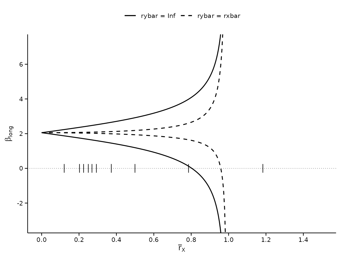
The two zero crossings are the two breakdown points of Table 1, Panel C:
Right panel: the breakdown frontier in space
The paper’s right panel is a different object from the left: it plots
the breakdown frontier
,
one curve per
,
in the
plane. That is what direction = "rybar" computes – the
frontier of DMP Theorem 4, solved for
at each
:
frontier <- function(cbar, rxs) {
    r <- regsen_breakdown(form, bfg2020, compare = w1, cbar = cbar,
                           direction = "rybar", rxbar = rxs)
    data.frame(rxbar = rxs, rybar = r$results$breakdown,
               cbar = factor(cbar))
}

rxs <- c(0.75, 0.85, 0.95, 1.05, 1.2, 1.4, 1.7, 2.2, 3, 4)
fr  <- do.call(rbind, lapply(c(1, 0.75, 0.5), frontier, rxs = rxs))

# Below its rxbar breakdown point a curve survives every rybar, so the
# frontier is +Inf: send those points off the top and let the panel clip
# them, which draws the vertical arm.
fr$rybar[!is.finite(fr$rybar)] <- 40

# As in the paper: thick black is cbar = 1; the greys are 0.75 and
# 0.5, moving outward. The coarse grid keeps the CRAN build fast; the
# website's figure-comparison article runs a fine one.
ggplot(fr, aes(x = rxbar, y = rybar, group = cbar)) +
    geom_line(aes(linewidth = cbar == "1", colour = cbar == "1"),
               na.rm = TRUE) +
    scale_linewidth_manual(values = c(`TRUE` = 0.9, `FALSE` = 0.4),
                            guide = "none") +
    scale_colour_manual(values = c(`TRUE` = "black", `FALSE` = "grey55"),
                         guide = "none") +
    coord_cartesian(xlim = c(0, 4), ylim = c(0, 4)) +
    labs(x = expression(bar(r)[X]), y = expression(bar(r)[Y])) +
    theme_regsen(base_size = 10)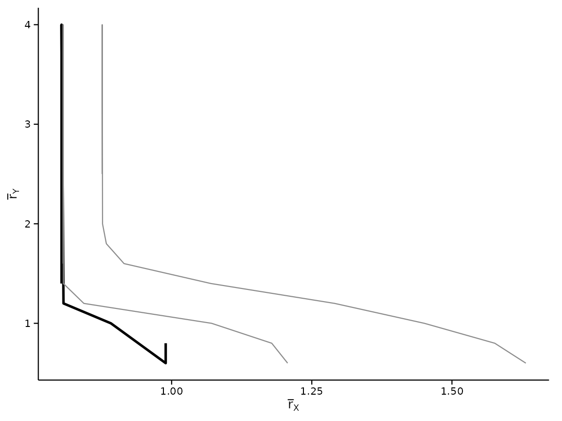
Each curve is the boundary between pairs under which the sign conclusion survives and those under which it fails. Each has two arms. The vertical one sits at for , the breakdown point from Table 1: as grows the restriction on the outcome side stops binding and the frontier is the breakdown point under no restriction at all. The horizontal arm is the level of below which the sign survives any . Smaller pushes both out, because restricting how endogenous the controls may be makes the conclusion harder to overturn.
Reading the frontier in the other direction shows why the package offers both. Fix and ask for the at which the sign fails: just above the horizontal arm there is an answer, and on it there is none, because no overturns the sign there.
vapply(c(0.7, 0.6, 0.55, 0.5), function(ry) {
    regsen_breakdown(form, bfg2020, compare = w1,
                     cbar = 1, rybar = ry)$results$breakdown
}, numeric(1))
#> [1] 1.074537 1.395827      Inf      Inf
The identified set at those larger is bounded, even though alone would say nothing there – restricting is what keeps it finite:
regsen_bounds(form, bfg2020, compare = w1,
              cbar = 1, rxbar = c(2, 4, 10), rybar = 0.5)$results
#>   rxbar rybar cbar      bmin     bmax
#> 1     2   0.5    1 0.4241849 3.774923
#> 2     4   0.5    1 0.4239135 3.774923
#> 3    10   0.5    1 0.4239135 3.774923
Overlaying the calibration values
# The breakdown point as a function of cbar alone, with each covariate's
# calibrated rho_k drawn as a reference line.
bd_cbar <- regsen_breakdown(form, bfg2020, compare = w1,
                             cbar = seq(0, 1, 0.02))

df_rho <- calibrate_rho(form, bfg2020, compare = w1)
df_rho$variable <- labels[df_rho$variable]
df_rho$rho_dec  <- df_rho$rho / 100  # express as fraction

# Several covariates calibrate to similar rho, so labels placed at a
# common x collide into an unreadable stack. Staggering them across three
# x positions keeps every label rather than dropping the crowded ones.
df_rho <- df_rho[order(-df_rho$rho_dec), ]
df_rho$xpos <- rep(c(0.02, 0.36, 0.70), length.out = nrow(df_rho))

plot(bd_cbar) +
    geom_hline(yintercept = df_rho$rho_dec, linetype = "dotted",
                colour = "grey55", linewidth = 0.3) +
    geom_text(data = df_rho,
               aes(x = xpos, y = rho_dec, label = variable),
               hjust = 0, vjust = -0.4, size = 2.5, colour = "grey25") +
    coord_cartesian(ylim = c(0, 1.45))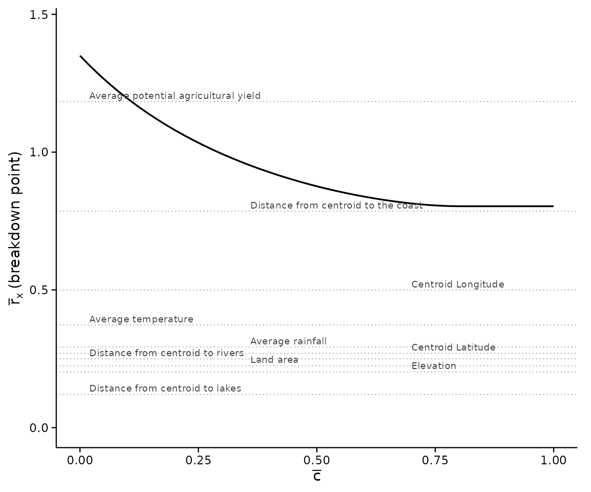
Each dotted line is one covariate’s : how much of the treatment’s variation that single observed control explains. Reading the frontier against them is the point of the figure – a covariate sitting above the frontier would, if an unobservable were comparably important, be enough to overturn the sign.
Figure 2: not reproducible from the bundled data
Figure 2 of DMP (2026) reports the same analysis for the Cut
Spending on Poor outcome, which is not part of the
bundled 14-variable bfg2020 slice. Once the full
Bazzi-Fiszbein-Gebresilasse replication data is loaded, the calls look
like:
Figure 3: moving the state fixed effects into the calibration set
Figure 3 repeats Figure 1 with the state fixed effects calibrated
against rather than merely controlled for. It needs no
additional data, only a different compare set. The paper
reports that the breakdown point drops from about 80% to about 30%, its
illustration that
is only interpretable relative to the calibration covariates:
fig3 <- regsen_bounds(form, bfg2020, compare = c(w1, "statea"), cbar = 1)
c(`w1 only`            = abs(bp_conservative$breakdown),  # paper: ~0.80
  `w1 + state effects` = abs(fig3$breakdown))             # paper: ~0.30
#>            w1 only w1 + state effects
#>          0.8035643          0.2909420
The full figure, with both panels next to the published ones, is on the website: see the article Side by side with the published figures.
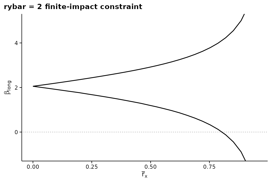
Bonus: identified set under
The paper notes that restricting the unobservable’s effect on the outcome shrinks the identified set considerably. An illustration in that spirit (this is not a figure from the paper):
fy <- regsen_bounds(form, bfg2020, compare = w1, rybar = 2,
                     rxbar = seq(0, 0.95, length.out = 30))
plot(fy, ylim = c(-1, 5),
     title = "rybar = 2 finite-impact constraint")