Treatment Calendar Heatmap for Staggered Adoption Designs
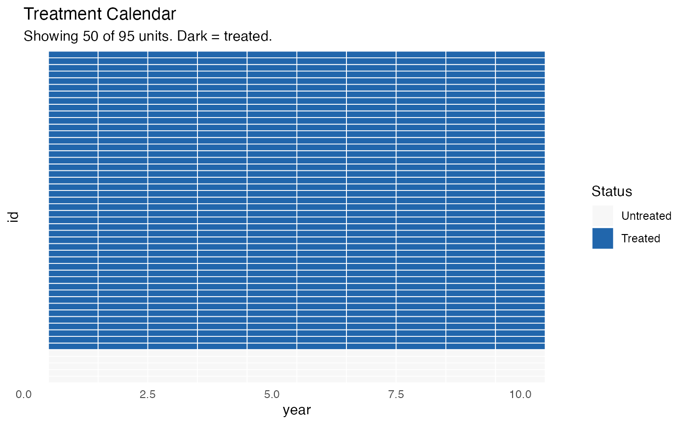
treatment_calendar.RdCreates a heatmap / calendar visualization showing when each unit received treatment in a staggered adoption panel design. Useful for communicating treatment timing variation to readers and reviewers.
Usage
treatment_calendar(
  data,
  unit_var = "id",
  time_var = "year",
  treat_var = "treatment",
  cohort_var = NULL,
  max_units = 50,
  colors = c("#F7F7F7", "#2166AC"),
  title = "Treatment Calendar"
)
Arguments
- data
A data frame in long (panel) format.
- unit_var
Character. Name of the unit identifier column.
- time_var
Character. Name of the time period column.
- treat_var
Character. Name of the treatment indicator column (binary 0/1).
- cohort_var
Character or
NULL. Name of a cohort/group variable (e.g., year first treated). IfNULL(default), cohorts are inferred automatically.- max_units
Integer. Maximum number of units to display. Units are sorted by first treatment date. Default
50.- colors
Character vector of length 2. Colors for untreated and treated cells. Default
c("#F7F7F7", "#2166AC").- title
Character. Plot title. Default
"Treatment Calendar".