Parallel Trends Plot for DiD
parallel_trends_plot.RdCreates a publication-ready time-series plot comparing treated and control group mean outcomes before and after treatment. Pre-treatment parallelism is annotated visually to help assess the key identifying assumption of difference-in-differences designs.
Usage
parallel_trends_plot(
  data,
  unit_var,
  time_var,
  outcome_var,
  treatment_var,
  treat_time,
  title = NULL
)
Arguments
- data
A data frame in long (panel) format.
- unit_var
Character. Name of the unit/panel identifier column.
- time_var
Character. Name of the time period column (numeric or integer).
- outcome_var
Character. Name of the outcome variable column (numeric).
- treatment_var
Character. Name of the binary treatment indicator column (0/1 or logical). Treatment status is taken as the ever-treated indicator (max value per unit).
- treat_time
Numeric. The first treatment period (vertical line placement and shading boundary).
- title
Character or
NULL. Plot title. DefaultNULLuses a generic title.
Details
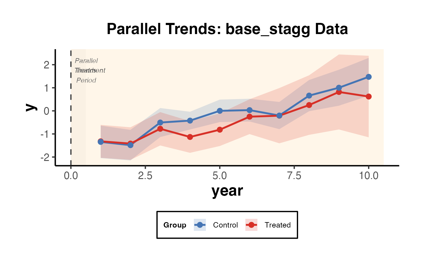
Parallel Trends Visualization for Difference-in-Differences
Plots mean outcome trajectories for treated and control groups over time, with shaded pre- and post-treatment regions, 95% confidence interval ribbons, a vertical dashed line at the treatment period, and a visual annotation highlighting the pre-treatment parallel trends assumption.
References
Angrist, J. D., & Pischke, J.-S. (2009). Mostly Harmless Econometrics. Princeton University Press.
Examples
if (requireNamespace("fixest", quietly = TRUE)) {
  data("base_stagg", package = "fixest")
  parallel_trends_plot(
    data          = base_stagg,
    unit_var      = "id",
    time_var      = "year",
    outcome_var   = "y",
    treatment_var = "treated",
    treat_time    = 0,
    title         = "Parallel Trends: base_stagg Data"
  )
}